| Author | Thread |
|
|
01/13/2003 03:36:23 PM |
Gordon --
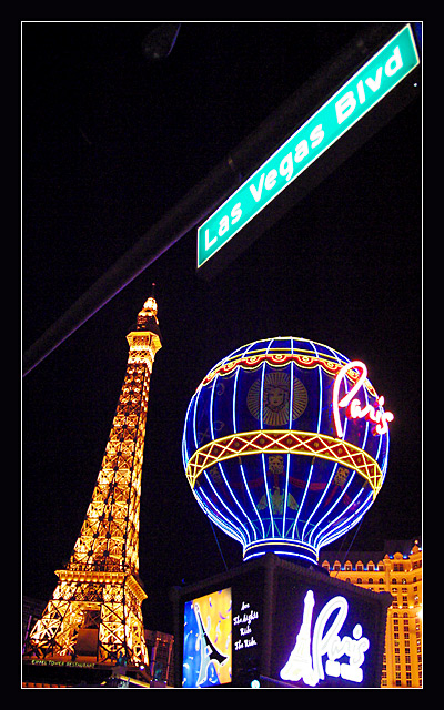
This picture has it all. Great colors, great compositon. Focus is a little lost is the lower right corner, but that is understandable due to your wide DOF.
-- shohn/DPC -- CC |
|
Comments Made During the Challenge  |
|
|
01/12/2003 11:53:27 PM |
| Bright, colorful, interesting, fun, and well executed. |
|
|
|
01/12/2003 05:53:21 PM |
| interesting perspective, after the contest is over take out the thing on the top of the picture in photoshop |
|
|
|
01/10/2003 12:52:02 PM |
|
|
|
01/09/2003 05:54:30 PM |
| Well I LIKE the angle of the sign but NOT the angle of the Tour Eiffel - and the green of the sign is kind of odd... I mostly like it OK but that sign thingy at the bottom makes it less appealing to me - I think it's the base of the balloon maybe... |
|
|
|
01/09/2003 03:38:17 PM |
| Great shot, really captures Las Vegas well. Challenge well met. 8 Swash |
|
|
|
01/09/2003 05:17:17 AM |
| The street sign makes the picture special and well fitting to the title. Thumb up! |
|
|
|
01/08/2003 12:44:29 PM |
| Very pretty colors. The angle and framing/cropping is nice, a little tilted, but I don't mind that in this photo at all. The Lighting is just perfect. Great focus and clarity. Looks like a postcard. Great shot. Good luck in the challenge. |
|
|
|
01/08/2003 12:39:09 AM |
| Perfect exposure.Nice job. I also love the comp in this image. |
|
|
|
01/07/2003 08:57:01 AM |
| Definitely better if the sign was more true green. - BB |
|
|
|
01/07/2003 08:29:49 AM |
Great shot the color and lighting were superb! Couldn't figure out out what was on the very top of the shot...another part of the road sign? But overall great effect.7.
Take my comments for what they are worth for I am just a novice with a new camera. Dodo |
|
|
|
01/06/2003 10:44:20 PM |
| interesting shot, great exposure and colors. |
|
|
|
01/06/2003 09:15:00 PM |
| Just like a postcard! Nice lights! |
|
|
|
01/06/2003 01:23:44 PM |
| Although the angle of the sign seems somewhat strange to me I love the bright colours against the black. |
|
|
|
01/06/2003 01:21:18 PM |
| good composition. i like the diagonal across the top of the frame. teh colors all balance and exposure is good. |
|
Home -
Challenges -
Community -
League -
Photos -
Cameras -
Lenses -
Learn -
Help -
Terms of Use -
Privacy -
Top ^
DPChallenge, and website content and design, Copyright © 2001-2025 Challenging Technologies, LLC.
All digital photo copyrights belong to the photographers and may not be used without permission.
Current Server Time: 04/26/2025 10:54:57 PM EDT.