| Author | Thread |
|
|
01/27/2003 07:54:53 AM |
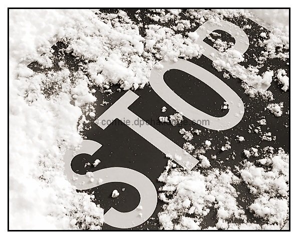
| absolutely one of my fave shots of this challenge |
|
Comments Made During the Challenge  |
|
|
01/26/2003 08:45:44 PM |
| I think that this would be much more effective in colour. You obviously did not think so, and who am I to judge your style! ;) jgillard6 |
|
|
|
01/26/2003 06:44:52 PM |
| This has no bearing on my rating of your pic, (which is very high), but I don't think the border added anything-better without. |
|
|
|
01/26/2003 02:01:02 PM |
|
|
|
01/26/2003 01:54:07 PM |
| borders. who needs 'em. nice job grabbing the grain of the snow, but why not show color? |
|
|
|
01/26/2003 04:18:13 AM |
| Nice idea makes it stand apart from the other STOP signs. Clairty and definition is good, I do wonder what it would have been like in colour though. The subtle border adds nicely to the shot too! |
|
|
|
01/25/2003 02:35:17 PM |
| A really nice shot. I wonder why you didn't use color here though. I really like B & W but with the sign looking so new I thought the bright red might look really nice against the snow. |
|
|
|
01/24/2003 09:30:20 PM |
| On second viewing, this needs a higher score. Very nice B/W with good story. Compositionally, I'd like the see the S just a little bit higher, but that's small potatoes. Very fine. |
|
|
|
01/24/2003 07:23:56 PM |
| Simply great...great composition and use of black and white. The placement of the snow around the word,stop, very dramatic. One of my few 10's . |
|
|
|
01/24/2003 01:52:35 PM |
| Really nice photo. I like the black and white. Originally gave an 8, boosting to a 9. |
|
|
|
01/24/2003 10:30:02 AM |
| This is a great shot.. the strong diagonal combined with the black and white here really looks nice! Kudos.. = 10 - setzler |
|
|
|
01/24/2003 07:31:54 AM |
| Nice tone, good composition |
|
|
|
01/24/2003 12:39:24 AM |
| I am glad you went with black and white. It works well |
|
|
|
01/23/2003 05:20:43 PM |
|
|
|
01/23/2003 12:09:45 AM |
| Very crisp and vivid - the snow has so much texture in it. Focus and composition are lovely - the only thing I would have done differently would be a little less snow around the top of the S (currently it blends a little too well). The border is very appropriate for the image. One of the better photo's this week. |
|
|
|
01/22/2003 10:46:22 PM |
| Nice crisp duotones...like the composition too. |
|
|
|
01/22/2003 03:49:38 PM |
| this is one of the best in the challenge. i like the sharpness. it's near perfect. and the duotone or black and white really works well with the snow |
|
|
|
01/22/2003 01:50:16 PM |
| Great contrasts powerful b&w photo!!!!10 |
|
|
|
01/22/2003 01:12:20 PM |
| Love everything about this one. 10. |
|
|
|
01/22/2003 11:35:11 AM |
| This could have been better in colour. (Red/White) |
|
|
|
01/22/2003 12:39:44 AM |
| ahhhh.. simplicity...... very nice. |
|
|
|
01/21/2003 11:26:53 PM |
| I'm scratching my head on this one. I like it. I dont. I do. I dont... Not sure why, but as I write this, I lean towards liking it. I think maybe the STOP is a tad crowded in the frame. Maybe just a bit more breathing room may have helped. Or maybe not. I dunno. Oh, and too much border. 8 md |
|
|
|
01/21/2003 11:15:02 PM |
|
|
|
01/21/2003 08:20:53 PM |
| Obviously someone didn't! Nice and clear and sharp. Good cropping and the border adds to this. Still would love it in bright red against the white snow. That would be a show stopper, an eye catcher a 10. You could still keep your border. Still a good photo and technically sound, but only a 7. |
|
|
|
01/21/2003 05:32:36 PM |
| I actually think red might have been cooler for this picture then black and white. I think this would have been an awesome pic, if you had made it color. It's really nice as it is, but it lacks pizzaz. Still a -9- though. Good luck. |
|
|
|
01/21/2003 06:52:58 AM |
| Nice idea. Looks great in B&W and the border enhances the photo. 7 from me. |
|
|
|
01/20/2003 10:09:03 PM |
| Nice shot. Did you plow it over for the shot? 8 |
|
|
|
01/20/2003 06:51:09 PM |
| This one is great, visually and unique (that a Stop sign was run over). Nice one!! 8. |
|
|
|
01/20/2003 03:36:35 PM |
|
|
|
01/20/2003 10:39:28 AM |
| IMO if this was in colour it would have more impact, still that said, good shot. |
|
|
|
01/20/2003 10:25:56 AM |
| why black and white? the red versus the snow might have been a very cool contrast. |
|
|
|
01/20/2003 01:52:45 AM |
| I don't think the frame adds anything positve to the photo... 10 |
|
|
|
01/20/2003 01:39:54 AM |
| one of the best images I've seen so far! Very nice shot. 10 |
|
Home -
Challenges -
Community -
League -
Photos -
Cameras -
Lenses -
Learn -
Help -
Terms of Use -
Privacy -
Top ^
DPChallenge, and website content and design, Copyright © 2001-2025 Challenging Technologies, LLC.
All digital photo copyrights belong to the photographers and may not be used without permission.
Current Server Time: 04/26/2025 05:32:10 PM EDT.