| Author | Thread |
|
|
02/02/2003 12:29:09 PM |
CRITIQUE CLUB REVIEW
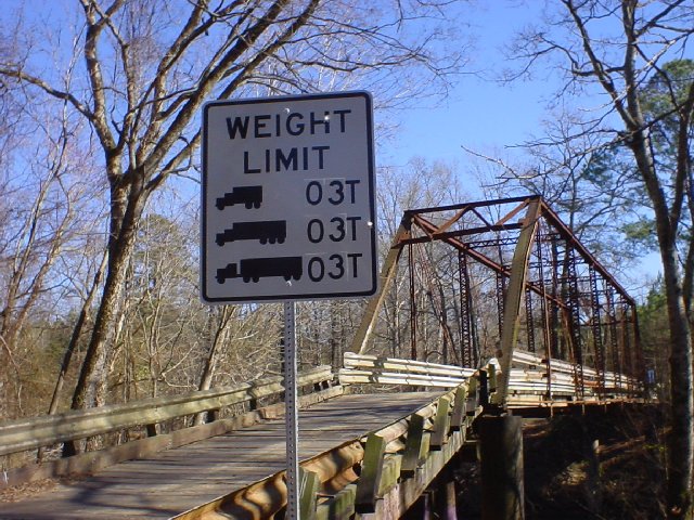
I'm amazed that they let trucks that big on the bridge. It looks old and rickety. It must be well reinforced.
This picture is an interesting location. What could we do to make it better?
Point the camera a little more to the right, or even actually move physically to teh right (if there's a place to ) to get the sign in the upper left third corner of the frame (do a search on Google for "Rule of Thirds" for more information). As it is, it's almost centered but not enough for it to look like you made a strong compositional choice. Also the right edge of the bridge is to close to the edge of the frame.
Try having used your fill flash to bring the lighting on the sign up to match the rest of the scene. Roadsigns are made to flouresce when lights hit them, and a fill flash can be just the thing to have made this sign pop. Also, even tho it's an interesting sign with an interesting backdrop, since there's not a ton of color in the background it might have been a nice contrast to have a more colorful or more brightly lit sign.
Time of day could also have played a major role in the improvement of this picture. A sunset, sunrise or lower more angular lighting would be nice. Usually when the sun is high in the sky is the most boring time to shoot. Interesting clouds in the sky are also good to watch for. |
|
|
|
01/27/2003 10:02:01 AM |
Originally posted by sparky_mark:
Nice photo - although I'm surprised by the sign. Most (if not all) of the types of truck shown would weigh more than 3T unladen - especially the semi which probably weighs 8-10T. Anyway, back to the photo... Nice composition and focus is pretty good (perhaps just a little blury on the bridge). Colours are good and the sign is well positioned to grab my attention. Good work. |
This bridge is down an old wash board dirt road. I'm guessing they don't want trucks on it at all. I just wonder what the weight limits were under the stickers on the sign. |
|
|
|
01/27/2003 09:57:53 AM |
Originally posted by kiwiness:
Nice photo. Are those two bullet holes through the sign? |
text
Yes they are bullet holes!!!! Should have seen the sign on the other end of the bridge...... |
|
Comments Made During the Challenge  |
|
|
01/26/2003 08:47:59 PM |
| That looks sorta like a bridge I know! I like the colour of the sky, but the lower right corner of the image is a bit dark, and draws the viewers eyes there unneccesarily. jgillard6 |
|
|
|
01/26/2003 01:37:53 PM |
| real nice composition, great light and shades. |
|
|
|
01/26/2003 11:31:18 AM |
|
|
|
01/24/2003 10:40:49 PM |
| Who makes up these signs? Nice photo. Where in the world did you come across it? The composition is nice, like the rust on the railing and the girders. |
|
|
|
01/24/2003 10:18:16 AM |
| there needs to be more light on the sign. this photo isn's very interesting to me either. maybe from a straight on perspective |
|
|
|
01/23/2003 09:49:57 PM |
| Nice photo - although I'm surprised by the sign. Most (if not all) of the types of truck shown would weigh more than 3T unladen - especially the semi which probably weighs 8-10T. Anyway, back to the photo... Nice composition and focus is pretty good (perhaps just a little blury on the bridge). Colours are good and the sign is well positioned to grab my attention. Good work. |
|
|
|
01/23/2003 03:34:39 PM |
| Very good. Maybe just a hair dark but really good photo. Good composition with really good execution. Only fault I can find, like I said, is maybe just a little dark, especially under the bridge and at the vry end of the bridge. If you're going to let me see under there I want to see under there. But it really doesn't hurt the photo that much. Still an 8. |
|
 Photographer found comment helpful. Photographer found comment helpful. |
|
|
01/23/2003 03:06:14 PM |
| nice picture without the sign |
|
|
|
01/22/2003 11:49:40 AM |
| Nice picture. I love the rustic old bridge iln the background. |
|
|
|
01/22/2003 11:26:28 AM |
| This reminds me of Maine. |
|
|
|
01/21/2003 05:22:38 AM |
| Nice photo. Are those two bullet holes through the sign? |
|
|
|
01/20/2003 10:49:23 AM |
| too bad everything is nicely exposed except the sign. using your flash might have improved that. |
|
|
|
01/20/2003 02:40:37 AM |
|
Home -
Challenges -
Community -
League -
Photos -
Cameras -
Lenses -
Learn -
Help -
Terms of Use -
Privacy -
Top ^
DPChallenge, and website content and design, Copyright © 2001-2025 Challenging Technologies, LLC.
All digital photo copyrights belong to the photographers and may not be used without permission.
Current Server Time: 03/12/2025 07:52:32 AM EDT.