| Author | Thread |
Comments Made During the Challenge  |
|
|
04/28/2002 10:04:00 PM |
| yes, i guess its a transition, but the picture lacks energy |
|
|
|
04/28/2002 06:18:00 PM |
| the foreground is a little dark, and you've got stuf overlapping which makes it hard to pick out the details of the leaves and branches. they also seem to have been cut rather unnaturally. |
|
|
|
04/28/2002 06:32:00 AM |
| I wish this had been exposed just a little bit longer, to allow for greater contrast. Also, the composition is lacking something, but I am not sure what. Maybe shooting closer in on the subject matter might have helped. |
|
|
|
04/27/2002 12:09:00 PM |
| maybe take a little off of the left. |
|
|
|
04/26/2002 03:25:00 PM |
| deparately needs close-up here - if your camera won't allow this then get hold of a strong spectacle lens and place in front of your camera lense - this will allow you to focus much closer for no cost! Did you try this shot in colour? I think it would have worked better, but the close-up is more important. Good subject for challenge. |
|
|
|
04/26/2002 02:44:00 PM |
| too dark, can't see detail of 'leaf' |
|
|
|
04/25/2002 04:51:00 PM |
| I think this does not benefit from being a B&W photo. Part of the attraction here is the color. |
|
|
|
04/25/2002 11:13:00 AM |
| Nice composition, a bit of compression around the plants, but not that noticeable. Intriguing background |
|
|
|
04/23/2002 10:14:00 PM |
| Did you try this in color? This would be a great photo to paint. |
|
|
|
04/23/2002 01:01:00 PM |
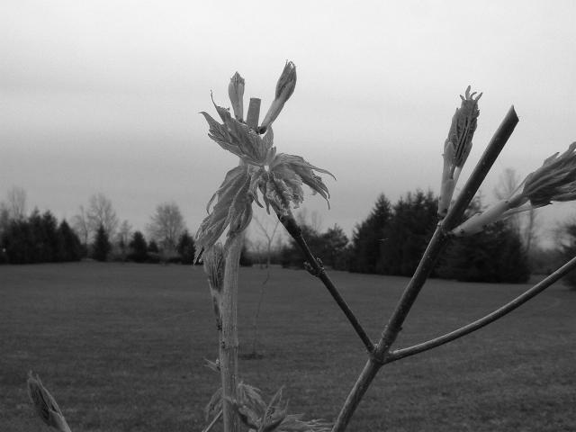
Way too much dead space with the background. If you photographing a new leaf, much of this new leaf should fill the image.
Without the title, this just looks like a twig and some leaves...It doesn't give much indication of a transition. |
|
|
|
04/23/2002 09:20:00 AM |
| simplify simplify, the background is too busy and very distracting |
|
|
|
04/23/2002 01:45:00 AM |
| thre crossing of the two stems is too confusing |
|
|
|
04/22/2002 09:09:00 PM |
| done before, and better, and i don't like the black and white choice |
|
|
|
04/22/2002 07:33:00 PM |
| This seems dark to me, I would have liked it better in color |
|
|
|
04/22/2002 04:42:00 PM |
| Black and white photos should have both those tones this has neither just many grays. |
|
|
|
04/22/2002 03:48:00 PM |
| This is a nice black and white image. The black and white may be making it difficult for me to catch the transition between the new leaves and the old ones... |
|
|
|
04/22/2002 12:51:00 PM |
|
|
|
04/22/2002 10:57:00 AM |
| Good idea. I think I would've choosen a different angle to avoid cutting off the leaves to the right and maybe try not to have the leaf on the left in the pic. Also think that maybe color would've been better here. |
|
|
|
04/22/2002 09:50:00 AM |
| B&W hasn't done much for this - the contrast is still quite low and very grey - some work in photoshop with levels might have darkened the darks and lightened the lights to make this stronger. Framing is too central and makes it quite static. |
|
|
|
04/22/2002 08:56:00 AM |
|
|
|
04/22/2002 08:18:00 AM |
| I think I would have lightened this up so that more detail was visible. |
|
|
|
04/25/2002 12:41:00 PM |
| I'd have prefered this one to be in colour, as the 'new leaf' of the title is very hard to see in mono. |
|
Home -
Challenges -
Community -
League -
Photos -
Cameras -
Lenses -
Learn -
Help -
Terms of Use -
Privacy -
Top ^
DPChallenge, and website content and design, Copyright © 2001-2025 Challenging Technologies, LLC.
All digital photo copyrights belong to the photographers and may not be used without permission.
Current Server Time: 03/13/2025 07:59:18 PM EDT.