| Author | Thread |
|
|
11/09/2015 10:49:33 AM |
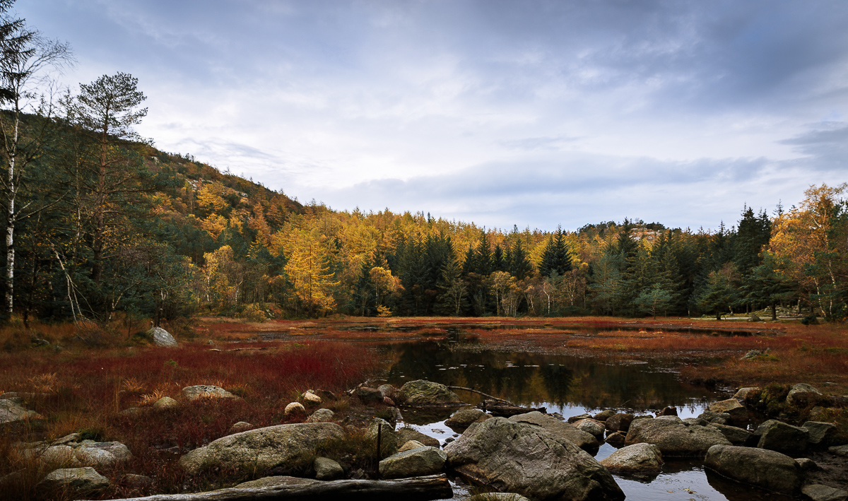
I think the biggest problem is the composition. In the landscape there does not need to be focal point but then you need to look at shapes and layers. I played with your uncropped image and thought that there were distinct layers and that the sky reflection would be good emphasize as well as the foreground rocks. The sky is a problem, did you really shoot in JPEG and not in RAW? With your gear it seems such a pity. The sky could be saved. Here is my PP idea:
 |
|
 Photographer found comment helpful. Photographer found comment helpful. |
|
|
11/09/2015 07:59:16 AM |
Greetings from the Critique Club!
Hmm it looks like other post-commenters have already picked out the best and worst of this shot so I really don't have anything new to add. I do agree that you mainly need a focal point, something to draw the eye; my eye is wandering looking for something. It's like seeing a set before the actors arrive. The sky is a bit bland. I would like to see the yellows pop a little more. The trees on the left could easily be cropped out as they aren't adding to the comp, they're just there.
As has been noted already, FS are by hardest the best to do well in as everyone enters something different. More weekly challenges where you are given more directions (usually anyway) may help.
Hope this has been useful
Susan |
|
| Photographer found comment helpful. |
|
|
11/08/2015 08:01:50 PM |
Arna, What your picture is lacking is luminosity/luster/lighting...your leaves were probably very vibrant when you saw this. Are you shooting in RAW/JPEG? That could be a major difference...with RAW you can play with light and color better.
IMO you need some good Dodge & Burn and I'd add a Soft Focus. It would make your colors really pop.
I agree that possible with some "step photography" (that's where you take a few steps left or right) to get the rocks and water to look as good as possible, getting rid of the tree/log. It looks like you could have gone to the right and gotten in that little opening between the rocks and away from the log...therefore making a channel/line for your eyes to enter the picture and travel through the water and into the trees. And personally I'd of sharpened this more (before the soft focus...by way of High Pass Filter (applied lightly).
This all being said doesn't mean that it's not a good picture. When I started here I just tried to "beat my score"....and did ALOT of tutorials on youtube!!! Good luck...not bad for your 6 entry...FS's are the toughest by far!!! Enter more of the weekly challenges...they are more "focused" for subject. |
|
| Photographer found comment helpful. |
|
|
11/08/2015 05:41:22 PM |
What stuck out to me as I voted, and even more as I see the original, is the unrealistic clouds. The lights and darks simply don't add up.
I like that you cropped the bottom, but you cropped a little too much. That big rock ad the end of the rock is slightly chopped off, and looks better if we can see some water in front of it.
The colors in the trees are really dull. Try turning up the brightness of yellows, and the leaves will start to pop. |
|
| Photographer found comment helpful. |
|
|
11/08/2015 12:03:29 PM |
In response to your post-challenge comment request:
I gave this a 5. In my scoring, this means a decent entry that just doesn't resonate for me. Specifically I'd agree with earlier comments about lack of central subject. I'd add support for cropping the tree on the left, but not sure I'd put the foreground log back in - it's lying at too much of a horizontal angle to lead into the scene.
For me the positives includes the restraint in your color processing. It's perfectly saturated for my taste, which tends to eschew the current preferences for exaggerated color and vibrance.
The biggest negative for me is the band of darker exposure and empty content that sits along the critical horizontal line defining the bottom third of the image. In particular, the pond which reflects the tree line above it is dark enough to lose some possibly interesting detail. You might consider reworking it with increased exposure and attention to the yellows in the reflection (which is sitting at a well-placed rule of thirds intersection). |
|
| Photographer found comment helpful. |
|
|
11/08/2015 09:07:39 AM |
I gave this a 6. It's a good basic autumn scene but you haven't somehow made the best out of the composition. As MichaelC says, it's missing a focal point.
When seeing the original Jpeg, I can see you've cropped it from the native 3:2 aspect ratio to 16:9. I would certainly have cropped the image, but not quite the way you did. I find that log lying the foreground of the image could have been used to lead the eye into the image. Like MichaelC I would have cropped the tree on the left out. |
|
| Photographer found comment helpful. |
|
|
11/08/2015 08:20:14 AM |
IMHO you have done more right than wrong:
Pros:
* great colour tones
* foreground, middle & background defined
* good angle to capture reflection
Cons:
* Tree on left edge could have been cropped out
* Sky a tad too bright and could have been reduced by post, a filter, or shooting earlier/later
Having said the above I feel the biggest drawback was lack of a focal point to rest the eyes. A big rock, a person or just about anything added would have improved this scene. Or if you were going for the completely natural look then shooting at golden/blue hour would have given some wonderful texture to that sky. |
|
| Photographer found comment helpful. |
Home -
Challenges -
Community -
League -
Photos -
Cameras -
Lenses -
Learn -
Help -
Terms of Use -
Privacy -
Top ^
DPChallenge, and website content and design, Copyright © 2001-2025 Challenging Technologies, LLC.
All digital photo copyrights belong to the photographers and may not be used without permission.
Current Server Time: 04/25/2025 10:58:45 PM EDT.