| Author | Thread |
|
|
05/06/2002 09:13:00 AM |
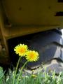
| Kee, I have absolutely no idea how this picture did not do better. Amazing. I really liked it! |
|
Comments Made During the Challenge  |
|
|
05/04/2002 10:09:00 PM |
| too muck like the cover of the box it came in |
|
|
|
05/03/2002 08:27:00 AM |
| I love the shot. Though simple it seems that there's a lot to look at. |
|
|
|
05/02/2002 06:09:00 PM |
| Interesting. Nice balance. |
|
|
|
05/02/2002 11:50:00 AM |
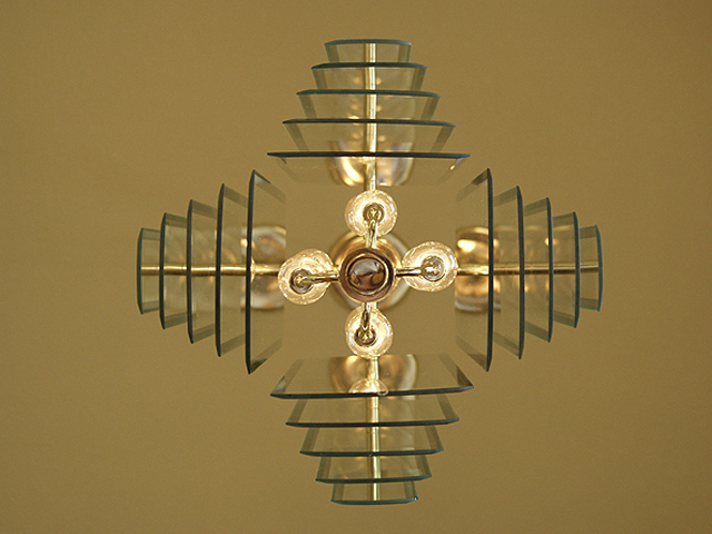
| Now this is what I call straight from the ground up. Very good how you captured the reflections. |
|
|
|
05/02/2002 12:47:00 AM |
| kinda cool, photo should of been cropped better |
|
|
|
05/01/2002 01:53:00 PM |
| I really like this. I think I would have moved it further to the right so that there is an equal margin on the top, bottom and right hand sides (and then maybe see if it looks better as a vertical with the lamp at the top or at the bottom or if it looks better horizontal). If possible (and it may not be) I'd also try to make sure that the fixtures in the middle were all squared up. |
|
|
|
05/01/2002 10:38:00 AM |
| Nice symmetrical design. This would work well as a square picture if the challenge rules allowed it. |
|
|
|
05/01/2002 09:36:00 AM |
| Nice shape. I think I'd like this better if I'd had a chance to see it before reading the title - to wonder what it was. Well seen. |
|
|
|
04/30/2002 09:21:00 PM |
| This is a great example of taking a very common object and illustrating its beauty. I applaud your attention to detail in your composition. Give us more of this good work. |
|
|
|
04/30/2002 05:34:00 PM |
| FANTASTIC. CREATIVE. SO BASIC, SO COOL! |
|
|
|
04/30/2002 03:36:00 PM |
| thats really good, i bet it took a few attempts to get right in the centre like that |
|
|
|
04/30/2002 10:27:00 AM |
| Nice symmetry. Technically well-done. |
|
|
|
04/30/2002 09:45:00 AM |
| I like this shot! This painfully reminds me of my "quittin time" clock shot from last week. My idea was to produce a photo that was as close to technical perfection as possible. This photo is nicely centered and I can see ZERO flaws. It also meets the challenge nicely! Nice job! |
|
|
|
04/30/2002 08:01:00 AM |
| Excellent. I love the symmetry. It sucks that you have to stick to 640x480 and not 480x480 because a square photo would be great with this. |
|
|
|
04/30/2002 05:23:00 AM |
| Would like this to be cropped a lot tighter but a good abstract anyway. |
|
|
|
04/30/2002 04:17:00 AM |
| very nicely taken and composed picture of a rather uninteresting object |
|
|
|
04/29/2002 10:57:00 PM |
| Very simple subject turned into a very interesting design. Excellent work! |
|
|
|
04/29/2002 08:43:00 PM |
| I love this image. If it were shifted a little more to the left it would be perfect. |
|
|
|
04/29/2002 05:50:00 PM |
| i don't agree with you that this is from the ground up, but that doesn't matter i guess. the lights seem a little off center, but they are captivating |
|
|
|
04/29/2002 05:49:00 PM |
| Very nice job centering this picture. Interesting composition. |
|
|
|
04/29/2002 03:03:00 PM |
| This looks like art, very nice. |
|
|
|
04/29/2002 02:00:00 PM |
| wow. this is an amazing light - great photo |
|
|
|
04/29/2002 10:51:00 AM |
| would prefer to see it from a side angle instead of directly underneath |
|
|
|
04/29/2002 10:10:00 AM |
| this picture is one of the better ones. i like how you take a normal object and make it unusual looking and geometric. |
|
|
|
04/29/2002 08:54:00 AM |
| ceiling is a bit too brown to make this really interesting |
|
|
|
04/29/2002 07:55:00 AM |
| This is a very neat effect. It looks a little uneven but I think that's due to it being a light as they tend to do that. I'm so happy it wasn't against a white wall as this color just adds so much to the photo:) |
|
|
|
04/29/2002 07:41:00 AM |
| Nice colors and very symetrical. |
|
|
|
04/29/2002 05:52:00 AM |
| Great symmetry... but the white balance could be better |
|
|
|
04/29/2002 05:33:00 AM |
| Nice. A bit off center, but nice nonetheless. |
|
|
|
04/29/2002 01:57:00 AM |
|
Home -
Challenges -
Community -
League -
Photos -
Cameras -
Lenses -
Learn -
Help -
Terms of Use -
Privacy -
Top ^
DPChallenge, and website content and design, Copyright © 2001-2025 Challenging Technologies, LLC.
All digital photo copyrights belong to the photographers and may not be used without permission.
Current Server Time: 04/27/2025 12:11:06 AM EDT.