| Author | Thread |
Comments Made During the Challenge  |
|
|
12/14/2004 01:04:48 PM |
| could never do it myself... |
|
 Photographer found comment helpful. Photographer found comment helpful. |
|
|
12/14/2004 08:46:22 AM |
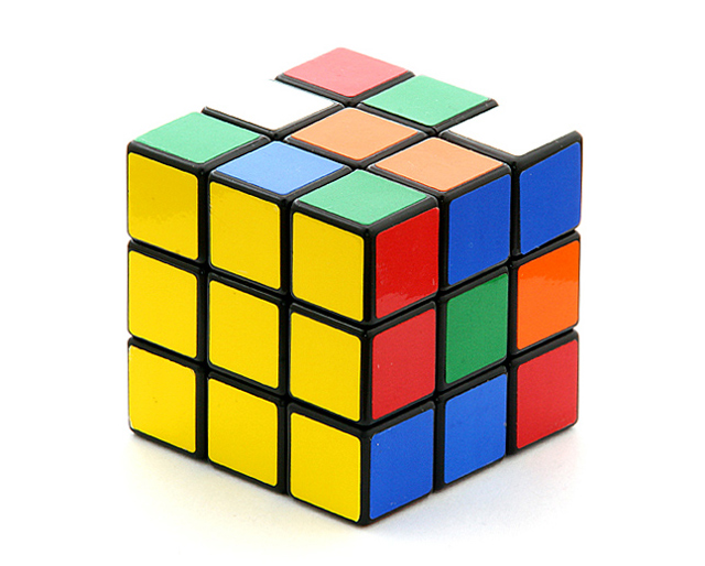
| Image looks nice, not very artistic, but.... you took a picture of an unsolved rubiks cube. Surely there must be some sort of rule against this unless you're trying to photograph frustration incarnate. |
|
|
|
12/11/2004 08:09:43 PM |
Did ya take the sticky colored squares off and move all the yellow ones to one side? That's the only way I could ever beat that thing.
I like this -- nice and simple, great white balance...lighting is perfect. great job, great idea. |
|
| Photographer found comment helpful. |
|
|
12/11/2004 06:20:19 PM |
| Sharp focus, good colors. My husband passed by and saw it and likes the centered composition. |
|
| Photographer found comment helpful. |
|
|
12/09/2004 10:02:43 PM |
| Oh, man, this is one of the more creative/amusing ones I've seen so far! Very nicely done :) |
|
| Photographer found comment helpful. |
|
|
12/09/2004 07:00:23 PM |
| I have just got to build a tabletop studiol. Excellent. Nice clean image. A 10. |
|
| Photographer found comment helpful. |
|
|
12/09/2004 03:48:21 AM |
|
| Photographer found comment helpful. |
|
|
12/09/2004 02:01:46 AM |
|
| Photographer found comment helpful. |
|
|
12/08/2004 09:39:56 PM |
| Hope you didn't have to paste the squares on. Good shot. |
|
| Photographer found comment helpful. |
|
|
12/08/2004 08:53:26 PM |
| Great idea, maybe a black basckground would have worked a bit better because of the white squares blending in with the white background. I know, just a little thing. |
|
| Photographer found comment helpful. |
|
|
12/08/2004 07:49:12 PM |
| i like the concept. perhaps it would be more striking against a black background? |
|
| Photographer found comment helpful. |
|
|
12/08/2004 12:31:29 AM |
Nice idea - I have one of these sitting at my desk, but it is so worn out that I can hardly tell the colors on it!
I am not so sure about the symmetry on this one. If you had rotated the cube slightly ccw, and took a shot from a lower point, i.e. to show more of yellow side, that might have worked better.This way, other colors are too distracting, taking away from the yellow impact.
Another thing that catches my attention in somewhat negative manner are the two white fields that seem to have no border on the outside. Your post processing probably hid those.
I still like it - solid 6 |
|
| Photographer found comment helpful. |
Home -
Challenges -
Community -
League -
Photos -
Cameras -
Lenses -
Learn -
Help -
Terms of Use -
Privacy -
Top ^
DPChallenge, and website content and design, Copyright © 2001-2025 Challenging Technologies, LLC.
All digital photo copyrights belong to the photographers and may not be used without permission.
Current Server Time: 03/12/2025 08:58:55 AM EDT.