| Author | Thread |
Comments Made During the Challenge  |
|
|
05/12/2002 10:23:00 PM |
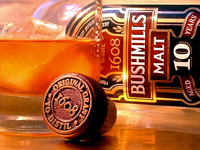
| Love the cap in the front; don't like so much the bottle on its side. Nice image, but doesn't sell me as marketing. |
|
|
|
05/12/2002 09:17:00 PM |
| Nice setup. I don't think the vertical text works well for the subject though. |
|
|
|
05/12/2002 05:31:00 PM |
| Not bad for having polished of the jug. Nice DOF and clarity. Great color definition. |
|
|
|
05/11/2002 06:44:00 AM |
| nice to photograph but don't drink it. I took off one point cause I THINK you took a sip |
|
|
|
05/11/2002 05:55:00 AM |
| Clear, concise, very nice. |
|
|
|
05/10/2002 02:45:00 PM |
| Lovely image, nice detail |
|
|
|
05/10/2002 12:53:00 AM |
| An interesting arrangement, but has some technical issues. The cork is just ahead of the field of focus, the whiskey in the glass looks very cloudy and not so appealing, and the whole image needs a little CCW rotation. |
|
|
|
05/09/2002 03:20:00 PM |
| Nice colors, but a little bright in the upper left. Nice composition |
|
|
|
05/09/2002 02:28:00 PM |
| I like how you placed the bottle cap in front. Nice effect. |
|
|
|
05/09/2002 12:15:00 PM |
| yeah this is definitely a good liquor shot, nice job |
|
|
|
05/08/2002 11:13:00 PM |
| I like the warm tone of this photo and the arrangement of the items. I find the slightly out of focus cork to be a little distracting. |
|
|
|
05/08/2002 02:01:00 PM |
| This is very nice. Excellent cropping and lighting. I think I would have put more ice in the glass but that is very trivial and it's hard to beat a ten, anyway. |
|
|
|
05/08/2002 12:09:00 AM |
| I like the graininess of this photo. It has a lot of nice elements, but I think it's a bit busy overall. Having the bottle lying on its side also makes it difficult to read. |
|
|
|
05/07/2002 09:23:00 PM |
| one of my favorite Irish Whiskeys. The photo is good. I'm sold on having one :) |
|
|
|
05/07/2002 08:16:00 PM |
| beautiful color, composition, and lighting -- i love that the product is laying on it's side, makes an apt point -- the only distracting thing is the bottle top in the foreground being a little too light and a little too out of focus -- if this were for a real ad that could be fixed in photoshop by simply selecting and darkening -- great job! |
|
|
|
05/07/2002 04:40:00 PM |
| This is the number one photo for me. Leaps out even in thumbnail. Perfect composition, detail and colors. Great work! |
|
|
|
05/07/2002 04:25:00 PM |
| Excellent shot. Well layed out. Especially like the cork. |
|
|
|
05/07/2002 06:26:00 AM |
| nice colour, its a shame the drink looks cloudy |
|
|
|
05/06/2002 06:55:00 PM |
| Nice browns and yellows. Bottle looks good. |
|
|
|
05/06/2002 05:55:00 PM |
| I really like the colors in this shot. The cap seems to be a tad out of focus, but otherwise, a very nice photo. Good work! |
|
|
|
05/06/2002 05:38:00 PM |
| Very nice composition, however a little more focus would have been nice. |
|
|
|
05/06/2002 02:38:00 PM |
| Very nice shot! This scores well with me. I would like to see the same shot without the glass and a tighter crop around the bottle label. Good job! |
|
|
|
05/06/2002 02:30:00 PM |
| mmm booze, nice shot. This is well done there is hardly anything in the background to distract from the product. |
|
|
|
05/06/2002 01:22:00 PM |
| Great composition, EXCELLENT color consistancy whether intended or not. Not sure if the cap is out of focus on purpose.. but its a great effect anyway.. its about what's inside the bottle..not what caps the bottle. |
|
|
|
05/06/2002 01:21:00 PM |
| overall this is a very good photo, the only advice i have is that the lighting toward the top left seems a little harsh and tends to create a distracting glare. |
|
|
|
05/06/2002 11:58:00 AM |
| Good photo! (Hard to comment thoughtfully after seeing all the other boozy adverts, but better than most!) Photo 9 Advert 9 total 9 |
|
|
|
05/06/2002 11:28:00 AM |
| I really like the layout and the lighting. The only thing I can nit-pick is the white spec under the cork and the specs, or air bubbles, in the bottom rim of the glass. it is still a 10. |
|
|
|
05/06/2002 10:24:00 AM |
I like your work and I like Bushmills.
Sad that the ice has caused the Bushmills to look milky....maybe it was the table or the light. Otherwise it's a nice shot. |
|
|
|
05/06/2002 08:55:00 AM |
| I like the overall tone/hue. |
|
|
|
05/06/2002 07:44:00 AM |
|
|
|
05/06/2002 06:49:00 AM |
| very tight. love the cropping, framing and lighting. this might be the best one. |
|
|
|
05/06/2002 06:03:00 AM |
| Great lighting and set up ! This is a 10 ! |
|
|
|
05/06/2002 04:16:00 PM |
| I like this alot. The colors are actually very cool in this. |
|
|
|
05/06/2002 03:25:00 PM |
| Even though I see some reflection from the lighting, I really think this is great work. I think the compostition is outstanding. One of my top picks. |
|
|
|
05/06/2002 03:18:00 PM |
| Well done - but the ice in the whisky makes it cloudy. Also - no fan of malt uses ice... The photo as such is good though. 7. |
|
Home -
Challenges -
Community -
League -
Photos -
Cameras -
Lenses -
Learn -
Help -
Terms of Use -
Privacy -
Top ^
DPChallenge, and website content and design, Copyright © 2001-2025 Challenging Technologies, LLC.
All digital photo copyrights belong to the photographers and may not be used without permission.
Current Server Time: 03/12/2025 02:57:10 AM EDT.