| Author | Thread |
|
|
05/14/2002 03:33:00 PM |
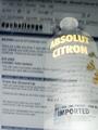
For those of you who asked, yes, black vodka really does exist, and it's very nice too! :o)
US site - www.blackvodka.com
UK site - www.blavod.com
They use a herb to stain it a very dark green, nearly black, and it makes the vodka just a tiny bit smoother :o) Enough of the plug, back to the photo! The shot was light by sunlight alone, but I was playing about with aperture & shutter settings, so ended up with a very blue shot. I got most of it black by readjusting the levels, but couldn't get it as dark as I had hoped, hence its a bit over exposed looking. The focus was a pain, as I wasn't able to get the depth I wanted, so I went with the focus on the 'pure black vodka', since that's what I was trying to sell.
Final thing - the reason this doesn't show any more of the bottle or its enjoyment was that I was trying to sell the name, ie create brand awareness, rather than the physical product.
Thanks for all your comments! |
|
Comments Made During the Challenge  |
|
|
05/12/2002 10:41:00 PM |
| Did you try rotating -pi/2? I suppose you wanted the name to be readable. In that case, better focus would have helped. Good job, though. |
|
|
|
05/12/2002 10:37:00 PM |
| Wish the lettering towards the bottom of the bottle was sharper. |
|
|
|
05/12/2002 12:17:00 AM |
| I've always had a problem reading the red-on-black motif. Maybe more contrast would help here. |
|
|
|
05/11/2002 12:29:00 PM |
| Interesting perspective. I little too bright around the edges, I think |
|
|
|
05/11/2002 10:16:00 AM |
| Nice photo. My personal preference would be to see the whole bottle but that's because I'm not familiar with this brand and I think it would help others like me to identify the product. Otherwise, this is nicely presented. |
|
|
|
05/11/2002 07:22:00 AM |
| nice clean shot. where did the blue come from? |
|
|
|
05/10/2002 05:47:00 PM |
| If the black was a bit more saturated, I think this would have been a great shot. |
|
|
|
05/10/2002 01:54:00 AM |
| hard to focus on that. interesting perspective. |
|
|
|
05/09/2002 03:49:00 PM |
| cool idea but words loose crispyness and takes away from photo back light is too stong. |
|
|
|
05/09/2002 01:33:00 PM |
| Stylish. I could see this being used as an ad. Nicely done. |
|
|
|
05/09/2002 04:05:00 AM |
| Just so fine, but you know that. Might have been more effective cropped top, bottom and left to remove the lighting glare and airspace in the bottle - would have tightened everything up a bit for better or worse, but them's pretty small pomme de terre. Congratulations! |
|
|
|
05/08/2002 03:38:00 PM |
| I like it a lot. It would make a great ad. Great lighting. I give it a ten. |
|
|
|
05/08/2002 07:53:00 AM |
| i think looking up rather than down would have worked better. also i dont think the over exposure really works. it doesnt bring out the 'blackness'. |
|
|
|
05/07/2002 11:57:00 PM |
| latest russian space rocket ?:) interesting perspective |
|
|
|
05/07/2002 11:38:00 PM |
| I love the unusual angle and the lighting. |
|
|
|
05/07/2002 10:17:00 PM |
| Great perspective here. Very unique. |
|
|
|
05/07/2002 04:45:00 PM |
| I find the reflection on the top of the bottle a little distracting apart from that a good product shot. |
|
|
|
05/06/2002 10:52:00 PM |
| photo seems a little hazy |
|
|
|
05/06/2002 06:51:00 PM |
| interesting shot, but it wouldn't make me want to buy. |
|
|
|
05/06/2002 05:54:00 PM |
| Wow, never knew there was such a thing as Black Vodka. Did you bring enough for the whole class?? Very nice shot. |
|
|
|
05/06/2002 04:49:00 PM |
| Like the angle, but the brightness is distracting. Seems too faded to me. |
|
|
|
05/06/2002 03:08:00 PM |
| nice ad shot, good angle. Like the depth of field effect. |
|
|
|
05/06/2002 02:16:00 PM |
| The concept and angle on this photo is really nice. The lighting is just a little bright and the focus on the bottle logo deteriorates significantly towards the bottom of the bottle. I'm not sure what camera is in use here, but there is possibly a better exposure setting for this shot. I would try it with a smaller aperture and a longer shutter speed... I would also attempt to make the lighting a little less obtrusive. Nice job! |
|
 Photographer found comment helpful. Photographer found comment helpful. |
|
|
05/06/2002 01:33:00 PM |
| great lighting and perspective. |
|
|
|
05/06/2002 01:18:00 PM |
| i like how the white letters leap out...i'm curious because i've no clue, is there really a black vodka and does it have a 'flavor'? |
|
|
|
05/06/2002 12:50:00 PM |
|
|
|
05/06/2002 12:37:00 PM |
Nice comp, good color, interesting.
Good job here. |
|
|
|
05/06/2002 11:55:00 AM |
Interesting angle! Good photo. (not specific to you, but how do you show "enjoyment" of alcohol {product you are selling} in this ad?)
Photo 9 Advert 7 total 8 |
|
|
|
05/06/2002 07:17:00 AM |
| Impressive focal point. You've focused on exactly what the subject is. I think rotating it 90cw would make it even better. |
|
|
|
05/06/2002 05:16:00 AM |
| This would work better as a ad if it were not blur. I love the background and even the angle. Just needs to be more in focus. |
|
|
|
05/06/2002 04:38:00 AM |
| Nice photo, but maybe a little too much glare. |
|
Home -
Challenges -
Community -
League -
Photos -
Cameras -
Lenses -
Learn -
Help -
Terms of Use -
Privacy -
Top ^
DPChallenge, and website content and design, Copyright © 2001-2025 Challenging Technologies, LLC.
All digital photo copyrights belong to the photographers and may not be used without permission.
Current Server Time: 03/13/2025 02:09:19 AM EDT.