| Author | Thread |
|
|
03/25/2003 10:21:37 PM |
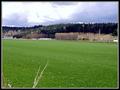
Hi - you asked for some critiqing of your photo's... Unfortunately the first thing that grabbed my attention is the border. It's perhaps a little too bright, and maybe a fine black line between it and the image would help.
There is a lot of noise in the background. I suspect you didn't really have enough light for this. You could try noise reduction in photoshop, or similar, but I would aim for more light if possible. I've used very bright lights and held lace up around the object to create a soft even light cheaply. |
|
Comments Made During the Challenge  |
|
|
03/19/2003 09:37:17 AM |
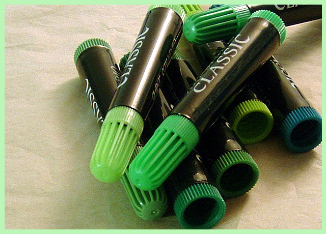
| Are those markers or makeup? Maybe removing the top off of one of them would help. |
|
 Photographer found comment helpful. Photographer found comment helpful. |
|
|
03/18/2003 11:39:49 AM |
|
|
|
03/18/2003 10:51:18 AM |
Hmm. Lots of choices of green here, aren\'t there? I don\'t think I would have used a green border around me either.
Composition is nice and simple
Idea is nice and original,
Fits the Challenge
Lighting looks good, but there is one highlited area on the top \"classic\"
Focus looks okay
Colours are fine, but why the blue one?
And I like your use of the 3rds. |
|
| Photographer found comment helpful. |
|
|
03/18/2003 10:37:07 AM |
| Pretty good lighting, just a little shadowy in the lower right area. Composition feels a little awkward for me. The pens are all clumped up there with the one in the upper right leading the eye right out of the photo. Definitely would have like to have seen the black edge of your border be wider to balance all the black in the shot. |
|
| Photographer found comment helpful. |
Home -
Challenges -
Community -
League -
Photos -
Cameras -
Lenses -
Learn -
Help -
Terms of Use -
Privacy -
Top ^
DPChallenge, and website content and design, Copyright © 2001-2025 Challenging Technologies, LLC.
All digital photo copyrights belong to the photographers and may not be used without permission.
Current Server Time: 03/14/2025 06:01:25 AM EDT.