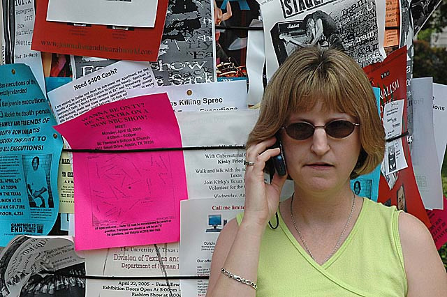
There's a quirky affability to this image that I like very much. The overall composition is eefective, viz placement of the subject down and right and the crowd of messages surrounding and compressing her. The facial expression is downright amusing and endearing. The overall sense of being lost & confused in the midst of a sea of messages and communication comes across clearly. Although others have commented negatively on the shades, I disagree; they fit the gestalt of the image perfectly for me with their overtone of anonymity.
So why didn't this techincally competent (sharp, well-exposed, well-composed) image score better? Personal vagaries of the voters aside (and those are hard to factor in, except to say it's not a WOW type of shot no matter how you slice it up, it's more of a subtle, endearing shot) I have these observations:
1. The tonalities of her flesh are somewhat too dull, too cyan maybe, it's a little offputting in a subtle way.
2. The background messages are crisper and sharper appearing than the subject herself (because they ARE crisper and sharper, more saturated colors and hard edges do that), so the BG is actively competing with the subject for our attention.
3. The DARKEST part of this image, perversely enough, is the part we should be drawn to; the subject's face. Her arm and shoulder stand out more than her face does.
How can you deal with this? In basic editing, it's hard to do. Since this was an advanced editing challenge, here's a possible approach;
Make a careful selection of the subject herself in whatever manner works best for you, via masking, lasso, magic wand+lasso, whatever. This will take some time. Feather the selection to maybe 6 pixels and save it.
Invert the selection and go to work on the background with a combination (each on a separate adjustment layer) of hue/saturation, selective color, and levels to mute it down somewhat. With the selection still loaded, create a duplicate layer from background, name it "blur", and apply slight gaussian blur to pull some of the sharpness out of the background. Then go back to the levels adjustment layer and tweak that so the end result is good for you.
Now go to make the "bur" layer the active layer and make a copy of that. name it "subject". Load the original selection of subject only onto this layer and use dodge and burn at a very low percentage to bring the face up a tad and take the shoulders/arms down a tad. Then make a levels adjustment layer to bring a little visual "pop" into the subject, taking care that the hotspot on the nose doesn't go grotesque on you. If necessary, use a little healing brush to bring some borrowed tonality to that hot spot. Finally, make adjustment layers for selective color and, possibly, hue/saturation to warm up her flesh tones and bring her to life.
When allt his looks good, save it with layers intact, flatten image, resize, and save as jpg. Be sure you're working in sRGB color space (image/mode menu to assign color profile).
Hope this helps. I'm assuming you have photoshop. If you don't, put it on your wish list :-)
I guess I went with the crowd on this, I voted 5. Like some of your other commentors, I felt it left me rather flat, although I enjoyed what I felt you were trying to say.
I like your composition, and I guess the busy background is a part of the message. I do think that a way is needed to focus attention the subject. The light is also very diffuse, so the image lacks depth. There are two things possible in post that IMO improve it:
- Quick mask to decrease BG exposure and increase subject exposure
- Increased contrast & tweaked curves to warm it a bit and give it some depth
Although the messages crowding the background are an integral part of the photo's composition, they could be de-emphasized a little without detracting. I'm wondering how shooting this at a wide aperture, say f/2.8, to just barely throw the BG out of perfectly sharp focus would have done to increase the focus on the subject?
You probably wanted to get a message across with this composition but it's not really clear..the notice board? The lady on the phone? Has a snapshot feeling about it and I always think when photgraphing people you should see there eyes...
The complicated background takes our focus off of your subject. Also the lighting on her seems very flat and lifeless. If you had taken her and put her in a more interesting lighting environment and maybe made sure the background wasnt so distracting it would have been much better. Perhaps this was a candid though and you couldnt control these elements.