| Author | Thread |
Comments Made During the Challenge  |
|
|
05/26/2002 11:53:00 PM |
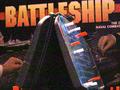
| The red tint gives the impression of being on a boat/sub when all of the red warning lights are going off. If that was intentional -- good job, if not, well . .. |
|
|
|
05/26/2002 02:24:00 AM |
| Macro, IMO, ought to be sharper than this. The center of the board rather than a corner might have been more effective, as well. Why red? |
|
|
|
05/26/2002 01:04:00 AM |
| The red just doesn't work for me and it looks blurry. |
|
|
|
05/25/2002 08:17:00 PM |
| Did you mean for this to be all red? |
|
|
|
05/25/2002 10:55:00 AM |
I can see where you are going with the red lighting effect but its very hard to use red lighting in a home environment and get the drama you see on TV. The all red lighting you see on many movies is actually supplemtned VERY heavy with white light and highlighted with red.
Good way to get red light real well is with flashlights. Get 2, use one with a white bulb and one with a red bulb or red plastic over the lense and play with the various angles. This is light cheap stage lighitng. |
|
|
|
05/25/2002 12:38:00 AM |
| I like the red saturation, feels like I'm in the Sub. |
|
|
|
05/24/2002 10:34:00 PM |
| I like the red in the image to kinad give that red alert feel on a battle bridge, wish the shot was a little better focused and not quite so grainy. |
|
|
|
05/24/2002 06:36:00 AM |
| Intresting , but fuzzy image |
|
|
|
05/23/2002 09:26:00 PM |
| This would have been better with natural colors |
|
|
|
05/23/2002 06:49:00 PM |
|
|
|
05/23/2002 12:05:00 PM |
| (It's an aircraft carrier) |
|
|
|
05/23/2002 08:33:00 AM |
| i didnt like this photo... maybe it's just too red for my taste. also, it seems to be out of focus and the framing could be better. |
|
|
|
05/23/2002 05:30:00 AM |
| red for distress...good idea! -NBT |
|
|
|
05/22/2002 07:24:00 PM |
| Interesting photo but I don't particluarly like the red glow.. I know that this is relaying the sense of the 'sinking' ship but it just isn't grabbing me... |
|
|
|
05/22/2002 10:48:00 AM |
| Not sure the red cast really works |
|
|
|
05/21/2002 06:39:00 PM |
| I'd probably add some contrast and run the Unsharp Mask filter. OR...I might have tried to change the overall coloring to a bluish-green to make it look as though it was taken underwater. |
|
|
|
05/21/2002 12:03:00 PM |
| Is this image supposed to be very red? Either way, the red overwhelms the image. |
|
|
|
05/21/2002 11:10:00 AM |
| I like the composition of this photograph, and the use of red is very compelling. I do believe that the subject should have been in focus a little more. |
|
|
|
05/21/2002 10:35:00 AM |
| Wow, very red. Was this to give the feel of an explosion? Since this boat has been destroyed, and the one in the background at least hit, I think I would have added at least a couple of misses to the shot to add some realism. I also have to admit, I don't think the red works. This is a clever idea for a macro, and I think that alone could have carried it off -- especially if you moved one or two of the ships so all you saw around them was "water" and some misses. Finally, the focus seems a little soft -- either better focus taking the shot (preferable) or at least some sharpening during post-processing. |
|
|
|
05/20/2002 08:58:00 PM |
| this photo is pretty bad! you should have adjusted the levels before submitting. also, the red light is a little too powerful for the photo. |
|
|
|
05/20/2002 04:34:00 PM |
|
|
|
05/20/2002 01:51:00 PM |
| I'm assuming you were going for the red blurred look? IMO, it doesn't work all that well, unfortunately. |
|
|
|
05/20/2002 01:42:00 PM |
| whoa hold down that red. Just a bit too much. |
|
|
|
05/20/2002 01:23:00 PM |
| Loud game, fun idea. Composition needed some help, part of the boats stack is cut off and OOF. All in all fun shot, good idea. |
|
|
|
05/20/2002 12:28:00 PM |
| Seems out of focus on my monitor. But keep on trying and getting better. I like the red! |
|
|
|
05/20/2002 11:44:00 AM |
| sorry, don't like the coloring on this |
|
|
|
05/20/2002 06:57:00 AM |
| The red cast isn't very appealing, and I think you cropped the top too much, as the peg is cut off. |
|
|
|
05/20/2002 06:18:00 AM |
|
Home -
Challenges -
Community -
League -
Photos -
Cameras -
Lenses -
Learn -
Help -
Terms of Use -
Privacy -
Top ^
DPChallenge, and website content and design, Copyright © 2001-2025 Challenging Technologies, LLC.
All digital photo copyrights belong to the photographers and may not be used without permission.
Current Server Time: 03/12/2025 05:57:35 PM EDT.