| Author | Thread |
|
|
05/02/2005 02:58:08 PM |
| Hey Ice: very well done. Congratulations on your 12th finish with this subtle beauty. |
|
 Photographer found comment helpful. Photographer found comment helpful. |
Comments Made During the Challenge  |
|
|
05/01/2005 11:11:32 PM |
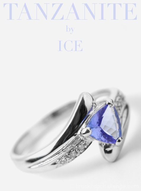
| I really like the layout of this as an ad. The two-tone color scheme is perfect. I'm sure the narrow depth of field, keyed on the stone is intentional, but I feel like having just a bit more of the ring in stronger focus would be helpful. I do agree that having the back of the ring softened is a good call for the feel of the ad. (7) |
|
| Photographer found comment helpful. |
|
|
05/01/2005 10:57:17 PM |
Eye catching thumbnail--
Great shot, wish it was a little more sharp now that I see it fullsized though.
Perfect layout, solid 8 |
|
| Photographer found comment helpful. |
|
|
05/01/2005 11:19:35 AM |
| Only comment I have is the DOF could have been a tad deeper (to encompass the whole leading edge of the ring and the stone). I really like this though. |
|
| Photographer found comment helpful. |
|
|
05/01/2005 01:19:26 AM |
| The big white highlight on the stone really bothers me, otherwise this would be really good |
|
| Photographer found comment helpful. |
|
|
04/30/2005 09:54:57 PM |
| Good lighting ... simple and elegant. |
|
| Photographer found comment helpful. |
|
|
04/30/2005 08:35:11 PM |
|
| Photographer found comment helpful. |
|
|
04/30/2005 04:08:27 PM |
Very professional looking. Good job with the typography!
I do like the shallow DOF although I think it could have used a touch more. A bit soft as well. Another issue is that the light reflected off of the stone is distracting. I would have loved to see more blue there. |
|
| Photographer found comment helpful. |
|
|
04/30/2005 03:31:50 PM |
| As an artistic rendition this is excellent because of the shallow dof leaving only a hint and then the lovely blue type and stone. It may fall short as an advertising because of lack of detail. The composition is great. Bumping up. |
|
| Photographer found comment helpful. |
|
|
04/30/2005 01:42:28 PM |
| Lettering is too light, and the photo of the ring is too soft. Great layout though and I like the lighting with the slight shadow under the right side of the ring. It give the image more depth. 5 |
|
| Photographer found comment helpful. |
|
|
04/30/2005 12:41:12 PM |
| Like the dof, and how the stone and text color play off each other. The hint of a shadow is a small distraction, imho. nice ad. 8 |
|
| Photographer found comment helpful. |
|
|
04/30/2005 07:59:20 AM |
| great piece and nice use white background. |
|
| Photographer found comment helpful. |
|
|
04/30/2005 12:06:03 AM |
| Lovely Lovely image! I like the colors and the white background. Would have liked more dof but I still like it a lot. Good luck. 9 |
|
| Photographer found comment helpful. |
|
|
04/29/2005 10:45:27 PM |
| Great layout. Could use more clarity on the ring so it pops out. 7 |
|
| Photographer found comment helpful. |
|
|
04/29/2005 10:07:20 PM |
| The graphic and look of the add are quite good. Like the placement of the ring in the frame for an ad. Think the ring image itself it good compositionally, but I would have liked to have seen more of it in focus. Good job handling the lighting, no blowouts and you minimized the reflections. |
|
| Photographer found comment helpful. |
|
|
04/29/2005 07:36:28 PM |
| Now this is a Jewellery shot awesome DOF and lovely white BG, I can almost picture this in the next major Jewellery TV Commercial. Excellent job no suggestions though sorry !!! |
|
| Photographer found comment helpful. |
|
|
04/29/2005 01:58:21 PM |
| Very Professional Looking |
|
| Photographer found comment helpful. |
|
|
04/29/2005 11:15:43 AM |
| Classy composition and colors. Great layout. |
|
| Photographer found comment helpful. |
|
|
04/29/2005 10:00:58 AM |
| Wonderfully professional. Great depth of field. Nice color choice for the font - mirrors the stone and doesn't distract the eye. This should do well. |
|
| Photographer found comment helpful. |
|
|
04/29/2005 07:01:22 AM |
| impressive. I like everything about this image. The color saturation is good in the stone and I like the dof used. 10 |
|
| Photographer found comment helpful. |
|
|
04/29/2005 06:54:50 AM |
| great pic, being picky I think there is room for just a little more dof, but I might be wrong - should do well :) |
|
| Photographer found comment helpful. |
|
|
04/29/2005 04:43:28 AM |
|
| Photographer found comment helpful. |
|
|
04/29/2005 01:22:24 AM |
| I think that the color of the stone will be the color of your ribbon. Great job! |
|
| Photographer found comment helpful. |
|
|
04/28/2005 05:02:15 PM |
| This is very professional looking.9 |
|
| Photographer found comment helpful. |
|
|
04/28/2005 01:49:41 PM |
| Im looking at an advertisment! well done. 9 |
|
| Photographer found comment helpful. |
|
|
04/28/2005 01:04:49 PM |
| Good composition and overall lighting. Rotation of the ring makes the picture moer interesting I think. Too shallow DOF however, especially on the front of the ring; would have be nice to see all diamonds in sharp focus. From what I can tell, there seems to have a strong reflection of something white in the main stone. Text is subtle, well done. |
|
| Photographer found comment helpful. |
|
|
04/28/2005 11:09:02 AM |
| Great shot... Looks like it is right out of a magazine ad. I think you'll place in the top three. |
|
| Photographer found comment helpful. |
|
|
04/28/2005 11:02:13 AM |
| I really love this. Perhaps your depth of field is slightly too restrictive, but it's a great idea. Nice composition, too, and good use of lettering. 8 |
|
| Photographer found comment helpful. |
|
|
04/28/2005 10:03:04 AM |
| At first glance I really like this. Nice color matching with the text and the ring stone. Composition is good as is the focus. Only negative is the reflection on the ringband - makes me want to know what it is. Doesn't look natural. Edge of the table maybe...? Overall, very nice. Good luck. |
|
| Photographer found comment helpful. |
|
|
04/28/2005 07:42:51 AM |
Very effective approach to the subject...the shallow DOF giving the stone more prominance.
The text will be seen as a welcome addition by some and a hindrance by others depending on taste...but it works for me. |
|
| Photographer found comment helpful. |
|
|
04/27/2005 10:04:44 PM |
| I like the lighting. Better focus or deeper DOF would help this greatly. |
|
| Photographer found comment helpful. |
|
|
04/27/2005 05:09:22 PM |
| this really looks like a poster. I love the use of white... wish a slightly larger dof was used on the ring bcos some part of the blue gem are blurry. 8 |
|
| Photographer found comment helpful. |
|
|
04/27/2005 02:33:11 PM |
| Very nice imge but I'm not too sure about the dof. I guess that if your gonna spend big bucks on something that you'll wanna see the whole thing |
|
| Photographer found comment helpful. |
|
|
04/26/2005 07:39:44 PM |
| Nice comp and lighting. Good job with the reflections too. I think the font style and color complient the ring nicely. I predict a top 10 finish for this one. Well done. |
|
| Photographer found comment helpful. |
|
|
04/26/2005 06:58:21 PM |
| This is an excellent image which focuses the viewer's attention where it should be . . . on the stone. Excellent job! |
|
| Photographer found comment helpful. |
|
|
04/26/2005 06:55:20 PM |
| Nice layout and comp. It needs a different DOF that accentuates the whole ring. Font needs to be in contrast with background to stand out more. Minor revisions that would bring a smile to most ad people. Nice job. |
|
| Photographer found comment helpful. |
|
|
04/26/2005 01:34:45 PM |
| I like the compositiong quite a bit. I even like the shallow DOF. I would only wish the focus were shifted more to the stone than the setting. |
|
| Photographer found comment helpful. |
|
|
04/26/2005 12:57:34 PM |
| really a good shot. I would have liked st see more of that beautiful color on the stone and a little less of the highlights. |
|
| Photographer found comment helpful. |
|
|
04/26/2005 12:41:51 PM |
| I do not like the lighting on the rings. Too light. |
|
| Photographer found comment helpful. |
|
|
04/26/2005 12:26:34 PM |
| Oh yeah. . . .this really looks like a professional magazine ad. You did GOOD! |
|
| Photographer found comment helpful. |
|
|
04/25/2005 10:44:11 PM |
| Superb lighting mastery. Composition is very good. Text is very nice and brings lots of synergy to the shot. Masterful. One thing i don't like is the big reflection on the jewel. Its very subjective, but its a bit too big for me. Either way, i suspect this is gonna make it first place. 9 |
|
| Photographer found comment helpful. |
|
|
04/25/2005 10:39:53 PM |
| great photo. nice and sharp the soft lighting is very nice. the only distracting thing is the white triangle on the jewel not sure what is it. GL. |
|
| Photographer found comment helpful. |
|
|
04/25/2005 09:49:34 PM |
| Nice. Looks like a magazine sales ad. |
|
| Photographer found comment helpful. |
|
|
04/25/2005 09:16:39 PM |
| very nice shot. I would have went with a darker text. It gets lost in the background The color of the jewel would have been nice IMHO. |
|
| Photographer found comment helpful. |
|
|
04/25/2005 06:29:58 PM |
| Beautifully photographed. I find it very interesting. |
|
| Photographer found comment helpful. |
|
|
04/25/2005 05:09:35 PM |
| 10 made my top three..easy win!! Beautiful shooting. |
|
| Photographer found comment helpful. |
|
|
04/25/2005 04:59:16 PM |
| Love this photo! It is simple and clear, nice |
|
| Photographer found comment helpful. |
|
|
04/25/2005 04:42:46 PM |
| Wow! What a fantastic entry. Love the DOF. Excellent lettering as well. My top three for the challenge. |
|
| Photographer found comment helpful. |
|
|
04/25/2005 01:49:19 PM |
| Very nice ring, but a little too out of focus IMO .... I like the way it's tilted, very powerful ! |
|
| Photographer found comment helpful. |
|
|
04/25/2005 11:02:22 AM |
| Nice DOF Lovely colors and simple white background. Not sure about the text but what do I know. I gave it an 8. |
|
| Photographer found comment helpful. |
|
|
04/25/2005 10:35:41 AM |
| pretty good. the light on the stone flattens it, there's not much sparkle |
|
| Photographer found comment helpful. |
|
|
04/25/2005 10:13:25 AM |
| Beautiful picture but I don't see what it is that you are advertizing so I am not tempted to buy it:-( |
|
| Photographer found comment helpful. |
|
|
04/25/2005 10:10:59 AM |
| The colors are so pretty in this picture...the text color, size, and font used are just right. |
|
| Photographer found comment helpful. |
|
|
04/25/2005 08:59:33 AM |
|
| Photographer found comment helpful. |
|
|
04/25/2005 08:28:22 AM |
| almost perfect -- black reflection detracts from the great composition and perfect tie in colors of the text and stone. |
|
| Photographer found comment helpful. |
|
|
04/25/2005 07:11:04 AM |
| V Nice image - i need a macro lens... ! Great detail on stone. Very typical of adverts I have seen. Lettering works. |
|
| Photographer found comment helpful. |
|
|
04/25/2005 02:25:37 AM |
| Great image, the lighting is perfect. |
|
| Photographer found comment helpful. |
|
|
04/25/2005 02:15:44 AM |
Shots like this remind of the reason I should NOT have entered this challenge.
Well lit and composed. |
|
| Photographer found comment helpful. |
|
|
04/25/2005 02:02:12 AM |
| Superb choice of lettering and font color. Nice DOF. Good shot pal. Classy! |
|
| Photographer found comment helpful. |
|
|
04/25/2005 02:00:40 AM |
| Very nice. Very elegant. Could maybe be a little sharper? I dunno. Still a top pick for me. |
|
| Photographer found comment helpful. |
|
|
04/25/2005 01:27:26 AM |
| Very nice work love the colors. |
|
| Photographer found comment helpful. |
|
|
04/25/2005 01:14:30 AM |
|
| Photographer found comment helpful. |
|
|
04/25/2005 12:41:57 AM |
| font color...i understand subtle intent?but think shade darker? gl... 7 |
|
| Photographer found comment helpful. |