| Author | Thread |
Comments Made During the Challenge  |
|
|
05/01/2005 10:34:23 PM |
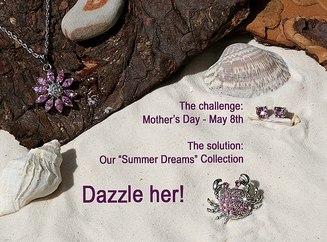
| I like the arrangement, good lighting |
|
 Photographer found comment helpful. Photographer found comment helpful. |
|
|
05/01/2005 07:25:42 PM |
| A tad too busy to rivet a passing eye but the concept remains nice. Bumoing up. |
|
| Photographer found comment helpful. |
|
|
05/01/2005 03:16:06 PM |
|
| Photographer found comment helpful. |
|
|
05/01/2005 12:41:47 PM |
|
| Photographer found comment helpful. |
|
|
04/30/2005 01:24:49 PM |
| I think the jewelry should have been central in the image and not the wording for the ad |
|
| Photographer found comment helpful. |
|
|
04/30/2005 09:28:28 AM |
| The subjects get lost in the background, they are too small in the image |
|
| Photographer found comment helpful. |
|
|
04/30/2005 03:28:39 AM |
|
| Photographer found comment helpful. |
|
|
04/29/2005 11:23:56 PM |
| I like the concept, but it would have been nicer were the jewels closer together. It took a minute for my eyes to focus on the jewelry, they kept straying to the shells. |
|
| Photographer found comment helpful. |
|
|
04/29/2005 03:50:34 PM |
| I like the contrast and arrangement of this photo. Nice crisp image! |
|
| Photographer found comment helpful. |
|
|
04/29/2005 01:54:35 PM |
|
| Photographer found comment helpful. |
|
|
04/29/2005 06:54:57 AM |
| Very nicely done. makes me what to go out and buy the crab there. Very nice! 10 |
|
| Photographer found comment helpful. |
|
|
04/28/2005 09:26:46 PM |
Challenge: 6
Technical: 6
Interest: 5
Overall: 6
There is just too much going on here. It's a nice idea, but the background items are a bit overpowering. |
|
| Photographer found comment helpful. |
|
|
04/28/2005 04:21:50 PM |
| good idea. Plenty of thought. 8 |
|
| Photographer found comment helpful. |
|
|
04/28/2005 03:00:46 PM |
| Very nice. Great composition and nice lighting. |
|
| Photographer found comment helpful. |
|
|
04/28/2005 02:33:31 PM |
| I like the layout and idea here. Given the light tones of the jewelry, though, I think a darker background, like the tone color behind the necklace, would be more effective. 7 |
|
| Photographer found comment helpful. |
|
|
04/28/2005 10:55:19 AM |
| Nice concept, but too much thing going on in this picture. I had to look for the jewelry. |
|
| Photographer found comment helpful. |
|
|
04/27/2005 05:07:56 PM |
| no focal point in the photo. |
|
|
|
04/27/2005 03:22:12 PM |
| Too late it`s on the 6th March here in the UK ;) |
|
|
|
04/26/2005 07:09:44 PM |
| the starbust is a nice touch, good job. |
|
| Photographer found comment helpful. |
|
|
04/26/2005 05:49:31 PM |
| great colors and very crisp. great tag lines but the comp is lacking. My eyes have to work to take in the ad. Remember " Less is more" |
|
| Photographer found comment helpful. |
|
|
04/26/2005 03:43:29 AM |
nice display and well thought out well done
Lucky Mum! |
|
| Photographer found comment helpful. |
|
|
04/25/2005 05:59:32 PM |
| To me it seems the picture was taken to frame the text, i think this may have worked better without the generic looking text. |
|
| Photographer found comment helpful. |
|
|
04/25/2005 05:20:48 PM |
A little bit "busy" in the composition overall in my opinion.
A different font and perhaps something less in the way of text like:
"Dazzle her this Mother's Day with our Summer Dreams Collection" may have faired better.
|
|
| Photographer found comment helpful. |
|
|
04/25/2005 03:29:35 PM |
| Interesting lay out.good job. |
|
| Photographer found comment helpful. |
|
|
04/25/2005 11:00:09 AM |
| So far this is one of the best. The composition, clarity, concept and lighting are good. The only thing I can see that bothers me is the cut off stone by the necklace. It seems like it should have been either in or out of the picture. Just as a fyi. When you work with sand, take a paintbrush to feather around where you worked. |
|
| Photographer found comment helpful. |
|
|
04/25/2005 10:10:23 AM |
Composition: excellent - well balanced
Lighting: the flares on the necklace and crab to my eye seem to be off slightly from where they micht be actually
Color: very good, would like to see better definition between the silver and pink
Clarity: very good - as jewelry is a lot different texture than the natural elements, it looks slightly out of focus.
Lettering: average - I would have liked to see a different font used
|
|
| Photographer found comment helpful. |
|
|
04/25/2005 04:31:59 AM |
| Nice layout. I think it would possibly work better with the jewels taking up twice the space they are at present. Would make a great advert. 7 |
|
| Photographer found comment helpful. |
|
|
04/25/2005 03:57:21 AM |
|
| Photographer found comment helpful. |
|
|
04/25/2005 02:15:53 AM |
| I'll give you points for originality, that's for sure! Too bad there is so much text... distracting. Lighting could use a facelift too. Composition is nice. |
|
| Photographer found comment helpful. |
|
|
04/25/2005 02:04:36 AM |
| Amazingly creative. Wonderful set up, the clarity and detail in your stones are phenominal! Looks like a winner to me!! 10 |
|
| Photographer found comment helpful. |
|
|
04/25/2005 01:04:39 AM |
|
| Photographer found comment helpful. |
|
|
04/25/2005 12:40:34 AM |
| I would've enjoyed this shot more without the text. Good shot! |
|
| Photographer found comment helpful. |
|
|
04/25/2005 12:22:35 AM |
| don't care for the color scheme...I think it would have been more effective with just the jewels and the sand and shells...5 |
|
| Photographer found comment helpful. |
|
|
04/25/2005 12:19:06 AM |
| Nice compostition here. I like this idea. Very nicely done. |
|
| Photographer found comment helpful. |
Home -
Challenges -
Community -
League -
Photos -
Cameras -
Lenses -
Learn -
Help -
Terms of Use -
Privacy -
Top ^
DPChallenge, and website content and design, Copyright © 2001-2025 Challenging Technologies, LLC.
All digital photo copyrights belong to the photographers and may not be used without permission.
Current Server Time: 03/13/2025 11:07:59 PM EDT.