| Author | Thread |
|
|
05/05/2005 12:11:05 PM |
*Critique Club*
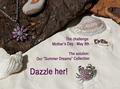
Seems just a tad dark. I read your comments in the forums, so I know that you are fully aware of that, and what caused it, so I wont elaborate on that.
Focus is great. I like the little stars. (and they were added legally too. lol)
The background is nice. I like the use of roses as a background. Makes the photo seem soft and feminine, which is good for an ad that needs to appeal to women.
You did a very nice job of avoiding reflections in the smooth part of the heart. There is one reflection though from the petals on the inside of the heart near the upper point. It's a dark reflection compared to the rest of the photo and since it's the only reflection on the heart, it stands out to me.
I like the angle and crop. I think that was very nicely selected and works very well. The writing is simple and to the point.
The only real issue I see is the darkness, so I think you did an excellent job. Congrats on the finish.
~Heather~ |
|
 Photographer found comment helpful. Photographer found comment helpful. |
Comments Made During the Challenge  |
|
|
05/01/2005 10:43:29 PM |
Very nicely composed and layed out image.
Soft & subtle choice of background works well here, and the detail on the jewelry is very nice. Text / font used works well. (7) |
|
| Photographer found comment helpful. |
|
|
05/01/2005 07:50:46 PM |
| Very good caoture and great soft pastel flower petal background. Bumping up. |
|
| Photographer found comment helpful. |
|
|
05/01/2005 06:01:23 PM |
| Great star effect and color! |
|
| Photographer found comment helpful. |
|
|
05/01/2005 12:43:30 PM |
| Nice set-up, but too dark for me, Especially for he price. I want something that shines. |
|
| Photographer found comment helpful. |
|
|
05/01/2005 01:13:50 AM |
| Good photo, seems a bit to dark. almost as if there is a shadow over your shot. love the refracting light off the diamons. GL |
|
| Photographer found comment helpful. |
|
|
04/30/2005 08:24:16 PM |
| Nice thought it needed to be a bit brighter |
|
| Photographer found comment helpful. |
|
|
04/30/2005 09:22:31 AM |
| dark and needa more contrast to bring out subject |
|
| Photographer found comment helpful. |
|
|
04/29/2005 01:31:22 PM |
| Sharp I like the star filter effect |
|
| Photographer found comment helpful. |
|
|
04/29/2005 06:38:33 AM |
| good sparkles, need to be a bit brighter and more vibrant though |
|
| Photographer found comment helpful. |
|
|
04/29/2005 04:46:38 AM |
| love colours, sparkle, remove yellow |
|
| Photographer found comment helpful. |
|
|
04/28/2005 01:44:00 PM |
| like the starbursts. well done. |
|
| Photographer found comment helpful. |
|
|
04/27/2005 09:47:05 PM |
| Nice shimmer on the diamonds. Color balance feels a bit off. May be what you were striving for. A bit blue / purple to me. |
|
| Photographer found comment helpful. |
|
|
04/27/2005 10:31:29 AM |
|
| Photographer found comment helpful. |
|
|
04/26/2005 10:27:16 PM |
| It's the title that makes my cursor slide more to the right- if you know what I mean. |
|
| Photographer found comment helpful. |
|
|
04/26/2005 03:00:47 PM |
| Very nice. first one to sparkle~ |
|
| Photographer found comment helpful. |
|
|
04/26/2005 02:38:20 PM |
| There seems to be a filter that takes away some needed contrast. Nice comp and title. Although it seems like less than one ct. |
|
| Photographer found comment helpful. |
|
|
04/26/2005 01:41:32 PM |
| Nice composition. I like the sparkle on the diamonds. |
|
| Photographer found comment helpful. |
|
|
04/26/2005 12:28:47 PM |
|
| Photographer found comment helpful. |
|
|
04/25/2005 11:18:05 PM |
| I love the sparkles on the diomands and having the neclace on the rose petals adds a touch of softness, nicely done! |
|
| Photographer found comment helpful. |
|
|
04/25/2005 04:28:11 PM |
| Looks like a ad to me. Well done. |
|
| Photographer found comment helpful. |
|
|
04/25/2005 03:09:06 PM |
| Funny title, but you can't wear the lens. |
|
| Photographer found comment helpful. |
|
|
04/25/2005 12:47:28 PM |
| The softness is nice in this image. |
|
| Photographer found comment helpful. |
|
|
04/25/2005 09:44:33 AM |
| The overall image tone seems to be a little blue...very nice "sparkle" in the stones. The text is a little strange, mainly because of the stated price...seems a little exaggerated. |
|
| Photographer found comment helpful. |
|
|
04/25/2005 07:23:35 AM |
| another one of my top pics...if i was a member i would vote an easy 9 for this one...good luck! |
|
| Photographer found comment helpful. |
|
|
04/25/2005 06:26:20 AM |
| Technically, background looks a bit dull (colour-wise) and maybe dirty. Good reflections. Yellow petal end distracts. Style of image totally not in my taste. Lettering very divorced from picture - informative, not augmentative. |
|
| Photographer found comment helpful. |
|
|
04/25/2005 02:49:19 AM |
|
| Photographer found comment helpful. |
|
|
04/25/2005 02:15:40 AM |
| And which would you rather have? |
|
| Photographer found comment helpful. |
|
|
04/25/2005 02:14:16 AM |
| Very nice, but gems are not in focus. |
|
| Photographer found comment helpful. |
|
|
04/25/2005 02:06:15 AM |
| Good focus on the heart, lovely lights on the jewels. I'd love to see this with a slightly lighter b/g, really like the ?petal background but on my monitor they look a little dark. |
|
| Photographer found comment helpful. |
|
|
04/25/2005 01:54:32 AM |
|
| Photographer found comment helpful. |
|
|
04/25/2005 01:47:55 AM |
| not sure if the yellow tint on petal in center of heart doesn't detract..overall...nice :-) ...9 |
|
| Photographer found comment helpful. |
|
|
04/25/2005 01:42:20 AM |
LOL! love the title very nice image lighting could do with a boost though IMHO
Pretty image |
|
| Photographer found comment helpful. |
Home -
Challenges -
Community -
League -
Photos -
Cameras -
Lenses -
Learn -
Help -
Terms of Use -
Privacy -
Top ^
DPChallenge, and website content and design, Copyright © 2001-2025 Challenging Technologies, LLC.
All digital photo copyrights belong to the photographers and may not be used without permission.
Current Server Time: 03/13/2025 02:09:34 AM EDT.