| Author | Thread |
Comments Made During the Challenge  |
|
|
05/03/2005 07:01:37 PM |
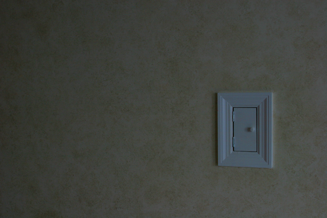
| What a fun subject. I wish the photo had more contrast. I like the gradient of light across the wall and think that more of a pop on the little door would help. |
|
 Photographer found comment helpful. Photographer found comment helpful. |
|
|
05/03/2005 03:20:08 AM |
|
| Photographer found comment helpful. |
|
|
05/02/2005 10:44:29 PM |
|
|
|
05/02/2005 06:36:50 PM |
| A little too dark or maybe its my monitor, the placement of the subject could be better for me it would be better to place it a little bit higher up og lower and a tiny bit to the left, good idea nonetheless |
|
| Photographer found comment helpful. |
|
|
05/01/2005 04:21:47 PM |
| The concept is there, but for this I think your angle needs to be dead on to create a more graphic quality to the composition. Lighting is a bit dull, you've got quite a bit of fall-off on the left--not always a poor choice, but in this case it doesn't help. |
|
| Photographer found comment helpful. |
|
|
05/01/2005 10:29:03 AM |
| cute idea, but seems a bit dark to me. |
|
| Photographer found comment helpful. |
|
|
04/30/2005 11:00:55 PM |
| lol. thats pretty freakin funny. |
|
|
|
04/30/2005 10:36:06 PM |
| This image is very dark, needs a lot of light. |
|
| Photographer found comment helpful. |
|
|
04/30/2005 08:16:13 PM |
Heh, very creative
This could benefit with a bit of light and contrast |
|
| Photographer found comment helpful. |
|
|
04/30/2005 07:42:21 PM |
| I am intriged as to what it is, nice work |
|
| Photographer found comment helpful. |
|
|
04/29/2005 10:33:44 PM |
|
|
|
04/28/2005 06:00:53 PM |
| That is quite the fall that mouse has every time he leaves! |
|
|
|
04/28/2005 05:18:48 PM |
|
| Photographer found comment helpful. |
|
|
04/28/2005 05:12:50 PM |
| poor lighting lets down a good idea. 4 |
|
| Photographer found comment helpful. |
|
|
04/28/2005 04:48:27 PM |
| This could have been very good, IMO needs better lighting |
|
| Photographer found comment helpful. |
|
|
04/28/2005 03:44:57 PM |
| Entry definately fits the challenge, wish the lighting was better. Good Luck. |
|
| Photographer found comment helpful. |
|
|
04/28/2005 10:54:58 AM |
| Looks a bit dark...but hey maybe you wanted it that way. Still I think the white balance/levels could use adjusting. Good-luck. |
|
| Photographer found comment helpful. |
|
|
04/27/2005 10:07:39 AM |
| a bit dark but fits the challenge 8 |
|
| Photographer found comment helpful. |
|
|
04/27/2005 09:24:38 AM |
| Nice variations in negative space. |
|
| Photographer found comment helpful. |
|
|
04/27/2005 07:58:06 AM |
|
|
|
04/27/2005 07:43:04 AM |
| Good idea; lightning could have been better. |
|
| Photographer found comment helpful. |
|
|
04/27/2005 06:45:14 AM |
| The lighting really lets this down |
|
| Photographer found comment helpful. |
|
|
04/27/2005 05:01:41 AM |
|
| Photographer found comment helpful. |
|
|
04/27/2005 03:34:17 AM |
| That's pretty far off the ground for a mouse, but the concept is cute and entertaining. The overall image is too dark, though (though that's better than being too bright). |
|
| Photographer found comment helpful. |
Home -
Challenges -
Community -
League -
Photos -
Cameras -
Lenses -
Learn -
Help -
Terms of Use -
Privacy -
Top ^
DPChallenge, and website content and design, Copyright © 2001-2025 Challenging Technologies, LLC.
All digital photo copyrights belong to the photographers and may not be used without permission.
Current Server Time: 03/12/2025 01:03:00 PM EDT.