| Author | Thread |
|
|
05/04/2005 02:08:51 PM |
Whoa - Tiffany?! Looks like you're high maintenance!
; ) |
|
 Photographer found comment helpful. Photographer found comment helpful. |
Comments Made During the Challenge  |
|
|
05/01/2005 07:33:26 PM |
| A very resolut composition with a direct message and good capture. Bumping up. |
|
| Photographer found comment helpful. |
|
|
05/01/2005 11:00:48 AM |
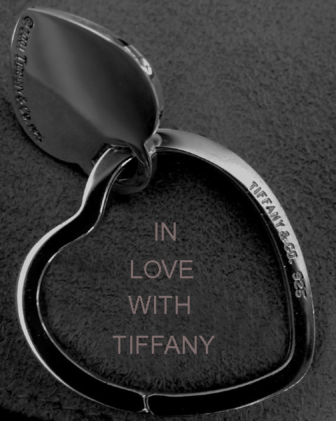
| This is a great shot but the text is distracting. Either a different choice of font or no text at all could have improved the entry. |
|
| Photographer found comment helpful. |
|
|
04/30/2005 07:47:13 PM |
| Just a tad more space at the bottom would be better 7 the crop is a little tight IMO. |
|
| Photographer found comment helpful. |
|
|
04/29/2005 01:50:07 PM |
|
| Photographer found comment helpful. |
|
|
04/29/2005 08:46:09 AM |
| I like the composition and lighting. The text works well with the ad as well. |
|
| Photographer found comment helpful. |
|
|
04/29/2005 07:10:02 AM |
| I wish the lighting had been more on the jewelery. It would be nice to really see it lit up. the clarity on the jewelery is nice. 6 |
|
| Photographer found comment helpful. |
|
|
04/28/2005 11:44:19 PM |
A decent composition and tone acheived here. Subtle, soft, filling the frame and well lit. (perhaps a little too tight of a crop, especially at the bottom)
Text/font used doesn't work well here as an advertisement. (5) |
|
| Photographer found comment helpful. |
|
|
04/28/2005 08:53:16 PM |
| Could have use a little more light. |
|
| Photographer found comment helpful. |
|
|
04/28/2005 01:45:00 PM |
| a tad dark, nice framing though. |
|
| Photographer found comment helpful. |
|
|
04/28/2005 10:02:25 AM |
| Why B/W? This is a very interesting piece of jewely, should be bright and happy...this image is coming off a bit dark to me. Text is hard to do if you're not used to it - looks like you upsized the text after inputing it, then it becomes jagged on the edges. Good luck in the challenge. |
|
| Photographer found comment helpful. |
|
|
04/28/2005 09:41:06 AM |
|
| Photographer found comment helpful. |
|
|
04/27/2005 03:16:30 PM |
| Let down slightly by the poor text. |
|
| Photographer found comment helpful. |
|
|
04/27/2005 12:33:06 PM |
| I love the shot but don't like the text font or placement. I noticed that the font matches Tiffany's but I still might have gone with something different or in script (Park Avenue font, perhaps?) 7 |
|
| Photographer found comment helpful. |
|
|
04/26/2005 05:55:31 PM |
| Great crop and Idea! Nice comp, needs more contrast to show the brilliance of the piece. I'd change the funny font with pixel problems |
|
| Photographer found comment helpful. |
|
|
04/26/2005 05:05:48 PM |
| Crop is a bit TOO tight IMHO. |
|
| Photographer found comment helpful. |
|
|
04/26/2005 03:41:57 AM |
| image is a little too dark but the overall image is good for an ad |
|
| Photographer found comment helpful. |
|
|
04/25/2005 01:55:00 PM |
| Image seems a little dark and doesn't the jewelry shine IMO |
|
| Photographer found comment helpful. |
|
|
04/25/2005 09:24:04 AM |
| Image looks a bit gray overall. |
|
| Photographer found comment helpful. |
|
|
04/25/2005 12:53:41 AM |
|
| Photographer found comment helpful. |
|
|
04/25/2005 12:36:40 AM |
| The lightings good..maybe a different background ? |
|
| Photographer found comment helpful. |
|
|
04/25/2005 12:24:53 AM |
| I don't think the text enhances this image. . .5 |
|
| Photographer found comment helpful. |
Home -
Challenges -
Community -
League -
Photos -
Cameras -
Lenses -
Learn -
Help -
Terms of Use -
Privacy -
Top ^
DPChallenge, and website content and design, Copyright © 2001-2025 Challenging Technologies, LLC.
All digital photo copyrights belong to the photographers and may not be used without permission.
Current Server Time: 03/14/2025 04:08:33 AM EDT.