| Author | Thread |
|
|
05/07/2003 11:30:15 PM |
Greetings from the Critique Club
Hi TerryGee,
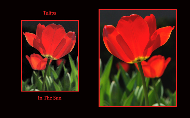
Beautiful photo, well lit and composed... nicely done. I think this would have been better as said below with a few different photos instead of just flipping one. Also the colors aren't the same for the two. To finish up the product I might have suggested the same size border around the entire thing in red. I just find the entire thing to be rather boring, and lacking any kind of a storyline... it doesn't really say much, except that you could flip the picture. Very nice colors, there's just something lacking for the entry. I also can't say that I care for the two different sizes... it just isn't attractive to my eye though I'm a very symmetrical person. The picture in itself though is very pretty, and well done.
-Talya |
|
 Photographer found comment helpful. Photographer found comment helpful. |
|
|
05/05/2003 07:41:31 AM |
I agree with the scores on this one. I think the photo i took is a good one, however I didn't have the time do do the rest of the project. This was done as a test to see if I could remember how to get more then one image on a background( I'm not good at that yet). I wound up not having anymore time, so I submitted the practice one.
All your comments are quite accurate, not enough story telling here. I did, by the way, have other tulip shots that I could have used along with this one.
Oh well, next time I will get my homework done sooner! |
|
|
|
05/05/2003 12:41:32 AM |
| Nice color, beautifully taken images. It meets the challenge, but lacks a storyline, like maybe three tulips in various stages of oppening might have. I gave this one a 6. |
|
| Photographer found comment helpful. |
Comments Made During the Challenge  |
|
|
05/04/2003 11:23:27 PM |
| I think this might have a higher visual impact on me had it been 2 seperate photos of the tulips. This is one photo, flipped. The photo is beautiful, excelent lighting and I love the black/green background on the tulips. The border fits wonderfully. Focus and clarity are good. Looks better on the right than left however. Overall nice. Good luck in the challenge. |
|
| Photographer found comment helpful. |
|
|
05/04/2003 05:24:50 PM |
| excellent work with the red... the lighting on these tulips is perfect :) |
|
| Photographer found comment helpful. |
|
|
05/04/2003 12:47:17 PM |
| Pretty but what's the story? |
|
| Photographer found comment helpful. |
|
|
05/02/2003 06:09:31 AM |
| Nice colors and lighting. I didn't really know that light would show thru tulips like this. Good DOF and perspective too. |
|
| Photographer found comment helpful. |
|
|
05/02/2003 01:20:47 AM |
| the photos are very well done, i don't understand why you sized them differently, i think the . . . . oh, they are the same photo reversed. neat idea, but still i think the final product fell short of its potential. |
|
| Photographer found comment helpful. |
|
|
04/29/2003 02:12:01 PM |
| Lovely light and tulip. I wish the second panel had something more new to say about the tulip. Lovely tones and colors, too. |
|
| Photographer found comment helpful. |
|
|
04/28/2003 06:14:23 PM |
| hey, that's the same shot flipped! Clever. Love the color/DOF and exposure of the one on the right. |
|
| Photographer found comment helpful. |
|
|
04/28/2003 10:36:51 AM |
| Good idea, beautiful colours! The heavy red margins distract. Suggestion: make the pictures the same size, write "Tulips in the Sun" across the bottom (in a light colour, not in red), use a slight red margin either around the two pictures or around the whole composition. |
|
| Photographer found comment helpful. |
|
|
04/28/2003 12:06:16 AM |
|
| Photographer found comment helpful. |
Home -
Challenges -
Community -
League -
Photos -
Cameras -
Lenses -
Learn -
Help -
Terms of Use -
Privacy -
Top ^
DPChallenge, and website content and design, Copyright © 2001-2025 Challenging Technologies, LLC.
All digital photo copyrights belong to the photographers and may not be used without permission.
Current Server Time: 03/14/2025 09:23:51 AM EDT.