| Author | Thread |
|
|
05/09/2003 10:43:02 PM |
Greetings from the Critique Club!
I concur with all of the compliments below!
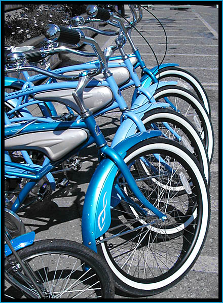
This was a memorable image from the challenge, so I'm thrilled that I have the opportunity to look at it in more detail! First and foremost arises to my eye the patterns created by the parked bikes. This obviously shows your good skill and seeing such patterns and capturing them well. The point of view is very effective at revealing the pattern without it becoming either lost or boring or trite.
I find the photo's mood to be lively and fun, though there tends to be a hint of tongue in cheek about it (and I can't explain why), and you make the bikes look fun to ride. Their quirky style, additionally, is enhanced by your point of view and composition, and makes them even more engaging and enticing.
Your explanation as to the desaturation is nice, but I don't find it all that necessary. The photo speaks for itself rather nicely. The blue is a nice color to isolate, and really makes the bikes pop. This may be where the tongue in cheek-ness lies, too. By isolating the blue color, you hint that this pattern and these bikes are unusual and possess a kind of special-ness that defies the rest of the mundane world around them.
To improve the shot, hmmm. You already mentioned the removal of the lower left bike, and some folks below noted that a tighter crop would be nice, but I'm not sure. I agree with your cropping inasmuch as the bikes really need the handle bars to be bikes. Otherwise, they would just become patterns and lines, and the fun of the photo is that these are special and unique BIKES, not isolated patterns. On the other hand, the parking lot beyond isn't all that interesting, and that is where the patterns ultimately lead the eye. Perhaps if you'd come at a later or earlier time, when shadows would help you. I'm kind of a light fanatic anyway, and can't help but think that the blue on the bikes would be that much more saturated and enhanced were the sun to be lower in the sky. However, you'd have to be careful not to sacrifice the fun mood of the photo. Wow. Complex!
Just goes to show you what a tough shot this is, and how appropriate the choices were that you made while there.
This is a really pleasing, skillfully executed image. Congratulations!
Keep up the good work!
David |
|
 Photographer found comment helpful. Photographer found comment helpful. |
|
|
05/07/2003 04:41:23 PM |
Thanks for the comments, everyone! I know that there has been a lot of discussion about the use of desaturation in photographs. It can be "gimmicky" but here I used it for a number of reasons.
1. the bike in front, which I should have moved!! (I didn't want to crop it out because of the other details I would lose with it) was RED. Yep. I had to change the hue significantly to get it to at least match the others since cropping it out would ruin the repetition of the bikes.
2. The flowers were ugly purple and got even uglier when I changed the red channel hue.
3. The pavement was boring and distracting with its faded yellow and white lines. I wanted the attention on the bikes, which is what caught my eye in the first place. I know now to move stuff out of the way to get the shot I want!
I desaturated all channels but blue and cyan which let me keep the chrome and silvers on the bikes. They pretty much look like that in real life too, but this way, I can control what my viewer is concentrating on, and that's why I desaturated. |
|
|
|
05/07/2003 11:58:37 AM |
Hey! I really liked this one. I was actually going to comment on this one during the voting, but I had too many other things on my mind this week. I didn't even get a chance to finish voting... Only got about 1/3 of the way through.
Great Photo. |
|
| Photographer found comment helpful. |
|
|
05/07/2003 12:07:48 AM |
WHOO HOO!!!!!
Congrats! :)
|
|
| Photographer found comment helpful. |
Comments Made During the Challenge  |
|
|
05/06/2003 05:48:18 PM |
| This shot has great colors and subject, but I would have given a better score if it were cropped more. Maybe less pavement at the top. That is only my opinion and opinions differ from person to person. |
|
| Photographer found comment helpful. |
|
|
05/04/2003 02:19:08 PM |
| i rated this image a very high mark, we have the same technique, but the worst thing here, my entry is in question or subject for disqualification. anyway, just wish you the best here in the challenge...i do hope you'll get a excellent average score...got my 10 vote. |
|
| Photographer found comment helpful. |
|
|
05/03/2003 11:53:41 PM |
| A tighter crop/shot would have made this a great abstract. But you caught something nice in this shot too. I like how you desaturated the colors too. good eye! |
|
| Photographer found comment helpful. |
|
|
05/02/2003 11:28:31 PM |
| I would have tried to crop the bike in the lower left. Good repetition, and blue is dp voters' favorite color. |
|
| Photographer found comment helpful. |
|
|
05/02/2003 10:33:20 AM |
| I like how you've captured the brilliant blues...good harmony in the lineup of the bicycles. |
|
| Photographer found comment helpful. |
|
|
05/02/2003 07:42:55 AM |
| Nice use of pattern here. the desaturation of red/green makes the blue stand out very nicely with the chrome of the handlebars. If you could spot edit out the bits of blue in the flowerbed and on the road, it'd look even better! |
|
| Photographer found comment helpful. |
|
|
05/01/2003 09:45:32 AM |
| nice composition and colors, good find. they look like rental bikes - something that's fun to drive for a couple of hours but you would never want to own ;-) |
|
| Photographer found comment helpful. |
|
|
05/01/2003 07:45:25 AM |
| Great picture. Nice sharp focus on the bikes and the semi-B&W looks great |
|
| Photographer found comment helpful. |
|
|
04/30/2003 11:14:39 PM |
| I like the subject(s), but I think a shot of one of them alone would be more powerful, or, if possible, repositioning them so the lowest wheel (without the white trim) would be out of the shot. Might be oversharpened too. -6- Mav |
|
| Photographer found comment helpful. |
|
|
04/30/2003 10:22:58 PM |
| love the coloring - nice image |
|
| Photographer found comment helpful. |
|
|
04/30/2003 07:27:04 PM |
| nice use of color, good composition |
|
| Photographer found comment helpful. |
|
|
04/30/2003 03:56:49 PM |
| A great shot, killed by the bike that is not following the pattern, If you had moved the last bike (bottom left) out of the shot I would have given a higher rating, as is though 7 |
|
| Photographer found comment helpful. |
|
|
04/30/2003 11:15:06 AM |
| Good shooting. Good color, dof, light. |
|
| Photographer found comment helpful. |
|
|
04/30/2003 12:57:56 AM |
| the linearity of the bikes i like |
|
| Photographer found comment helpful. |
|
|
04/30/2003 12:29:00 AM |
| Great use of blue! I'm not the biggest fan of this kind of photography (rather, photo art). Color can be used wonderfully in an all B&W shot, but there's no real purpose for the exclusion of color from the rest of the shot. |
|
| Photographer found comment helpful. |
Home -
Challenges -
Community -
League -
Photos -
Cameras -
Lenses -
Learn -
Help -
Terms of Use -
Privacy -
Top ^
DPChallenge, and website content and design, Copyright © 2001-2025 Challenging Technologies, LLC.
All digital photo copyrights belong to the photographers and may not be used without permission.
Current Server Time: 03/12/2025 10:14:12 AM EDT.