| Author | Thread |
Comments Made During the Challenge  |
|
|
06/09/2002 08:46:00 PM |
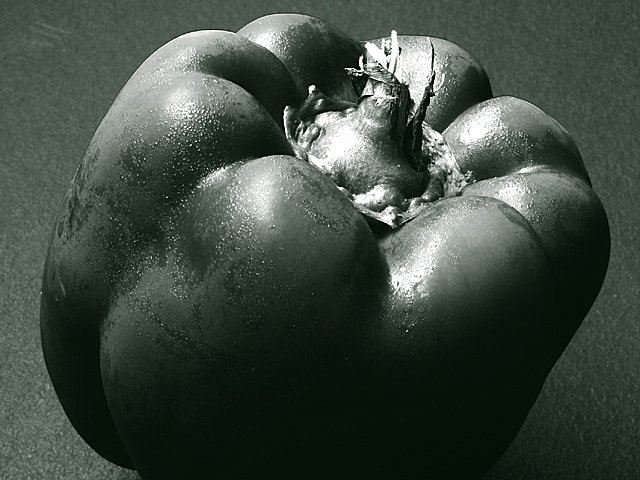
| that's a duotone, challenge was black and white |
|
|
|
06/09/2002 08:01:00 PM |
| Green? Green isn't black and white, sorry. |
|
|
|
06/09/2002 04:15:00 AM |
| IMO, the whites could be toned down just a touch - just enough to add a few more speckles of detail in the stem and the highlights at R. A non-textured bg might be better as well. Of course, this isn't really B/W, but voted as if it were. |
|
|
|
06/07/2002 08:20:00 AM |
| Nice photograph, but does not appear to be a B&W to me. |
|
|
|
06/06/2002 11:30:00 PM |
| edward weston anyone ? ; ) good moisture on the pepper. nice pic all round but doesnt really grab me. maybe a diff angle would show it to advantage |
|
|
|
06/05/2002 03:14:00 PM |
| I've heard Bret Weston speak, and seen John's gallery in Carmel, CA. Love the detail. Your picture has a sensual quality due to highlighting. I believe you are on the right track. |
|
|
|
06/04/2002 10:47:00 PM |
|
|
|
06/04/2002 10:36:00 PM |
| I don't like the fact that this pepper is clipped at the bottom but I do like the lighting and shadows that have been cast..... This isn't traditional black and white.. it seems to have a greeinish tint to it... |
|
|
|
06/04/2002 04:37:00 PM |
| good lighting and tonal ranges. maybe a lighter background though. |
|
|
|
06/04/2002 03:59:00 PM |
|
|
|
06/04/2002 01:23:00 PM |
| Not a bad shot, but unfortunately, a better one was submitted. Light background would've given more contrast and polishing/drying the pepper would've helped, too, IMO. I like how close you moved in |
|
|
|
06/04/2002 05:17:00 AM |
| This capsicum (that's what we call them in my country) has more texture than the other capsicum shot I've seen so far. The composition is a bit more interesting too. I don't really find that I like these photos though. |
|
|
|
06/04/2002 05:00:00 AM |
| nice photo but stands out next to all the other thumdnails as not being B&W. |
|
|
|
06/04/2002 03:18:00 AM |
| I wonder if you sprayed it with ethyl chloride if it would mist/frost up properly. |
|
|
|
06/03/2002 09:39:00 PM |
| would have liked to seen in color, a bit to dark |
|
|
|
06/03/2002 05:27:00 PM |
| Neat b&w. Good job. Tad over exposed on the top, but I like this very much. |
|
|
|
06/03/2002 03:37:00 PM |
| This isn't much contrast here. |
|
|
|
06/03/2002 02:29:00 PM |
|
|
|
06/03/2002 12:46:00 PM |
| Highlights blown out, too contrasty, duotone doesn't help the subject. |
|
|
|
06/03/2002 11:15:00 AM |
| Nice full tonal range and focus. The whole image is too dark for my tastes; maybe a lighter background would add some contrast. |
|
|
|
06/03/2002 07:21:00 AM |
|
|
|
06/03/2002 06:00:00 AM |
|
Home -
Challenges -
Community -
League -
Photos -
Cameras -
Lenses -
Learn -
Help -
Terms of Use -
Privacy -
Top ^
DPChallenge, and website content and design, Copyright © 2001-2025 Challenging Technologies, LLC.
All digital photo copyrights belong to the photographers and may not be used without permission.
Current Server Time: 12/14/2025 11:12:54 AM EST.