| Author | Thread |
|
|
11/18/2002 05:27:00 PM |
| this has been on my desktop ever since it got posted.. I love it! |
|
 Photographer found comment helpful. Photographer found comment helpful. |
|
|
06/15/2002 02:41:00 AM |
| Unlike some!, I have also a love for flowers, especially roses. Reason why I rated this photo as a 10. Because there is nothing else but 3 roses, I think it's actually good to center them. I also think you did an excellent job. Will have to try myself! |
|
| Photographer found comment helpful. |
Comments Made During the Challenge  |
|
|
06/09/2002 11:31:00 PM |
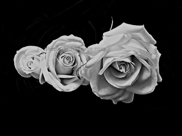
| Nice shot, great placement of the roses -- almost looks like a sketch. |
|
|
|
06/09/2002 09:07:00 PM |
| composition is quite static - maybe a diagonal would have more life ? |
|
|
|
06/09/2002 02:34:00 PM |
|
|
|
06/09/2002 01:15:00 PM |
|
|
|
06/07/2002 08:00:00 PM |
| The effect here is almost "oil painted". I trust these are "real" flowers (I will assume that) so GREAT JOB!!! Almost surreal. (It this is really just a photo of an oil painting, please reduce score by 80 %) Photo 10 Creativity 8 B&W 10 total 10 (very, very good) |
|
|
|
06/06/2002 11:31:00 PM |
| pretty masterful. you could hang this. subject matter isnt most personally exciting, but esthetically, and technically, this picture is excellent. |
|
|
|
06/06/2002 08:34:00 PM |
| I like the contrast and texture... they almost appear to be made of paper. I like the progression from bud to full bloom. They are captured in time this way, where as in color the "freshness" is assumed to soon pass. Here they are captured in a memory. I'm babbling, but I just had to tell you how it makes me feel. |
|
|
|
06/06/2002 01:33:00 PM |
| I love the detail and the stepped arrangement of the roses. |
|
|
|
06/06/2002 09:17:00 AM |
| Nice high contrast. To me it seems a little dull though... roses like this are on wallpaper, handbags, sofas.... It's very hard to look at them, arranged like this, and see something exciting. |
|
|
|
06/06/2002 08:05:00 AM |
|
|
|
06/05/2002 05:09:00 PM |
| I like the increasing/decreasing nature of the three flowers lined up. It has a very ominous, but good, impact. |
|
|
|
06/05/2002 05:00:00 PM |
| I like the sharpness/crispness of this picture, but I bet it would be awesome with a soft focus as well. I really like this one -- beautiful. 10. |
|
|
|
06/05/2002 04:04:00 PM |
|
| Photographer found comment helpful. |
|
|
06/05/2002 11:04:00 AM |
| The right rose looks great, but there's too much black in the picture. I'd like to see the flowers take up more of the frame. |
|
|
|
06/05/2002 06:51:00 AM |
| Is this really a photograph? Looks like either a photo of a drawing, or a pencil filter in post-processing. Assuming you're legit, it's very interesting. How did you get the background to underexpose so perfectly under such diffuse lighting? The centered composition is a bit static - maybe cropping up from the bottom to 427X640 would give it a little more life. |
|
|
|
06/04/2002 11:31:00 PM |
| interesting photo... the total darkness around the roses seems to be a little strange when roses are generally bright, nice, and soothing to look at... good photo! |
|
|
|
06/04/2002 11:04:00 PM |
| Love the jet black background---exellent pix. |
|
|
|
06/04/2002 10:53:00 PM |
| The title says it all STUNNING |
|
|
|
06/04/2002 08:35:00 PM |
| Yes they are. Very nice contrast. The only thing I can see that might be distracting to some is the stems in the background. I am familar with this problem mostly, because I wasn't totally successful in making my background "disappear" this week either. |
|
|
|
06/04/2002 04:59:00 PM |
| wow.. I love this. I'm also gonna say email me after the contest and tell me how you did the background so dark. I've been trying to figure that trick out. |
|
|
|
06/04/2002 08:36:00 AM |
| I'm sure you'll get "but why would you take a b&w shot of a flower" kind of comments (I am for my flower shot). I think if there's contrast and texture in the shot, b&w can work well, your photo is an example of that. I would probably not place the roses in the middle of the shot though, I'd prefer to see them in the bottom right hand side for example. Also, the rose on the left seems slightly blown out - would it have been possible to adjust the lighting for that a little? |
|
|
|
06/04/2002 12:25:00 AM |
|
|
|
06/03/2002 06:46:00 PM |
| Not really, I think B&W makes this subject rather plain. Also, seems a lot like pictures seen in the Transitions challenge. |
|
|
|
06/03/2002 04:59:00 PM |
| Neat b&w and a great job. Very painterly cool effect. |
|
|
|
06/03/2002 04:34:00 PM |
| Looks good in B&W, would like to have seen it in colour. I bet it looks spectacular |
|
|
|
06/03/2002 10:20:00 AM |
| beautiful..looks like a drawing. |
|
|
|
06/03/2002 08:06:00 AM |
|
|
|
06/03/2002 07:54:00 AM |
| COOL!! Looks like a magic trick. |
|
|
|
06/03/2002 07:45:00 AM |
I've seen too many flower photos to identify this one as original.
however, technically it's perfect. |
|
|
|
06/03/2002 05:51:00 AM |
| Great use of depth of field |
|
Home -
Challenges -
Community -
League -
Photos -
Cameras -
Lenses -
Learn -
Help -
Terms of Use -
Privacy -
Top ^
DPChallenge, and website content and design, Copyright © 2001-2025 Challenging Technologies, LLC.
All digital photo copyrights belong to the photographers and may not be used without permission.
Current Server Time: 03/12/2025 02:01:26 AM EDT.