| Author | Thread |
|
|
05/15/2003 03:12:28 PM |
| My outtakes and reasoning are here |
|
Comments Made During the Challenge  |
|
|
05/13/2003 09:43:46 PM |
|
|
|
05/13/2003 03:18:53 PM |
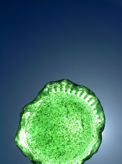
| Not sure I like the subject cut off at the bottom. Otherwise nice simple and effective. |
|
 Photographer found comment helpful. Photographer found comment helpful. |
|
|
05/12/2003 11:51:53 PM |
|
|
|
05/12/2003 08:33:57 PM |
| nice idea and very nice use of color |
|
|
|
05/11/2003 12:27:11 PM |
| Great colors and the backlighting works well. Simple, but effective. |
|
|
|
05/10/2003 10:58:01 PM |
| Love the blue background and the green in the glass, but I think may the lighting may be a bit harsh. Composition is extremely good. |
|
|
|
05/10/2003 12:53:00 PM |
| Nice background and well lit. 8 |
|
|
|
05/10/2003 02:02:25 AM |
| I feel that the lighting looks a little off, and the way that the glass suddenly stops at the end is bothersome. Good use with the blue background, but there is too much empty space at the top... also keep in mind the rule of thirds, as this is extremely centered, and not very interesting. Not much there to make this photo worthwhile. |
|
| Photographer found comment helpful. |
|
|
05/09/2003 06:12:17 PM |
| This photo reminds me of sunlight at the beach. Wonderful colors. |
|
|
|
05/09/2003 05:51:52 PM |
| Great set up. Very professional. |
|
|
|
05/09/2003 05:01:21 PM |
| Great usage of empty space and very appealing colors. I find the abrupt crop at the bottom disturbing though. Somehow, I'd like to see either the whole bottom of the botle or a much stronger crop so only half of the bottom would be visible. |
|
| Photographer found comment helpful. |
|
|
05/09/2003 04:18:56 PM |
| With your generous blue background, this makes me think of a green sun rising. I like it! |
|
|
|
05/09/2003 03:07:51 PM |
| not just an interesting piece of glass, it's an archaeological treasure. Possibly Phoenician, right? (Who says it came from the folks at 7-Up???) |
|
|
|
05/09/2003 01:51:31 PM |
| Nice idea, but something else needs to be added to the image. There isn't enough contrast or value to catch the viewers eye. |
|
| Photographer found comment helpful. |
|
|
05/09/2003 12:03:28 PM |
| Fits the theme well, but it feels overprocessed to me, with those neon grainy bits glowing out of the shot. If it were a little more subtle/realistic, I'd have graded it higher. This is a personal taste choice. :-> |
|
| Photographer found comment helpful. |
|
|
05/08/2003 10:21:24 AM |
| So much empty space at the top and yet the glass is cut off. I think I might have filled more of the frame w/ the glass. |
|
| Photographer found comment helpful. |
|
|
05/08/2003 07:24:58 AM |
| More original than most, but the base is chopped and a lot of empty space above. |
|
| Photographer found comment helpful. |
|
|
05/07/2003 03:08:44 PM |
| this is really great, creative. 10 |
|
|
|
05/07/2003 01:03:27 AM |
| your backlight is leaking out a bit, and I think I'd have chosen a different background colour (something complementary,rather than contrast-y) but I like it. 7-up you think? |
|
|
|
05/07/2003 12:18:09 AM |
| THe background here looks great, very smooth. The glass is great, I love sea worn glass. The lighting is perfect for the subject well done. |
|
Home -
Challenges -
Community -
League -
Photos -
Cameras -
Lenses -
Learn -
Help -
Terms of Use -
Privacy -
Top ^
DPChallenge, and website content and design, Copyright © 2001-2025 Challenging Technologies, LLC.
All digital photo copyrights belong to the photographers and may not be used without permission.
Current Server Time: 03/12/2025 08:54:20 AM EDT.