| Author | Thread |
|
|
05/27/2003 12:46:24 AM |
*Critique Club*
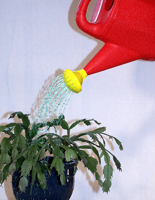
While I can see and read your explaination, I think that the red/yellow watering can is a little too brightly colored for this shot. It kind of 'steals the spotlight'. It's so much brighter than the plant that it really is a distraction for the plant.
The yellow alone might not bee SO harsh, and would still allow for your 'story' to stand true. In your explaination, I don't believe you need the red.
The lighting is not ideal here. The shadows are also a bit of a distraction in my opinion. As suggested, moving a bit away from the wall will help to reduce this shadow. Also, play with different lighting. That will helps shdows also.
The solid white background was a good choice, as there are no distracting elements in the background alone.
Focus and clarity seem ok to me. I especially like the detail in the water.
The angle and framing/cropping are OK, but maybe a little close to the plant on the left. Either crop more of the plant out, or include the entire plant. I tried a crop on the top also, and it actually doesn't look bad if you crop out ALL of the red part, and just let the yellow peek in through the top. Just my opinion though.
It's a neat idea.
~Heather~ |
|
 Photographer found comment helpful. Photographer found comment helpful. |
Comments Made During the Challenge  |
|
|
05/20/2003 11:26:01 PM |
| I actually kind of llike the shadow of the flash(?). It gives this shot a whimsical, fun feeling. |
|
|
|
05/20/2003 01:44:45 PM |
| The texture created by the water is nice. |
|
|
|
05/19/2003 04:20:40 PM |
| This has almost a snapshot feel, probably a combination of the lighting and the focus (which is either odd, or sharpened strangely in postproduction). The composition's also a little mushy - the eye isn't drawn to any one particular place, and so it wanders around to no purpose, as it were. Still, fits the theme well (nice colors). |
|
| Photographer found comment helpful. |
|
|
05/18/2003 08:42:07 PM |
| red and yellow are primary colors |
|
|
|
05/18/2003 10:58:35 AM |
| Good idea. Shadows are unappealing and the picture could have been cropped to include the whole plant and pot. A little more work would have made this an exceptional picture. |
|
| Photographer found comment helpful. |
|
|
05/15/2003 06:26:01 PM |
| I really like this idea - using the primary colors you "grow" secondary. the colors are good - I would have focused the comosition in more - just the spigot of the watering can, the water and the green leaves. Better lighting would help loose distacting shadows. Still fun work! |
|
| Photographer found comment helpful. |
|
|
05/14/2003 11:52:49 AM |
| Could have used a 'leafier' plant, this one looks a bit anemic. |
|
|
|
05/14/2003 08:12:54 AM |
| The light is too harsh. If you put your subjects more from the wall it might improve the photo. |
|
| Photographer found comment helpful. |
Home -
Challenges -
Community -
League -
Photos -
Cameras -
Lenses -
Learn -
Help -
Terms of Use -
Privacy -
Top ^
DPChallenge, and website content and design, Copyright © 2001-2025 Challenging Technologies, LLC.
All digital photo copyrights belong to the photographers and may not be used without permission.
Current Server Time: 03/13/2025 09:00:55 AM EDT.