*Critique Club*
Unfortunately, I'm one of those party poopers on here that doesn't particularily care for the blurred shots where little to nothing is recognizable.
The comments you got are full of praise, but don't really explain why you only got a 4.3. Hopefully, I'll be able to help out some.
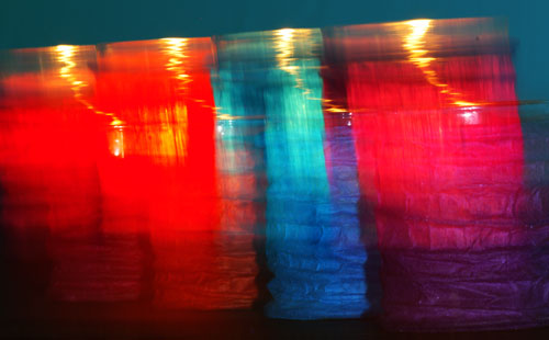
First thing that jumps out at me, are the colors. The challenge was for secondary colors, which are Purple, Green and Orange. You got some orange in your shot, and so it qualifies, however, the orange doesn't look like the main color in your shot. When I first see this, because of the angle, my eyes are lead from front to back. I see the red candle, then the blue candle, THEN I see the orange.
I also see the blue background. So the Orange isn't really the main focus in my opinion.
Speaking of focus, had not been for your title, I might still be trying to figure out what I'm looking at. I think that blurring, and long exposures work sometimes, when there is a reason. To create motion, or special effects. However, It looks very odd to see your candles producing "motion" all on their own. Why would they be needing any kind of motion effects? If you were trying to blend the colors, I don't think it worked too well. There is a very very small piece of purple, but I think it would need to be more noticable to be effective.
The angle is ok to get all the colors in the frame, but I do think that I would have put orange in the front. Make it the first thing we see.
Overall, just not my thing. I'm a huge fan of detail and this just doesn't have any.
I know people like praise, but I also know that people like to know why they got the score they did. This is only one person's opinion, but it may help to explain the 91 votes you recieved of 1's-4's. I probably would have given it a 3. Hope this helps.
~Heather~ |