| Author | Thread |
|
|
05/27/2003 02:51:47 PM |
*Criitque Club*
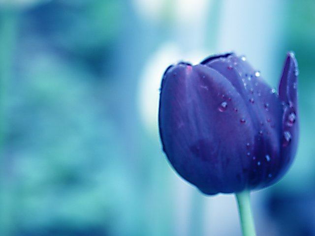
This looks purple to me. A lot more purple than the pinkish color people have entered. So I say that it fits the challenge in my opinion.
However, this does suffer greatly from lack of focus. You've heard it before, but what kind of crit would this be if I didn't mention it. You have used DOF very nicely to blurr the background to get it out of the way and let the subject shine, however, I am wondering if you set your distance, and then moved? The water drops are a nice touch, but as stated, creates some frusteration, as they are easily detected as being out of focus.
The lighting seems ok, but I wonder if some extra lighting would have helped both the focus, and to helps the front of the tuilp to have more detail.
The angle and framing/cropping is good. I wouldn't change that. I like how you have put the flower to the right of the photo. That does have visual appeal, however, it's hard to see through the focus to concentrate on the good aspects of the photo.
There is a vertical line, which I just noticed in your background, which once noticed creates a bit of a distraction to me. It cuts right through your subject. In through the top and out through the bottom. The blurred background helps to hide it, true, but once I see it, it's very obvious.
I believe this would have scored much higher with sharper focus.
~Heather~ |
|
Comments Made During the Challenge  |
|
|
05/20/2003 11:05:23 PM |
| Better focus on the subject would have greatly improved this photo. 3 md |
|
|
|
05/20/2003 11:04:48 PM |
| Really like the colors here...but the flower is way out of focus. |
|
|
|
05/20/2003 08:25:16 PM |
| I like the purple on bluey purple background. The tulip seems a bit too out of focus though. I'm not sure where the focus is sharp in this shot. |
|
|
|
05/20/2003 01:31:04 PM |
| nice job on this picture the oclor turned out very nice and the picture was very nicely taken good work |
|
 Photographer found comment helpful. Photographer found comment helpful. |
|
|
05/20/2003 12:00:03 PM |
| Nice composition though the focus seems a little too soft. BTW - It actually looks blue on my monitor. |
|
|
|
05/19/2003 05:55:44 PM |
| I like the softness of the background. I just wish the tulip was a little clearer. |
|
| Photographer found comment helpful. |
|
|
05/18/2003 10:07:36 PM |
| very nice, simple composition. Add some more foucs to give some punch. Jacko. 7 |
|
| Photographer found comment helpful. |
|
|
05/18/2003 11:00:01 AM |
| Nice picture but slightly out of focus. |
|
|
|
05/17/2003 10:46:28 PM |
| close focus issue here .. otherwise composition would be quite good |
|
|
|
05/17/2003 12:47:44 PM |
| Pretty, but a bit too soft for my taste. I feel frustrated that I can't see the raindrops more clearly. |
|
| Photographer found comment helpful. |
|
|
05/16/2003 09:14:43 PM |
| I would have given this photo a 10, had it been more in focus. The color theme is wonderful! |
|
| Photographer found comment helpful. |
|
|
05/15/2003 07:57:49 PM |
| I really like the color combination however,the focus seems way off on the tulip. |
|
|
|
05/15/2003 05:42:16 PM |
| Focus is a little off. Beautiful colors though. |
|
| Photographer found comment helpful. |
|
|
05/15/2003 12:15:41 PM |
|
|
|
05/14/2003 10:09:59 PM |
|
| Photographer found comment helpful. |
|
|
05/14/2003 09:37:17 PM |
|
|
|
05/14/2003 01:51:08 PM |
|
|
|
05/14/2003 09:28:25 AM |
| Could be more focused, and sharp. |
|
|
|
05/14/2003 09:18:15 AM |
| This subject needs a better focus. |
|
|
|
05/14/2003 12:29:22 AM |
| Seems a little soft/out of focus. Not sure if you were going for a mood here, but as it's the main (only) subject it doesnt really stand out as sharp as it probably should against the blurred background. |
|
| Photographer found comment helpful. |
Home -
Challenges -
Community -
League -
Photos -
Cameras -
Lenses -
Learn -
Help -
Terms of Use -
Privacy -
Top ^
DPChallenge, and website content and design, Copyright © 2001-2025 Challenging Technologies, LLC.
All digital photo copyrights belong to the photographers and may not be used without permission.
Current Server Time: 03/13/2025 02:39:35 AM EDT.