| Author | Thread |
Comments Made During the Challenge  |
|
|
06/09/2002 09:26:00 PM |
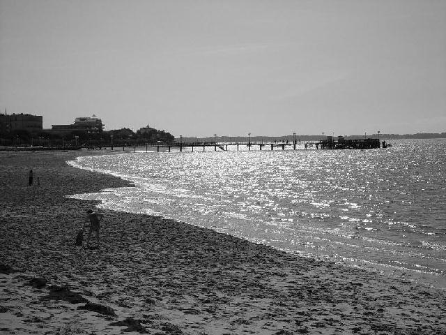
| too much dull sky in this really. The reflections on the water could have been used more strongly if you isolated some elements better |
|
|
|
06/09/2002 02:15:00 PM |
| where everyone walked is interesting. wierd seeing it in black & white but nice new perspective on it |
|
|
|
06/09/2002 01:42:00 PM |
| Needed a little more work before submitting. The horizon's not straight and a little cropped off the top & bottom, otherwise a pretty go shot. |
|
|
|
06/09/2002 12:24:00 PM |
| too much compression here. but I like the reflections off the water. |
|
|
|
06/08/2002 08:54:00 PM |
| I'm torn on this one, can't decide if I like it in b&w or not. I like the light bouncing off the water, but wish to see the blueness of the water - ah well, can't have everything ;) good job. |
|
|
|
06/07/2002 11:50:00 PM |
|
|
|
06/07/2002 04:25:00 PM |
I like the sun's reflection off the water, very nice. (I know they couldn't be helped, but I don't like the people on the sand; a distraction, but hardly visible.) Your horizon has some "ripples" that are barely visible (yes, a REAL NIT), could have been caused by many things, like overblown up, too much digital sharpening, etc. I'm not going to grade you down for these really insignificant items, just thought you might want to know.
Photo 9 Creativity 6 B&W 8 total 7 |
|
|
|
06/05/2002 05:19:00 PM |
| The view on this photo is excellent... It looks like the sun may be in front of you and that probably shortened up your shutter speed.. The shorter shutter speed caused the darker areas in your photo (the beach and the people on it) to become under exposed... |
|
|
|
06/05/2002 11:05:00 AM |
| The water is beautiful, but the sand and buildings are a bit too dark. |
|
|
|
06/04/2002 08:23:00 PM |
| Pretty good composition. The horizon being straight would have made this a little better I think. |
|
|
|
06/04/2002 06:55:00 PM |
| this image is only 78k and the low quality is very evident in the sky. i'd recommend taking the picture in the highest quality that your camera will allow and then using photoshop to resize to 640x480 and the highest quality possible under 150k. |
|
|
|
06/04/2002 05:19:00 PM |
| This picture is almost too sharp, and a little too bright in the water.. I do like the way you have gotten the curved motion of the water, and how it contrasts with the straightness of the pier. |
|
|
|
06/04/2002 09:41:00 AM |
| Personally, I feel that beaches often work better in color than b&w. The people on the beach could be subjects int he photo, but they are too much the same shade as the sand. Also, the horizon seems a little tilted. |
|
|
|
06/04/2002 01:25:00 AM |
| I like the effect of the picture dividing into 3 zones: shadow detail, highlight details, and no detail. I'd like to run it through a bunch of blurring filters and see how it would look asthe basis for an "abstract" piece... |
|
|
|
06/03/2002 05:34:00 PM |
| you've only used 78Kb - 50%over-compressed |
|
|
|
06/03/2002 03:23:00 PM |
|
|
|
06/03/2002 01:08:00 PM |
| Seems over sharpened, the water is very rigid, and the man&dog get lost in the sand. |
|
|
|
06/03/2002 12:55:00 PM |
| if the horizion was level I'd give it a 8, however... |
|
|
|
06/03/2002 09:50:00 AM |
| Beautiful shot. makes me want to go to the beach...... |
|
|
|
06/03/2002 06:51:00 AM |
| oversharpened and a bit to dark ont he right hand side |
|
Home -
Challenges -
Community -
League -
Photos -
Cameras -
Lenses -
Learn -
Help -
Terms of Use -
Privacy -
Top ^
DPChallenge, and website content and design, Copyright © 2001-2025 Challenging Technologies, LLC.
All digital photo copyrights belong to the photographers and may not be used without permission.
Current Server Time: 03/12/2025 02:52:03 PM EDT.