| Author | Thread |
|
|
06/10/2002 12:50:00 AM |
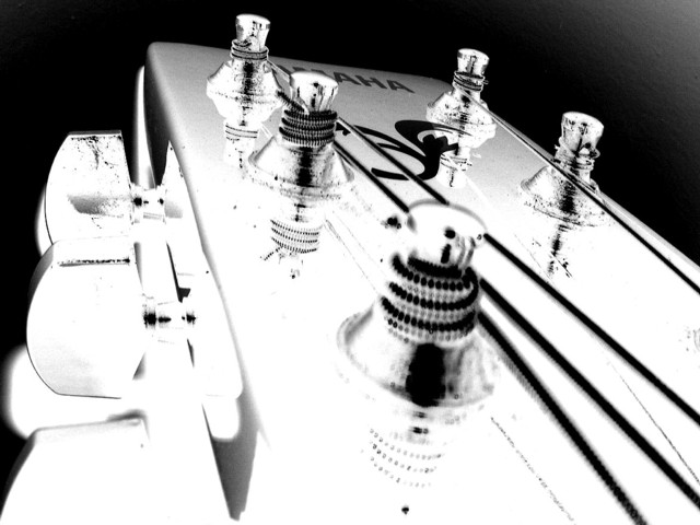
| You were robbed. It's a shame that people who don't know what they're looking at can't keep an open mind. |
|
Comments Made During the Challenge  |
|
|
06/09/2002 09:14:00 PM |
| cool effect with the over exposed/ inverted(?) Stands out. |
|
|
|
06/09/2002 04:34:00 PM |
| great angle great exposure! only nit pick is maybe correct the blown out right hand corner (for future use of course!) nice job. |
|
|
|
06/08/2002 11:13:00 PM |
| I like the perspective and the use of negative image. I had to try to envision this inverted to figure out what it was. |
|
|
|
06/07/2002 11:41:00 PM |
|
|
|
06/07/2002 08:07:00 AM |
| Like the leading lines of the strings. Not a fan of overexposed photographs, but at least this one is eye catching. |
|
|
|
06/06/2002 04:51:00 PM |
| Very striking use of the colour inversion. I checked it with them the other way around, and it was a great photo that way too, but this makes it eerie and interesting. |
|
|
|
06/06/2002 12:19:00 PM |
The G-String's on the right side, but this shot emphasizes the left, shoulda called it E, A or D strings = P
j/k nice shot. I like the overexposure, it makes it stand out more from the other b&w shots here. |
|
|
|
06/05/2002 10:32:00 PM |
| I don't care for the inverted look. Composition otherwise looks decent. |
|
|
|
06/05/2002 07:39:00 PM |
|
|
|
06/05/2002 02:07:00 PM |
| Not enough overall tonal range, and I am not sure if that was done intentionally or not. I am assuming that it was and I will give you the benefit of the doubt. |
|
|
|
06/05/2002 01:35:00 PM |
| Were you going for high key/abstract? I like this photo, but after studying it a bit I just can't explain why. It's just rather unique to me. |
|
|
|
06/05/2002 12:59:00 PM |
| i like the use of inversion to be arty in this instance. the close up of the headstock and unusual angle are good. an 8. |
|
|
|
06/05/2002 06:40:00 AM |
| Just have to break from my "from the ground up" commenting scheme to acknowledge my three favorites. This is an excellent piece of work. The inversion gives the tuning pegs a great chromed look. I guess I'd like the fg in better focus, but you get high marks from me on impact. Congratulations! |
|
|
|
06/04/2002 10:58:00 PM |
| The perspective and composition of this shot is excellent! I'm not sure that I really like the 'heat' offered by the light... Is this done in negative? |
|
|
|
06/04/2002 10:11:00 PM |
| great title :), i wish the string closes to camera was sharper, sorry I don't care for the 'blown out' contrast but I'm sure others do. good job. |
|
|
|
06/04/2002 10:11:00 AM |
|
|
|
06/04/2002 09:34:00 AM |
| I'm sure you get many comments that this one is totally blown out. It is. And it looks great for it! Just proof that sometimes you have to break the rules. :) |
|
|
|
06/04/2002 07:48:00 AM |
| Does a "negative" effect really count as B&W? |
|
|
|
06/04/2002 05:26:00 AM |
|
|
|
06/04/2002 01:27:00 AM |
|
|
|
06/04/2002 12:32:00 AM |
|
|
|
06/03/2002 11:46:00 PM |
| Very creative!!!! good one!! |
|
|
|
06/03/2002 11:02:00 PM |
| Too much light in the foreground. I really like the dark lines of the strings, but the bottom right hand corner distracts me away from it. |
|
|
|
06/03/2002 09:32:00 PM |
|
|
|
06/03/2002 06:21:00 PM |
| Very creative shot, well done. I like the reflections. I do however wish that the front knob (forgive my ignorance) could have been in focus. It also seems as though the contrast is just a bit too high. I like a lot of contrast, esp. for a shot like this, but with this much detail is lost. Still a good shot. |
|
|
|
06/03/2002 04:28:00 PM |
| Too overexposed on left side and bottom for me. |
|
|
|
06/03/2002 03:53:00 PM |
| Kool title, cool shot. Nicely done. |
|
|
|
06/03/2002 12:44:00 PM |
| Too bright with your inversion of colors. |
|
|
|
06/03/2002 11:56:00 AM |
| I would like to see this without all the filtering. |
|
|
|
06/03/2002 11:25:00 AM |
| nice shot, but out of focus up front and a little too light |
|
|
|
06/03/2002 08:03:00 AM |
| interesting textures and contrast |
|
|
|
06/03/2002 06:10:00 AM |
| It actually looks quite good without the inverting :) |
|
|
|
06/03/2002 05:56:00 AM |
|
|
|
06/03/2002 02:15:00 AM |
| too washed out for my taste. But I like the effect. Too bad you can't get both detail and the effect (having your cake and eating it too) |
|
|
|
06/03/2002 12:38:00 AM |
| love the guitar... but too bright |
|
Home -
Challenges -
Community -
League -
Photos -
Cameras -
Lenses -
Learn -
Help -
Terms of Use -
Privacy -
Top ^
DPChallenge, and website content and design, Copyright © 2001-2025 Challenging Technologies, LLC.
All digital photo copyrights belong to the photographers and may not be used without permission.
Current Server Time: 03/12/2025 02:20:38 PM EDT.