| Author | Thread |
Comments Made During the Challenge  |
|
|
06/09/2002 09:39:00 PM |
|
|
|
06/08/2002 03:15:00 PM |
| Excellent use of contrast, you (unlike a lot of the others) realize the purpose of black and white and know how to make it effective. |
|
|
|
06/08/2002 03:25:00 AM |
|
|
|
06/07/2002 03:29:00 PM |
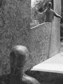
| Very nice stil life, no complaints technically, estically, I think this is a bit (just a bit) stark (a.k.a. bare). Concentrates your view, yes, but hardly excites. Photo 10 Creativity 6 B&W 9 total 8 (some may disagree, but I like the off center look, too) |
|
|
|
06/06/2002 12:44:00 AM |
| Hey. Nice. That's truly black and white. My only suggestion is slightly more depth of field to include the bottom and back of the pepper in the field of focus. Really excellent tones, with detail in all but the darkest shadows. |
|
|
|
06/05/2002 11:45:00 AM |
| If it's a red pepper on white, wouldn't the contrast be more interesting in color? |
|
|
|
06/05/2002 09:52:00 AM |
| I like the off-centered-ness. And the shadow. |
|
|
|
06/04/2002 11:06:00 PM |
| excellent photo! I can't really offer any suggestions on this one :) Good job! |
|
|
|
06/04/2002 08:25:00 AM |
| Now this is a shot that I would like to have taken. Usually done (and done well) in color, it is very intriguing in b&w. Well executed! :) I would probably have cropped just a tad more off the top (outside of this challenge of course) to emphasize the ROT. |
|
|
|
06/03/2002 06:40:00 PM |
| It would be nice to have the pepper centered to see the entire shadow. |
|
|
|
06/03/2002 05:13:00 PM |
|
|
|
06/03/2002 05:13:00 PM |
|
|
|
06/03/2002 03:31:00 PM |
| Why take a picture of something so colorful for a B&W challenge? I think it would have been great for a color challenge, but seems dull in B&W. |
|
|
|
06/03/2002 02:51:00 PM |
| I like the contrast. Is it resly a red peper, how did you get it to go so black? |
|
|
|
06/03/2002 01:52:00 PM |
| The cool thing about capsicums (it's what we call them in my country :P) is their vibrant colour! It's interesting that you chose to photograph it in black and white. The shape and texture of it isn't very compelling to me, which are things that black and white will emphasis by de-emphasising colour. Interesting idea though. |
|
|
|
06/03/2002 08:15:00 AM |
| This is WELL done. The crop is perfect and does adds to the rule of thirds. The light on top is JUST enough. It looks like a photo that would be sold for a kitchen wall. GREAT job ! |
|
|
|
06/03/2002 05:43:00 AM |
| Focusing looks a little off or DOF is just too shallow. |
|
Home -
Challenges -
Community -
League -
Photos -
Cameras -
Lenses -
Learn -
Help -
Terms of Use -
Privacy -
Top ^
DPChallenge, and website content and design, Copyright © 2001-2025 Challenging Technologies, LLC.
All digital photo copyrights belong to the photographers and may not be used without permission.
Current Server Time: 03/12/2025 08:27:43 PM EDT.