| Author | Thread |
|
|
11/09/2005 08:03:33 PM |
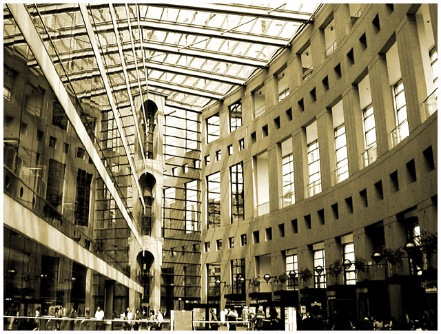
| Wow, looks like a really beautiful place, not only to check out books, but to spend some time. |
|
 Photographer found comment helpful. Photographer found comment helpful. |
|
|
06/02/2003 12:37:11 PM |
*Critique Club*
I'm finding this shot really busy. Lots of lines that really lead to nowhere.
I'm also wondering about the perspective/angle. The strong vertical line (support to the left of the center of the photo) appears to be leaning to the right. When matched up with the edge of my screen, it is leaning. However, the right side seems to be leaning inward as well. Wide angle lens? Sometimes they create distortion and can look a bit odd, with strong verticals curving inward to the photo.
The lighting is also a bit strange. Really bright at the top, to where it is almost washing out the detail in the ceiling. However, it's really dark in the bottom right so that we really don't get any detail at all out of that area.
Focus looks really good. Things seems sharp and lines are nice and crisp. Clarity though is a bit different. There are so many lines that in some places it all just kind of mushes together. Also, the people are really too far away to get much detail out of at all, and are almost a distraction to the building, which is a distraction itslef. lol
I wonder if focussing in on a smaller section of the building would have worked better for me.
You got a nice score, and some great comments, and I feel bad saying that this doesn't really appeal to me. Like I'm the bad guy or something, but it's just not striking any interest with me.
~Heather~
Message edited by author 2003-06-02 12:37:38. |
|
| Photographer found comment helpful. |
Comments Made During the Challenge  |
|
|
06/01/2003 12:21:38 PM |
| A great photo but a muddy color - Could another color have made it as dramatic as it should be? |
|
| Photographer found comment helpful. |
|
|
05/31/2003 12:32:34 PM |
| interesting perspective...would seem better for duotones without any people in the image, which I am sure is not easy to do. Noce perspective. thanks |
|
| Photographer found comment helpful. |
|
|
05/27/2003 10:39:44 PM |
| Amazing structure, love the perspective! |
|
| Photographer found comment helpful. |
|
|
05/27/2003 07:56:59 PM |
| Vancouver Library? Nice image 10 Morgan |
|
| Photographer found comment helpful. |
|
|
05/27/2003 12:32:43 PM |
| Nice toning here. I like the structure and the reflection in the left side. |
|
| Photographer found comment helpful. |
|
|
05/27/2003 08:11:33 AM |
| Buildings always provide great lines and details. I like the old world vs. new world feel in this shot. The gradient of light at the top to the dark at the bottom create a nice compliment to each other. And to put the perspective on the shot you have the people at the bottom adding a nice focal point and detail. Nice work. 8 -danny |
|
| Photographer found comment helpful. |
|
|
05/26/2003 10:38:11 PM |
| interesting lines but i wonder what they are leading my eyes to, my eyes wander across the image and don't find a resting place. |
|
| Photographer found comment helpful. |
|
|
05/26/2003 04:36:16 PM |
| Very interesting lines and angles. I really like the colors you used. Jacko. |
|
| Photographer found comment helpful. |
|
|
05/26/2003 09:41:06 AM |
| nice shot, I like the tones in this..... I might have cropped the people out..... good luck, Todd. |
|
| Photographer found comment helpful. |
Home -
Challenges -
Community -
League -
Photos -
Cameras -
Lenses -
Learn -
Help -
Terms of Use -
Privacy -
Top ^
DPChallenge, and website content and design, Copyright © 2001-2025 Challenging Technologies, LLC.
All digital photo copyrights belong to the photographers and may not be used without permission.
Current Server Time: 03/12/2025 08:35:05 AM EDT.