| Author | Thread |
Comments Made During the Challenge  |
|
|
06/23/2002 03:49:00 AM |
| Godel, Escher, Bach. Read it, learn it, live it! |
|
|
|
06/22/2002 03:55:00 PM |
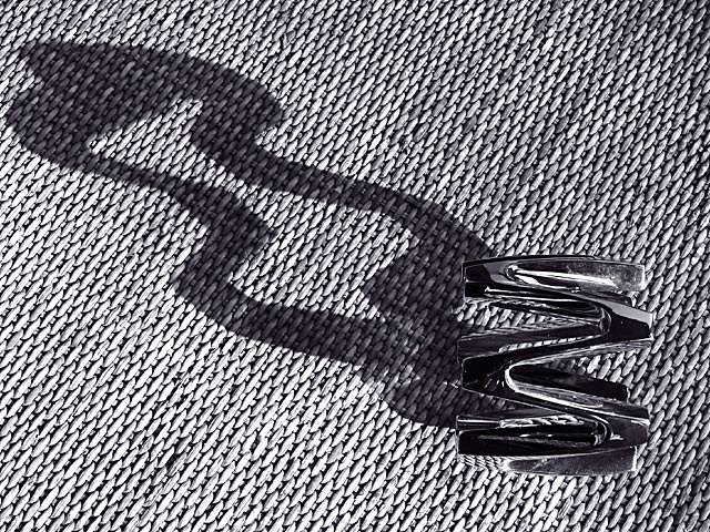
| great shot, the object looks so small from the angle, but the shadow is huge. i wouldnt have chosen that background...and if i didnt i wouldn't have had it black and white. you just get lost in it, there's not enough contrast. |
|
|
|
06/21/2002 05:55:00 PM |
| A flat background would have added a lot to this one, but I like the shadow. |
|
|
|
06/20/2002 05:19:00 PM |
| This is EXCELLENT! I really like a well planned and executed photo... I love the texture of the background and the shadow cast by the 'object'. i would probably like to see a little more space between the shadow and the right side of the frame, but this photo still scores high = 9 :) - jmsetzler |
|
|
|
06/20/2002 03:58:00 PM |
| I just love textures and curves. Creative title, that do you see in this pattern? |
|
|
|
06/19/2002 05:35:00 PM |
| good subject and textures - not many shots have have made the shadow so prominent |
|
|
|
06/19/2002 04:08:00 PM |
| I like the texture of this shot. Overall the image seems a tad dark, and I think I might have framed or cropped this to allow for more space on the right. All in all though, very nice! |
|
|
|
06/19/2002 02:43:00 PM |
| Very nice use of shadows! |
|
|
|
06/19/2002 08:20:00 AM |
| Very nice. I like how the shadow doesn't seem to fit the object. |
|
|
|
06/19/2002 05:12:00 AM |
| I personaly feel of you zoom out a little bit, it would give more breathing space on the top and left. THere is a strong sense of directionality in this image so I guess slightly off the diagonal would have helped. I like the idea. |
|
|
|
06/19/2002 12:02:00 AM |
| Nice and abstract. Lots of interest. I may have cropped it even tighter so the shadow goes out of the frame. |
|
|
|
06/18/2002 11:55:00 PM |
| Nice texture and funky shadow. I tried a similar idea, and it didn't turn out anywhere near as well. |
|
|
|
06/18/2002 10:32:00 PM |
| I really like the shape of the shadow and the texture on this one. Nice job. |
|
|
|
06/18/2002 04:58:00 PM |
| I like the composition and the shadow casted by the object, but the busy background makes it hard to spot the object that is casting the shadow. I wonder why you made this in B&W because this problem might not occur in color. |
|
|
|
06/18/2002 12:47:00 PM |
| A beautiful piece. Normally don't like B&W, but this would be an exception. I like your background, the mat adds alot of interest. What's the chrome thingy? Very cool. Photo 10 Creativity 10 Shadows 10 total 10 |
|
|
|
06/18/2002 11:22:00 AM |
| Love the surface texture... The shadow is an interesting shape, too. |
|
|
|
06/17/2002 07:38:00 PM |
| I like that the shadow extends to the point of almost becoming the subject. The busy backdrop is nice for the shadow, but almost hides the subject. I wonder if a solid or more subdued backdrop would improve things. |
|
|
|
06/17/2002 07:10:00 PM |
| rorschach had a twisted butterfly pattern on his mask |
|
|
|
06/17/2002 06:31:00 PM |
|
|
|
06/17/2002 02:28:00 PM |
| Excellent design! Good exposure and use of texture. Lighting good on the crome. |
|
|
|
06/17/2002 02:23:00 PM |
| Nice photo and detail. Just can't figure it out-I see a..... duck? - |
|
|
|
06/17/2002 11:21:00 AM |
| I'm torn on this one. A) I love the shadow and the clarity on the metal. B) I love the texture and color of the cloth. But I don't think A & B are very good together...b detracts from a for me. It's a great image anyway! I give it a 7 |
|
|
|
06/17/2002 03:32:00 AM |
| looks like a snake, and the background is like snakeskin |
|
|
|
06/17/2002 12:26:00 AM |
| Cool shadow, what is that? |
|
Home -
Challenges -
Community -
League -
Photos -
Cameras -
Lenses -
Learn -
Help -
Terms of Use -
Privacy -
Top ^
DPChallenge, and website content and design, Copyright © 2001-2025 Challenging Technologies, LLC.
All digital photo copyrights belong to the photographers and may not be used without permission.
Current Server Time: 03/12/2025 03:23:18 PM EDT.