| Author | Thread |
Comments Made During the Challenge  |
|
|
06/17/2003 11:07:37 AM |
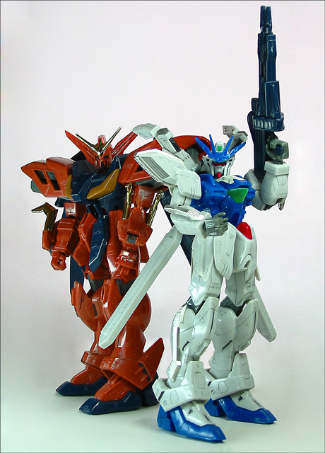
| Love the room you left for text without just having too much empty space. Could see this on the magazine cover, but maby with a whiter background. (8) |
|
|
|
06/17/2003 07:56:26 AM |
Excellent composition. Background showing some areas of shadow/ colour - perhaps needs additional lighting on backdrop?
8 |
|
 Photographer found comment helpful. Photographer found comment helpful. |
|
|
06/16/2003 01:09:33 AM |
| Interesting... I'm not sure what Model Graphix is about... but I think I get the idea with this magazine cover. Very well placed and lit. I like how you have two and not just one... that makes it much more visually interesting. I could definitely see this as a cover, it's not an extremely wonderful photograph, but it works, plain and simple. I like how you left plenty of room for type. |
|
| Photographer found comment helpful. |
|
|
06/13/2003 10:33:53 AM |
Maybe you should think about getting rid of that glare ...
Could be a very nice on a magazine
I like it |
|
|
|
06/13/2003 09:47:34 AM |
| Kewl... I miss Optimus Prime :D |
|
|
|
06/11/2003 10:27:58 PM |
|
|
|
06/11/2003 12:35:35 PM |
| Yes, I could see this on the cover of your magazine. However, using a different background would be a good idea. I invision a space ship flying amoung the milky way here. Or something like that...just an idea to make it more interesting. |
|
| Photographer found comment helpful. |
Home -
Challenges -
Community -
League -
Photos -
Cameras -
Lenses -
Learn -
Help -
Terms of Use -
Privacy -
Top ^
DPChallenge, and website content and design, Copyright © 2001-2025 Challenging Technologies, LLC.
All digital photo copyrights belong to the photographers and may not be used without permission.
Current Server Time: 03/12/2025 01:33:41 PM EDT.