| Author | Thread |
Comments Made During the Challenge  |
|
|
06/26/2003 11:24:33 AM |
I'm looking for the grace.....
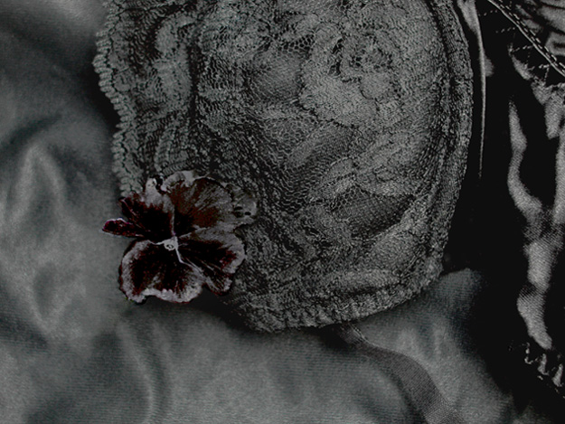
I really like the various textures here, made darkly nostalgic (bad, unavoidable memories) by the low key lighting. Brave of you to choose light subjects for this challenge! |
|
|
|
06/24/2003 02:15:30 PM |
| Lacks a bit of atmosphere and detail. Appears to be a bit crude around the flower.You may get disqualification comments! |
|
|
|
06/20/2003 06:30:06 PM |
| I had to look at this a while to try to distinguish the different textures/things in the shot. Overall, this shot seems to be pretty much all in the same tonal range, making it all kind of "run together". There are a few dark areas in there, but definitely not enough contrast in the shot to suit me. The flower (I think?!) is the only thing that stands out at all for me, and I do like that part of the shot. I would like to have seen this with a stronger oblique light source that maybe would have given it more depth. |
|
 Photographer found comment helpful. Photographer found comment helpful. |
|
|
06/20/2003 01:21:41 PM |
| A little bright for what I'd prefer of this challenge. The overall impression is grey, not black-with-gleams. 5. |
|
|
|
06/20/2003 11:08:27 AM |
| i think this image is a little too busy/cluttered. when i think of low-key images, i think of simple images which convey shapes and forms using high-contrast lighting effects. this is just too cluttered up by different textures that it really doesn't have a central point of focus to draw me in. the subject doesn't connect with me as the viewer. also, the light is flat and the image really needs more contrast overall. 4. |
|
|
|
06/20/2003 02:05:16 AM |
| the contrast are good. but the balance of the image seems off just a little. still a good shot based on rules 8 |
|
Home -
Challenges -
Community -
League -
Photos -
Cameras -
Lenses -
Learn -
Help -
Terms of Use -
Privacy -
Top ^
DPChallenge, and website content and design, Copyright © 2001-2025 Challenging Technologies, LLC.
All digital photo copyrights belong to the photographers and may not be used without permission.
Current Server Time: 03/12/2025 02:08:44 AM EDT.