| Author | Thread |
|
|
02/07/2006 03:19:03 PM |
Greetings from the Critique Club
Congratulations on getting through your first Challenge.
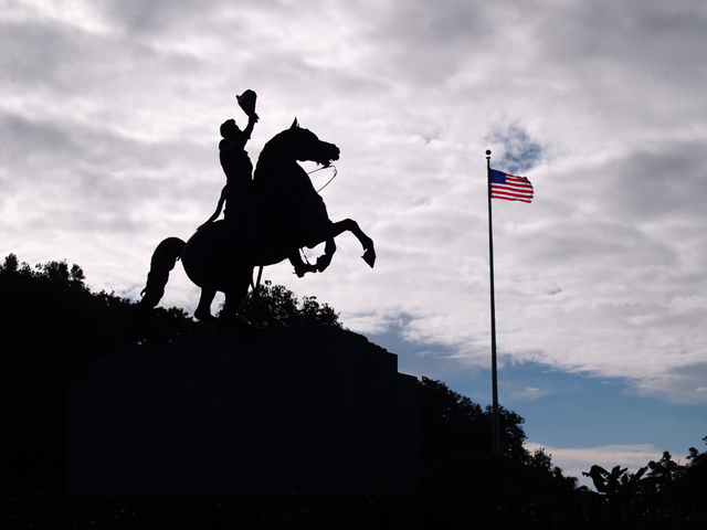
Now, to the matter at hand. You asked for a Critique on your image, which is quite nicely composed in the frame and crisp where it needs to be, at the flag. (Just as a matter of interest, you might look at this image after cropping out a bit behind the statue to take the activity away from the center of the frame.) As far as subject matter goes, some of our DPC viewers are not fond of pictures of statues, and perhaps this affected your score negatively.
Then, in Advanced Editing Challenges, it's nice to have the extra tools that are allowed, including burning and dodging to, for example, add some interest to that sky.
Nevertheless, for your first entry, it's a good one. And I look forward to seeing lots more of your work in future Challenges. |
|
 Photographer found comment helpful. Photographer found comment helpful. |
Comments Made During the Challenge  |
|
|
01/31/2006 10:26:24 PM |
|
|
|
01/30/2006 08:52:03 PM |
|
|
|
01/28/2006 07:19:07 PM |
| nice idea, great sillouette, excellent movement, good color, good light, blacks need work, whites good, nice dof, overall a nice acheivement |
|
| Photographer found comment helpful. |
|
|
01/28/2006 04:06:05 PM |
| Great concept, bad lighting. I would like to see more detail from the statue in this photo |
|
|
|
01/26/2006 08:26:22 AM |
| A salute to you as well..... |
|
|
|
01/25/2006 09:50:06 PM |
| I like the silhouette and the composition but the light blue in the sky is distracting for me. Personally, I'd prefer this as a b/w image or just leave the flag in color. Also the clouds look like they might benefit from a curves adjustment (or dodge/burn) to bring out more contrast. |
|
| Photographer found comment helpful. |
|
|
01/23/2006 11:23:14 AM |
| I like the how half is in shadows while the flag is not. Might have been stronger if the flag was a bit closer. Very nice. |
|
|
|
01/21/2006 04:39:48 PM |
| Very patriotic.. which isn't recommended fo DPC most of the time. |
|
|
|
01/21/2006 04:01:14 PM |
| Nice silhouette work, shame the flag is right near the hole in the clouds, detracts from the subject slightly. It's a shame it's a statue and not a real horseman but a decent take anyway. 6/10 |
|
|
|
01/18/2006 08:35:25 PM |
| I like the composition here, and the contrast is very well done. |
|
|
|
01/18/2006 03:42:08 AM |
| a nice silhouette - but just doesn't speak to me. I see ther is a story here, I'm just not being pulled into it. |
|
|
|
01/18/2006 12:43:17 AM |
| 8 from me...i like it...others probably wont' |
|
|
|
01/16/2006 06:00:09 PM |
| nice capture, too much dead space in bottom left. might try a different crop. 5 |
|
| Photographer found comment helpful. |
Home -
Challenges -
Community -
League -
Photos -
Cameras -
Lenses -
Learn -
Help -
Terms of Use -
Privacy -
Top ^
DPChallenge, and website content and design, Copyright © 2001-2025 Challenging Technologies, LLC.
All digital photo copyrights belong to the photographers and may not be used without permission.
Current Server Time: 03/12/2025 09:47:26 AM EDT.