| Author | Thread |
|
|
04/16/2006 09:12:37 AM |
|
Comments Made During the Challenge  |
|
|
07/17/2003 12:08:07 PM |
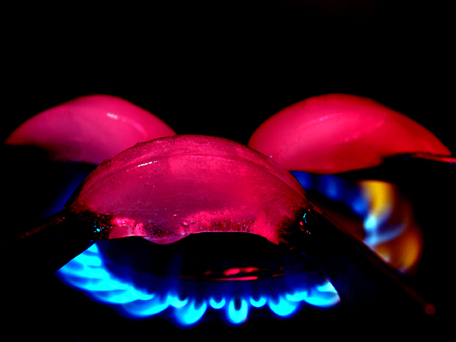
| Now there's a nice twist on the gas flame / icecube theme. I like it a lot. Makes a nice abstract, but you can recognize what you are looking at when looking closer. The focus and colors are great. Not sure about the empty space at the top, maybe just a little more cropping would be an improvement. After the challenge, I'd also change the color in the flames on the right to be blue, but that's obviously not allowed for the challenge and not that important. One of my top 5 picks for this week :) |
|
|
|
07/15/2003 06:53:40 AM |
|
|
|
07/15/2003 12:08:27 AM |
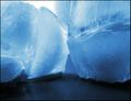
| generally i prefer the out in the world shots to the staged variety, but from time to time there are staged shots that stop me in my tracks, and one must give credit where credit is due. This shot certainly gets high marks by me in terms of the color. particularly of the ice. I almost wish it was just of the ice. Not sure how you got the ice this color but i like it . nice work |
|
|
|
07/14/2003 10:23:16 PM |
| Very original-- I also attempted a ice-cube/flame shot, but it didnt turn out, great tones on the cubes, gotta go 8 |
|
|
|
07/14/2003 10:12:56 AM |
| like the colours... how did you get your ice pink? dye in the water? |
|
|
|
07/14/2003 09:06:39 AM |
| WOW ! This is a cool photo. The ice being red just adds to the heat ! GREAT job :) |
|
|
|
07/14/2003 01:06:36 AM |
Composition
This is a great photo for temperature because it demonstrates differences in temperature so well. Not only does the subject matter exemplify differences in temperature, the colors of the opposing components helps to visually sort the cold from the hot. The ice cubes could be centered better (as they don't appear to be intentionally placed anywhere in particular). The positioning of the front ice cube seems to be arbitrarily off-center to the left.
Color
The juxtaposition of the red color on the cold items and the blue color in the warm flames creates a subconcious issue for the viewer, too. Culturally, red normally refers to hot while blue is reserved for icy objects.
Lighting
The lighting is used to good ends with the source of the red coloration coming from somewhere above (notice the light reflection on the upper edges of the ice cubes) but not overpowering any of the other objects in the work.
Focus
The focus is good but I would like to see a longer depth of field so that the front of the flames from the burner are sharper (perhaps this is a problem with gas flames).
Overall
I like this image; especially the lighting effects. Creative solution for this challenge. |
|
|
|
07/14/2003 12:13:39 AM |
| awesome pic! the colors are wonderful and i love the detail. what a great idea!...10 |
|
Home -
Challenges -
Community -
League -
Photos -
Cameras -
Lenses -
Learn -
Help -
Terms of Use -
Privacy -
Top ^
DPChallenge, and website content and design, Copyright © 2001-2025 Challenging Technologies, LLC.
All digital photo copyrights belong to the photographers and may not be used without permission.
Current Server Time: 04/28/2025 06:05:34 AM EDT.