| Author | Thread |
|
|
04/21/2006 12:32:44 PM |
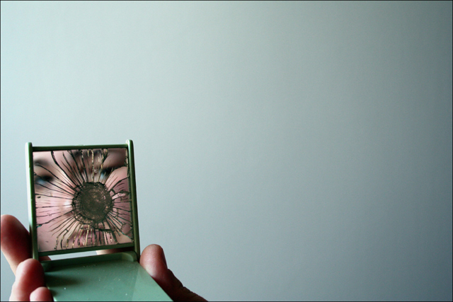
| Love the idea/concept, but agree that the crop is a bit too tight around the hand/fingers. Really like the use of negative space. Great shot. |
|
 Photographer found comment helpful. Photographer found comment helpful. |
|
|
02/24/2006 10:01:11 PM |
Thanks muchly :)
I appreciate the comments!
|
|
|
|
02/24/2006 03:36:39 PM |
| I thought this was an interesting take on the challenge. The crop is a bit too tight on the left hand side but overall, I love the simplicity of this image. Straight and direct. Gotta love it. |
|
| Photographer found comment helpful. |
|
|
02/21/2006 02:03:26 PM |
| I thought this should have been in the top two. Great composition. Most of all, I think the affinity of colors, from the background to the eyes, works very well. Great piece. |
|
| Photographer found comment helpful. |
|
|
02/15/2006 10:18:29 AM |
Thanks everyone for the comments! I'm pretty happy with this photo - and it placed my third highest ever, so boomshaka! ;)
|
|
Comments Made During the Challenge  |
|
|
02/14/2006 10:29:05 PM |
| ack... my idea... nooooooooo... i thought i was being original ;-) i like your take on it too though. Much cleaner than mine, just wish i could see some more emotion in the reflection |
|
| Photographer found comment helpful. |
|
|
02/13/2006 04:39:34 PM |
| Excellent use of color and composition. |
|
| Photographer found comment helpful. |
|
|
02/12/2006 06:15:12 PM |
| Original idea. I wish you hands were in better focus. 6 |
|
| Photographer found comment helpful. |
|
|
02/10/2006 08:56:00 AM |
| I love the composition here and the fading of the light over to the right. |
|
| Photographer found comment helpful. |
|
|
02/09/2006 06:57:04 PM |
|
| Photographer found comment helpful. |
|
|
02/09/2006 06:53:40 PM |
| I like the cracked mirror effect, but too much space in the background, as it overwhelms the focus of the mirror... |
|
| Photographer found comment helpful. |
|
|
02/09/2006 10:54:03 AM |
| I like the minimalism of this shot. My only criticism would be the finger being cut off on the left hand side. |
|
| Photographer found comment helpful. |
|
|
02/09/2006 04:42:06 AM |
| Clear focus on topic at hand. Well done. Although the face adds contents it does not distract from the broken mirror. Rule of 1/3 rds well applied. Angle of lid leads eye to focus point. No other distractions. MAYBE bit tighter cropping on the right? The space adds to the image, but may be just a tad too much |
|
| Photographer found comment helpful. |
|
|
02/08/2006 01:45:15 PM |
| strong composition - like the light and tones as well |
|
| Photographer found comment helpful. |
|
|
02/08/2006 07:29:56 AM |
| Very good. The background is "well done" |
|
| Photographer found comment helpful. |
|
|
02/08/2006 04:12:42 AM |
| lots of unneeded space on right and top, crop too tight on left and bottom |
|
| Photographer found comment helpful. |
|
|
02/08/2006 01:44:04 AM |
| Nice off centered subject. I like the use of negative space and the unusual aqua/green color. |
|
| Photographer found comment helpful. |
Home -
Challenges -
Community -
League -
Photos -
Cameras -
Lenses -
Learn -
Help -
Terms of Use -
Privacy -
Top ^
DPChallenge, and website content and design, Copyright © 2001-2025 Challenging Technologies, LLC.
All digital photo copyrights belong to the photographers and may not be used without permission.
Current Server Time: 03/13/2025 02:11:48 AM EDT.