| Author | Thread |
|
|
07/28/2002 12:22:00 PM |
| This shot deserved way better than 49th place. Good job, mci. |
|
Comments Made During the Challenge  |
|
|
07/13/2002 03:45:00 PM |
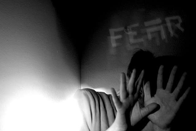
| I think the words fear were not needed in this shot. The expression is there. The only thing that I dont like about this shot is the lower left is way to bright. |
|
|
|
07/13/2002 05:31:00 AM |
| Not clear enough. Too much light on the left. Good idea. |
|
|
|
07/13/2002 12:40:00 AM |
| concentrated lighting... on one side... |
|
|
|
07/12/2002 11:46:00 PM |
| At first I thoughtit would be stronger with about half of the "extra" space on the left cropped-off, but I'd reconsider that if your intent is to create a "flowing to the left" effect... |
|
|
|
07/12/2002 02:47:00 PM |
| that bright light on the lower left bothers me. Not sure why. |
|
|
|
07/11/2002 03:37:00 PM |
| Very good, especially the dramatic lighting. Although it's not really bothering me, I think the text isn't necessary because the photo shows fear even without it. It is a nice effect though. |
|
|
|
07/11/2002 12:32:00 AM |
|
|
|
07/10/2002 07:20:00 PM |
| Love the text and the semblance of action, but the negative space kinds of bothers me. Would like to see it cropped differently (perhaps this photo lends itself to a more vertical slant) or I'd like to see it with the text in the upper left hand corner. Still, it's a real nice shot. |
|
|
|
07/10/2002 12:06:00 PM |
| I like this, but I'm not sure about the overexposed lower corner. Was this intentional? It sort of has the effect of being a supernatural entity or something like that, but if that's the case, the connection is still a little weak. Otherwise, nice black and white |
|
|
|
07/09/2002 07:23:00 PM |
| The over exposure in this image actually adds a nice impact to the 'fear' theme... good shot :) = 8 - jmsetzler |
|
|
|
07/09/2002 10:28:00 AM |
| Maybe the glare is part of the picture and I'm missing the point, :-) but it's distracting to me. |
|
|
|
07/08/2002 11:36:00 PM |
|
|
|
07/08/2002 10:49:00 PM |
| Nice effects for FEAR ! The white area is a little over exposed but that in a way adds to the bright lights on him to me:) |
|
|
|
07/08/2002 10:30:00 PM |
| Excellent composition and lighting effects -- works great as black and white image. One of the best this week. (9) |
|
|
|
07/08/2002 06:26:00 PM |
| Artsy shot. After the challenge, I would be interesting in how you "blew out" the head and neck. Interesting effect, good suspense. Might be overly deep for this site. 7 Swash |
|
|
|
07/08/2002 04:49:00 PM |
| Cool effect with the "FEAR." But I'd like to see more light on the person. |
|
|
|
07/08/2002 12:49:00 PM |
| I like the bright base balanced by the dark at top. I especially like the use of the corner. The obscure individual with hands raised is nicely detailed. Why'd you feel a need to label it over the person's head? |
|
|
|
07/08/2002 11:41:00 AM |
|
Home -
Challenges -
Community -
League -
Photos -
Cameras -
Lenses -
Learn -
Help -
Terms of Use -
Privacy -
Top ^
DPChallenge, and website content and design, Copyright © 2001-2025 Challenging Technologies, LLC.
All digital photo copyrights belong to the photographers and may not be used without permission.
Current Server Time: 04/27/2025 03:51:34 AM EDT.