| Author | Thread |
|
|
08/13/2003 06:16:56 AM |
| I appreciate the comments. Thanks! |
|
Comments Made During the Challenge  |
|
|
08/12/2003 11:05:22 AM |
| its very light..i really go for simplicity...7 |
|
|
|
08/11/2003 06:51:38 AM |
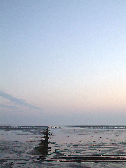
| Excellent, the sky is just right and composing as portrait is spot on |
|
|
|
08/11/2003 04:37:46 AM |
| Composition is really good, but there's a bit too much sky. It makes you look at the top of the picture, but the interest is at the bottom |
|
|
|
08/09/2003 05:28:11 PM |
| Cool...great eye. I would never have seen this one. Beautiful lighting and colors also...could be a winner! |
|
|
|
08/07/2003 01:50:39 PM |
|
|
|
08/07/2003 09:28:57 AM |
| The foreground is unclear with little detail. I am not sure how to fix that. |
|
|
|
08/07/2003 06:48:57 AM |
| Try noise removal using Neat Image |
|
|
|
08/07/2003 01:31:45 AM |
| hmmmm. great angles, nice muted tones in the sky, perhaps tooo much sky, the bottom portion is very interesting but confuses me. |
|
|
|
08/06/2003 10:00:56 PM |
| There is way too much sky in this pictures, wish there was half as much of it |
|
|
|
08/06/2003 01:10:46 PM |
| i like nature's right angle. very subtle. perhaps just a touch less sky, but lovely. :o) |
|
|
|
08/06/2003 10:28:09 AM |
|
|
|
08/06/2003 02:20:17 AM |
| Nice negative space. But it seems a tad oversharpened. |
|
Home -
Challenges -
Community -
League -
Photos -
Cameras -
Lenses -
Learn -
Help -
Terms of Use -
Privacy -
Top ^
DPChallenge, and website content and design, Copyright © 2001-2025 Challenging Technologies, LLC.
All digital photo copyrights belong to the photographers and may not be used without permission.
Current Server Time: 03/12/2025 02:46:51 PM EDT.