| Author | Thread |
Comments Made During the Challenge  |
|
|
04/18/2006 09:34:49 AM |
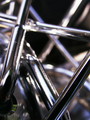
| Would have liked this better if the reflection was more an aspect of the composition, and did not have the distracting elements of the lightposts and wires. |
|
 Photographer found comment helpful. Photographer found comment helpful. |
|
|
04/18/2006 08:39:36 AM |
| Personally, I don't care for the reflections. I find myself spending more time trying to figure them out than looking at the logo, which is very nice against the black. If the reflection tied in that would be okay, but it isn't associated to the image. Just MY reaction :) |
|
| Photographer found comment helpful. |
|
|
04/18/2006 05:28:27 AM |
| I started out with just this idea. Hope it works for you. |
|
| Photographer found comment helpful. |
|
|
04/17/2006 01:35:16 PM |
Fits challenge=5
Color/lighting=1
DOF/focus=1
Wow factor/uniqueness=1
Attractiveness=1
Cool! I like the placement and idea but have a few suggestions. You can see water spots in the logo, maybe could be dried more to get it cleaner. I wonder what it would look like if you desaturate the blue only and make the chrome really pop while still keeping the other colors...just a thought, already a cool image. |
|
| Photographer found comment helpful. |
|
|
04/14/2006 02:50:35 AM |
|
| Photographer found comment helpful. |
|
|
04/12/2006 09:07:44 AM |
|
| Photographer found comment helpful. |
Home -
Challenges -
Community -
League -
Photos -
Cameras -
Lenses -
Learn -
Help -
Terms of Use -
Privacy -
Top ^
DPChallenge, and website content and design, Copyright © 2001-2025 Challenging Technologies, LLC.
All digital photo copyrights belong to the photographers and may not be used without permission.
Current Server Time: 03/13/2025 10:28:30 AM EDT.