| Author | Thread |
|
|
04/29/2006 01:40:19 PM |
::: Greetings from Critique Club :::
Hi, as requested, here is an indepth critique of your submission.
First Impression - the most important one:
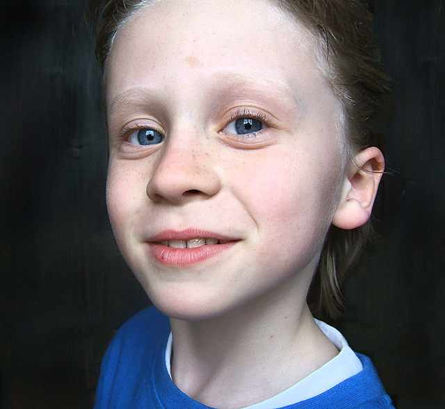
Nice "in-your-face" portrait of a cute young lady. The first thing that catches my eye are her blue eyes and the big square catch lights.
Composition:
I like the "in-your-face" feel of this image, but the crop is making me feel just a bit closterphobic. Back off just a hair in the crop and I feel your comp would be a little stronger.
Subject:
Sharp, in focus and stands out well from the background. Also, while it's not a classical portrait point of view, you have added interest to the subject by getting closer than usual.
Technical (Color, focus, and light):
Color: Good, I don't see much room for improvement here.
Focus: Sharp as a tack.
Light: Looking at the catch lights I see you have most likely used window light. It worked well for you. No unflattering shadows, yet the lighting doesn't come out too flat either.
To grow its vote?:
While I find the shot interesting and fresh, you possibly got some DNMC votes because of the background. It just doesn't look "studio" enough.
Summary:
What can I say, I think it's well done with "limited" resources. Keep up the good work.
Hope to see more from you soon,
Leroy |
|
 Photographer found comment helpful. Photographer found comment helpful. |
Comments Made During the Challenge  |
|
|
04/22/2006 03:16:15 AM |
| Nice and natural, I like!!! |
|
| Photographer found comment helpful. |
|
|
04/21/2006 11:47:33 AM |
| I have told a lot of people in this challenge that wide angle lenses are a big no no for portrait photography, unless of course you know how to use them and this is a good example of how it should be done if you want to use a wide angle, you obviously know enough about photography that you can break the rules and still make it work. Nice lighting. |
|
| Photographer found comment helpful. |
|
|
04/20/2006 09:14:10 PM |
| I think this would have worked better as an off-centered composition. Looks very good otherwise. |
|
| Photographer found comment helpful. |
|
|
04/19/2006 08:00:03 PM |
| Well now, little Sil seems to have a rather defiant look in his eyes...perhaps he has been up to a bit of mischief and fun? |
|
| Photographer found comment helpful. |
|
|
04/19/2006 04:17:06 AM |
| very funny and cute barrel distortion effect! :) |
|
| Photographer found comment helpful. |
|
|
04/18/2006 04:24:48 PM |
| Too closeup wide angle for my liking. |
|
| Photographer found comment helpful. |
|
|
04/17/2006 03:19:26 AM |
| Sil is a very cute girl. I like the wide angle choice here. 7 from me |
|
| Photographer found comment helpful. |
|
|
04/17/2006 01:32:52 AM |
|
| Photographer found comment helpful. |
|
|
04/17/2006 01:30:40 AM |
|
| Photographer found comment helpful. |
|
|
04/17/2006 01:16:24 AM |
| Perhaps too close for a wide-angle shot? The kid's forehead appears distorted. |
|
| Photographer found comment helpful. |
Home -
Challenges -
Community -
League -
Photos -
Cameras -
Lenses -
Learn -
Help -
Terms of Use -
Privacy -
Top ^
DPChallenge, and website content and design, Copyright © 2001-2025 Challenging Technologies, LLC.
All digital photo copyrights belong to the photographers and may not be used without permission.
Current Server Time: 03/10/2025 11:09:55 PM EDT.