| Author | Thread |
|
|
04/26/2006 01:06:03 PM |
*Howdy from the Critique Club*
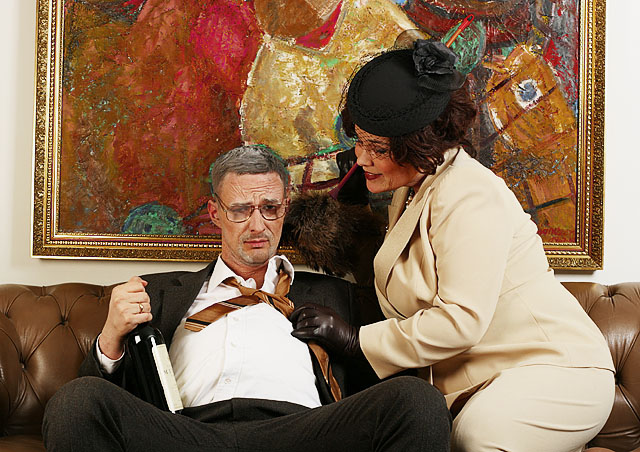
First of all, when I looked at it gave me a smile and as my eyes start to move around. The relationship between the picture and the couch are out and a little distracting.
Also if you would have moved your subjects over to your left about 6 inches this would have put his head in the red area and hers in the white. Because the green in the painting is around his head making it look strange. I know you did allot of set up for this shot, but you could always change the background to something else. Just my opinion.
His glasses seem smudged a bit I don't know if this was intentional or not. But I do know the voters see everything here.
Your lighting seems to be dead on, nothing to bright or dark.
You might also keep up your file size close to the 150K limit, so you don't loose any more detail than possible.
Over your photo has a nice funny story to it, I think you have fine image and keep up the good work. If you have any question feel free to ask.
Have a Great Day, Mark Thomas Kelsay |
|
 Photographer found comment helpful. Photographer found comment helpful. |
Comments Made During the Challenge  |
|
|
04/23/2006 04:14:51 PM |
even the painting is tilted! ;-)
very nice! |
|
| Photographer found comment helpful. |
|
|
04/23/2006 09:56:18 AM |
|
| Photographer found comment helpful. |
|
|
04/22/2006 09:22:37 PM |
Go get 'em !
Funny and really well done. |
|
| Photographer found comment helpful. |
|
|
04/22/2006 09:00:17 PM |
| I really like the image - a straighter crop etc. but I can't help but give it a high score. |
|
| Photographer found comment helpful. |
|
|
04/20/2006 09:11:23 PM |
| Color Studio Portrait challenge? DNMC |
|
|
|
04/19/2006 04:30:36 AM |
| the orientation of the image is awkward - due to the rotated painting hanging behind the subjects. But the wakwardness is caused mainly due to the combination of the rotated painting AND the tight cropping of this photo. |
|
| Photographer found comment helpful. |
|
|
04/18/2006 10:17:59 PM |
| Seems oversharpened to me. His right eye looks artificial or odd, maybe highlights cloned there? The titled painting disturbs me. |
|
| Photographer found comment helpful. |
|
|
04/18/2006 08:00:08 PM |
| superb! looks like these people are made of plastic. |
|
| Photographer found comment helpful. |
|
|
04/18/2006 03:17:15 PM |
| Your creativity in setting up this scene get you a 10. |
|
| Photographer found comment helpful. |
|
|
04/17/2006 09:21:07 PM |
| The sacrifice you make for England! Well set up. 10 |
|
| Photographer found comment helpful. |
|
|
04/17/2006 02:24:23 PM |
| The painting on the back wall adds a sense of tilt to the photo. |
|
| Photographer found comment helpful. |
|
|
04/17/2006 09:35:31 AM |
| Different, I like it, good luck. 9 |
|
| Photographer found comment helpful. |
|
|
04/17/2006 09:16:23 AM |
| White balance seems a bit to the yellow side and the painting in the background is crooked. A little bit of mood lighting rather than just full on, would have made this picture pop a bit more. |
|
| Photographer found comment helpful. |
|
|
04/17/2006 03:12:12 AM |
Where's the cigar? Sorry- I just couln't avoid thinking of Bill andMonica...
Wel done and a fun shot. Very sharp and good colors. 10 from me! |
|
| Photographer found comment helpful. |
|
|
04/17/2006 01:36:30 AM |
| More a candid than studio..... |
|
| Photographer found comment helpful. |
|
|
04/17/2006 01:30:53 AM |
|
| Photographer found comment helpful. |
|
|
04/17/2006 01:08:44 AM |
| Is the guy for real, or is he painted in? His hair looks really strange, as does one of his eyes.... |
|
| Photographer found comment helpful. |
Home -
Challenges -
Community -
League -
Photos -
Cameras -
Lenses -
Learn -
Help -
Terms of Use -
Privacy -
Top ^
DPChallenge, and website content and design, Copyright © 2001-2025 Challenging Technologies, LLC.
All digital photo copyrights belong to the photographers and may not be used without permission.
Current Server Time: 04/28/2025 07:06:06 AM EDT.