Hola! From the Critique Club!
Wassup Brian.
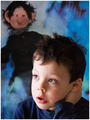
I think, for this challenge especially, that a tigher crop/composition were needed. The negative space here might seem artsy, but what people really wanted to see were faces, faces, and more of their faces. The top 9 were all tight crops, (#10 had other things distracting from the face) and 8 of the next 10 were tighter crops. That makes 17 of 20 at the top tight, mostly face crops in my estimation.
The negative space here is just a bit too much I think. The eyes are great, but, again, a tighter crop could have served to highlight them. He r face is turned a little too much away from the camera, and thus the viewer. Automatically takes a bit of the connection out of it. Turning her face down a bit and more toward the viewer, makes for a better pose.
The lighting is great, I like that, a bit more highlight on all the great hair would have done you well also. |