| Author | Thread |
|
|
05/26/2007 07:29:28 AM |
|
Comments Made During the Challenge  |
|
|
07/21/2002 10:54:00 PM |
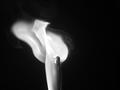
| Saw a similar shot over at Photosig -- don't think it's your work -- the dice look different. As silly as this will sound, it looks like you had a hair on the negative -- over on the left hand die at the top. The light coming out of the foreground holes is just a little too hot -- like the way it looks on the ones in the back better. I'm also gonna be picky in a stupid way. I know you meant for the 4 and 3 that point toward the camera to indicate the lucky number 7. But one of the dice actually has either a 6 or a 1 pointed up, and the other hase either a 5 or a 2. So this roller rolled either, 3, 6, 8, or 11. :-) Like I said being honery just for the sake of it. :-) |
|
|
|
07/21/2002 08:33:00 PM |
|
|
|
07/21/2002 06:21:00 PM |
| baby needs a new pair of shoes. i like this. i think i saw something similar on photosig - maybe that was yours also .. i would suggest slightly reducing the intensiity of the lights behind the collander, or using a little more fill. nice shot |
|
|
|
07/21/2002 02:34:00 AM |
| Like the b/w, but slightly distracted by too many holes in the bottom. Good focus on the die. |
|
|
|
07/20/2002 09:26:00 PM |
|
|
|
07/20/2002 08:34:00 PM |
| I don't think it's a good thing when the pips on the SIDES add up to seven... |
|
|
|
07/20/2002 05:24:00 PM |
| Nice idea.... i like the light filtering.. and the shadow effects |
|
|
|
07/20/2002 02:07:00 PM |
Lovin' it. Really great. Only one small thing. Whatever material is under the dice, is a little scratchy and distracting. If it was perfectly smooth, it would truly be an awesome photo. But I still like this very much. Great Work.
Ruthann |
|
|
|
07/20/2002 11:58:00 AM |
| Wonderful tabletop shot. Good reflections, strong, but not dominating the frame. The ceiling lights work well to draw the eye and encircle the subjects. Excellent work! |
|
|
|
07/19/2002 07:26:00 PM |
| Maybe too much glare from the lights in the front. 7 Swash |
|
|
|
07/19/2002 03:09:00 PM |
| I like the use of the round lights on the table here to counter the black spots of the dice. The reflection is a nice touch as well. |
|
|
|
07/19/2002 01:03:00 PM |
| was this taken on film...??? Notice the hairmark.... |
|
|
|
07/19/2002 11:13:00 AM |
| I'm sure Thomas Dybeck would be flattered! This is a good rendition of his 'Game of Dice 2' but what I like about his that seems to be lacking in yours is the softness - you don't see the crisp sharpness of the holes in the colander or the dots on the dice. I think you have the lighting down, but perhaps if you got a bigger colander and backed up - then again, perhaps you weren't out to duplicate but to borrow? In any case it's very good. 7 cthenk |
|
|
|
07/19/2002 12:22:00 AM |
|
|
|
07/18/2002 06:11:00 PM |
| Seems to work well as far as composition, light, shadow and some originality. |
|
|
|
07/18/2002 08:45:00 AM |
| Gooood. Black circles on cubes and light circles on the surface - excellent. |
|
|
|
07/18/2002 08:21:00 AM |
| I think this is a really neat concept :) I think that the image would be better if the light in the holes in front of the dice was toned down a bit and not so bright... = 8 - jmsetzler |
|
|
|
07/18/2002 04:58:00 AM |
|
|
|
07/17/2002 05:50:00 PM |
| nice blacks and whites. good lightinh. |
|
|
|
07/17/2002 02:07:00 PM |
| Nice picture and concept. Black adn white works well I think, though it might also be interesting to do with some of those gel colored dice and colored lights too. This would be a great poster in a rec room. karmat |
|
|
|
07/17/2002 10:11:00 AM |
| Oooh. Dice and spots and reflections. very nice. |
|
|
|
07/17/2002 08:21:00 AM |
| good contrast, composition, stands out |
|
|
|
07/17/2002 06:15:00 AM |
| nice play of lights and darks |
|
|
|
07/17/2002 03:16:00 AM |
| i love the lighting here. very interesting image visually. :) |
|
|
|
07/16/2002 04:13:00 PM |
| I dig it. The lights and reflections work well here. But I think I'd like to see the lights extending to the top of the frame. Also the line on the bottom right is distracting. PS - I just saw a similar shot on photosig - your inspiration? |
|
|
|
07/16/2002 04:04:00 PM |
|
|
|
07/16/2002 02:40:00 AM |
| i love this shot. the reflections are really nice, and I love how you have black dots on white, and white dots on black. A work of art. |
|
|
|
07/15/2002 11:42:00 PM |
|
|
|
07/15/2002 10:23:00 PM |
| Wow, cool picture, let me know if i'm wrong - something smeared on the glass to catch the light from below. Only nitpick is the bit of dust on the left die. |
|
|
|
07/15/2002 06:06:00 PM |
|
|
|
07/15/2002 03:55:00 PM |
| Nicely lit and composed. Good lighting. |
|
|
|
07/15/2002 01:59:00 PM |
|
|
|
07/15/2002 01:15:00 PM |
| Super light, good work. Creative too. Kee |
|
|
|
07/15/2002 06:34:00 AM |
| Beautiful play of light, contrast, reflections, and space. |
|
|
|
07/15/2002 05:36:00 AM |
|
|
|
07/15/2002 03:31:00 AM |
| Neat shot, I like the lighting. Black and white also works well here. |
|
|
|
07/15/2002 03:00:00 AM |
| This is very creative and interesting. |
|
|
|
07/15/2002 12:28:00 AM |
| Very nice shot! I espically like the "floor".. |
|
Home -
Challenges -
Community -
League -
Photos -
Cameras -
Lenses -
Learn -
Help -
Terms of Use -
Privacy -
Top ^
DPChallenge, and website content and design, Copyright © 2001-2025 Challenging Technologies, LLC.
All digital photo copyrights belong to the photographers and may not be used without permission.
Current Server Time: 03/12/2025 07:16:10 PM EDT.