| Author | Thread |
|
|
05/08/2006 11:43:40 PM |
Hello from the critique club,
I see this is your first challenge, so welcome to DPC. This entry didn't do very well, but I hope that doesn't discourage you from contributing more in the future.
Here are my comments of your image.
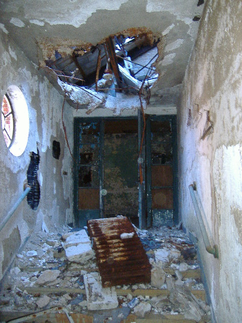
I think the complementary colors you are going for are blue and orange. As most of the comments you got mention it was too much of a stretch for the challenge, which is the biggest reason it did so poorly. Although present, the blue and orange are not dominant enough in the image to fit into 'complementary colors'
I like the textures that you have found here. There is alot going on visually. My eye is mostly drawn between the window, the heater and thebig hole in the ceiling. It is kind of a haphazard composition, but it is a haphazard subject, so it seems to fit.
I wonder if you could have found a more interesting angle from which to shoot this. Maybe kneeling down shooting up so the heater is in the foreground and the hole is above it in the background? I think a more dynamic angle and perspective would 'tell the story' of this scene more effectively.
Good luck in future challenges! Please feel free to pm me if you have any questions about my comments.
Liza |
|
Comments Made During the Challenge  |
|
|
05/02/2006 09:32:03 PM |
| Interesting textures, but I don't see complementary colors. |
|
|
|
05/02/2006 09:19:38 AM |
| I'm not sure this one was meant for this submission...not much color... :) |
|
|
|
05/01/2006 06:28:08 PM |
| Not very attractive or interesting, nor are there complementary colors. |
|
|
|
05/01/2006 01:58:43 AM |
| There seems to be almost no color in this photo, despite the challenge topic... |
|
|
|
04/30/2006 04:43:28 PM |
| very grainy,and I'm not sure what the complementary colors are supposed to be here but interesting subject. |
|
|
|
04/30/2006 02:19:21 PM |
| Not quite seeing the compliments here I'm afraid ;( |
|
|
|
04/30/2006 11:24:11 AM |
| how does this fit the challenge |
|
|
|
04/30/2006 11:12:01 AM |
| Maybe it's m bad eyes, but this image looks to be OOF and noisey. Also, I seem to be missing the complementary colours in the image? JMO |
|
|
|
04/29/2006 12:29:10 PM |
| maybe better in black and white ? |
|
|
|
04/29/2006 09:27:03 AM |
| can't see the complementary colors |
|
|
|
04/29/2006 07:56:22 AM |
| Sorry, I don't see 'complimentary colours' in this nor do I find it stimulating in any way. |
|
|
|
04/28/2006 10:44:23 AM |
| I'm not sure how this fits the challenege. Image looks a little over sharpened or something. |
|
|
|
04/28/2006 03:22:26 AM |
| I don't get this photo at all... I am searching and searching, but cannot see the color. 1 |
|
|
|
04/27/2006 09:49:49 PM |
|
|
|
04/27/2006 09:00:29 PM |
| 1 - Bit of a stretch to meet the Challenge - maybe sharper and 'tweaking' in pp may have created something, who knows. Overall, a bit snapshottish as is, in my opinion. |
|
|
|
04/27/2006 10:32:21 AM |
|
|
|
04/26/2006 11:20:15 PM |
| good shot.. but it doesnt suit the challenge |
|
|
|
04/26/2006 08:16:41 PM |
| To be honest, this seems more like "here is a shot I took this week" than a conscious entry into a complementary colors challenge. |
|
|
|
04/26/2006 07:45:38 PM |
| Hmmm, this must be a wrong entry. This one is really interesting. Not sure what to think. I don't think the photo is all that great, but I'm curious as to what the rusty thing is. |
|
|
|
04/26/2006 07:24:25 PM |
| Wonderful. Not on task, no complementary colors, very poor quality, you got it all. |
|
|
|
04/26/2006 07:02:17 AM |
| I'm not seeing complementary colors here (appears as blue and brown) |
|
|
|
04/26/2006 04:49:52 AM |
| are you sure you are on the right website? |
|
Home -
Challenges -
Community -
League -
Photos -
Cameras -
Lenses -
Learn -
Help -
Terms of Use -
Privacy -
Top ^
DPChallenge, and website content and design, Copyright © 2001-2025 Challenging Technologies, LLC.
All digital photo copyrights belong to the photographers and may not be used without permission.
Current Server Time: 03/13/2025 01:30:01 AM EDT.