| Author | Thread |
|
|
07/23/2002 12:43:00 PM |
Thanks everyone for your comments. I'll probably be working on a "how'd they do that?" for this, so be on the lookout if you're interested.
|
|
Comments Made During the Challenge  |
|
|
07/21/2002 11:38:00 PM |
| This shot is great, and I'm sure it's received a lot of discussion. Contact me about doing a "how'd they do that?" :) |
|
 Photographer found comment helpful. Photographer found comment helpful. |
|
|
07/21/2002 01:15:00 AM |
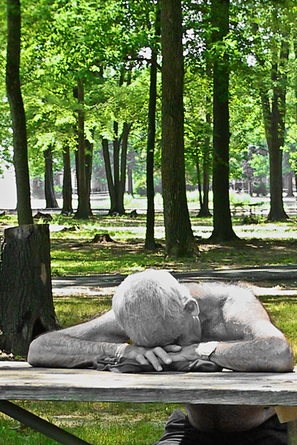
| I think I would've liked the picture better if it was all in color or all in black and white. I find I'm distracted by the color change instead of struck by it. Nice idea though. |
|
| Photographer found comment helpful. |
|
|
07/20/2002 09:50:00 PM |
|
|
|
07/20/2002 06:18:00 PM |
| I like it but it would have been better if the color could have been removed from all of his body. The spots of color are really distracting on his neck, tummy, shoulder... |
|
| Photographer found comment helpful. |
|
|
07/20/2002 05:07:00 PM |
| That is really a cool effect. I think that the combo color photos are extremly good. |
|
| Photographer found comment helpful. |
|
|
07/19/2002 04:44:00 PM |
| Very interesting photo. The combination of the composition and the "bleaching" effect is superb. |
|
| Photographer found comment helpful. |
|
|
07/18/2002 10:38:00 PM |
| bizzare. this one has me 50/50 I just can't decide if I like the effect or not. I do like the bright green. 5 cthenk |
|
| Photographer found comment helpful. |
|
|
07/18/2002 09:31:00 PM |
| interesting for sure, can't wait to see how it's done. |
|
|
|
07/18/2002 06:22:00 PM |
| An often used manipulation but it sems valid her. The lack of detail in the BG is a distraction. |
|
| Photographer found comment helpful. |
|
|
07/18/2002 12:33:00 PM |
| wow cant wait to hear this one 6 |
|
|
|
07/18/2002 08:48:00 AM |
| Crop the trunk on the left, all area beneath the desk. Consider lower angle on the subject. |
|
| Photographer found comment helpful. |
|
|
07/18/2002 08:24:00 AM |
| effective concept; composition needs more balance on right, middle or upper third |
|
| Photographer found comment helpful. |
|
|
07/18/2002 04:15:00 AM |
|
|
|
07/17/2002 06:53:00 PM |
| I like it, would like to know how this was done....love the contrast between the man and the color background, shows more emotion. great shot. |
|
| Photographer found comment helpful. |
|
|
07/17/2002 05:27:00 PM |
| Wow, thank god for the Admin. How did you get this almost black and white look? Cool and nicely done. 8 Swash |
|
| Photographer found comment helpful. |
|
|
07/17/2002 01:29:00 PM |
|
|
|
07/16/2002 10:17:00 PM |
| neat.. i can see how you adjusted the levels..the subject and the background are close to the same colors |
|
| Photographer found comment helpful. |
|
|
07/16/2002 05:19:00 PM |
| Can't wait to hear how you did this! |
|
|
|
07/16/2002 02:35:00 PM |
| When the challenge is over please write up a "how'd he do that" for this shot. Very good work, the coloring effect does much to bring out the subject and strengthen the photograph. Very nice work! |
|
| Photographer found comment helpful. |
|
|
07/16/2002 02:34:00 PM |
| Clever effect--bleached out man and exuberant nature |
|
| Photographer found comment helpful. |
|
|
07/16/2002 11:20:00 AM |
| I love the fact that you stepped out and submitted something that caused people to wonder in here. I voted on this before the validation was made and my score reflected more on what is said in this photo...I love the title "rest" and the subject is good. 7 - KDJohnson |
|
| Photographer found comment helpful. |
|
|
07/16/2002 11:19:00 AM |
| This is great - please do a tutorial when the challenge is finished! = 10 |
|
|
|
07/16/2002 09:40:00 AM |
| interesting use of colour desaturation on the skin pigments/ reds. Don't know that I see what you are trying to convey with the effect though. |
|
|
|
07/16/2002 06:38:00 AM |
| I'd like to know what those legal modificatinos were |
|
|
|
07/15/2002 11:41:00 PM |
| nice picture, cool effect, but overall ho hum subject. |
|
| Photographer found comment helpful. |
|
|
07/15/2002 11:38:00 PM |
| This is disturbing to me...looks more like death. Just not something I like to look at. Technically, not that great either. I think whatever method you used to achieve the b&w and color mix is neat and could be used on some other subject matter much more successfully. 5 Lisa |
|
| Photographer found comment helpful. |
|
|
07/15/2002 10:08:00 PM |
| Great shot, great effect. Awesome framing and composure. |
|
| Photographer found comment helpful. |
|
|
07/15/2002 09:26:00 PM |
| Very cool effect. I would have liked to see less of the trees in the background though. |
|
| Photographer found comment helpful. |
|
|
07/15/2002 09:10:00 PM |
| This is interesting. I'd like to know how you did this (although I'm sure I'll have to stand in line). However, I don't see how the trees in the background add to this picture, or at least not the top third of the picture. |
|
| Photographer found comment helpful. |
|
|
07/15/2002 08:46:00 PM |
| great effects. how did you do it? |
|
|
|
07/15/2002 05:40:00 PM |
| At first I thought silver makeup then I scroled down and saw the admin note. So now please tell us how this effect was acheived through legal image modifications. |
|
|
|
07/15/2002 04:55:00 PM |
| It's sure different. I do like it. Kee |
|
|
|
07/15/2002 04:35:00 PM |
| Great colors. He looks like he could use the rest. 8 |
|
| Photographer found comment helpful. |
|
|
07/15/2002 03:50:00 PM |
| Very Cool.. I notice very small spots of skintone creeping in, however just being so much different than everyone else's it caught my eye and recieved an 8. If the skin tone had not shown some I wopuld have given it a 9. I would like to see a Tutorial on this if possible. |
|
| Photographer found comment helpful. |
|
|
07/15/2002 03:31:00 PM |
| Looks like an interesting use for chanels. |
|
|
|
07/15/2002 01:44:00 PM |
I really like this affect. Im actually messing with it myself. Unfortunatly I believe It is not allowed for this photo contest. for this reason i have to give a mediocor rating.
P.S.I just got the note on the validation of this photo so ill upgrade my vote. |
|
|
|
07/15/2002 01:18:00 PM |
| Is that a statue? I like the shot. |
|
|
|
07/15/2002 12:35:00 PM |
| I'm reminded of Beckett's Stirrings Still when I look at this, but I have my doubts about the intention. I think this would look better all B&W or with the colours much more muted; the framing could be improved by reducing the stretch of trees above. This is still the most evocative piece this week and it deserves a 10 on artistic merit alone. |
|
| Photographer found comment helpful. |
|
|
07/15/2002 12:31:00 PM |
| How did you make the man just black and white? *6* --balynch |
|
|
|
07/15/2002 10:40:00 AM |
| Uhm... doesn't this photo break the rules? It doesn't need that de-colourzation. |
|
|
|
07/15/2002 07:50:00 AM |
| I like it, not sure why, but I do. |
|
|
|
07/15/2002 07:43:00 AM |
| This photo conveys a feeling of desperation to me. (Of the subject, NOT the photographer!) The contrast between the subject and the pastoral setting behind him is very unsettling. |
|
| Photographer found comment helpful. |
|
|
07/15/2002 06:56:00 AM |
| How is this not photoshopped? |
|
|
|
07/15/2002 01:39:00 AM |
|
|
|
07/15/2002 01:22:00 AM |
| what ever you di, I do not like it, that worst of digital manipulation. |
|
|
|
07/15/2002 01:19:00 AM |
| Interesting effect, whatever it is :) I commented earlier about the edit not being allowed and I will now adjust... This has a really ghostly effect and I like it :) = 7 - jmsetzler |
|
| Photographer found comment helpful. |
Home -
Challenges -
Community -
League -
Photos -
Cameras -
Lenses -
Learn -
Help -
Terms of Use -
Privacy -
Top ^
DPChallenge, and website content and design, Copyright © 2001-2025 Challenging Technologies, LLC.
All digital photo copyrights belong to the photographers and may not be used without permission.
Current Server Time: 03/12/2025 03:09:22 PM EDT.