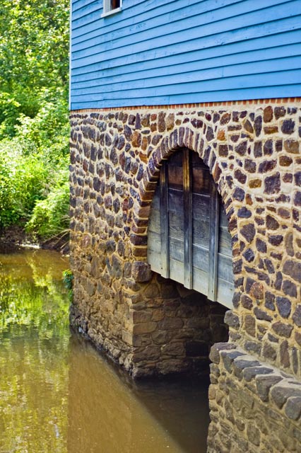
The grist mill in Walnsford, Upper Freehold NJ
The third mill rebuilt after a fire in 1872 represented the \\\"peak\\\" or \\\"state of the art\\\" in grist mill design. Unfortunaly grist milling (grinding corn between large stones) was on it\\\'s way out as an industry!) Today there seems to be hundreds of \\\"stone Ground\\\" products on supermarket shelves, the revival is too lat for Waln\\\'s Mill!
Statistics
Place: 251 out of 281 Avg (all users): 4.8696 Avg (commenters): 5.0000 Avg (participants): 4.7059 Avg (non-participants): 5.0732 Views since voting: 838 Views during voting: 231 Votes: 184 Comments: 6 Favorites: 0
This is your entry in Architecture III, and I think it definitely meets the challenge. It's a good subject. Nice interest in the arch (arches just seem to always be so photogenic), and the varying textures of brick, wood and water. I like the angle from which you've shot this. I think it has some good dynamics and 'flow' to the composition. Looks like it was pretty bright at the time, exposure looks good. The image does appear to be a touch on the soft side. There could be different factors here. Did you use a tripod? If not, there could be a little bit of camera shake, although you did have a good fast shutter speed. Possibly a thing to consider would be for a shot like this, maybe going for a little smaller aperture, getting a slightly deeper dof, you can see where at the far edge of the bricks, it is starting to blur, might be nice to show off the detail all across the structure. Since it is just slightly soft, I am wondering if in processing, you used USM on it? Some usm could make the shot more crisp.
I am looking at the shadow and brightness of the light on the trees, and wondering what time of day this was. My guess would be mid-day, or early to mid afternoon? I obviously don't know how the building sits, but if you could catch a time of day to get some low raking light across the structure, it could really show off the texture in the brick face, and really add some tonal depth. It also seems like a little tweaking of basic adjustments could be beneficial. Some levels, curves and or selective color. Hard saying without knowing what editing steps you already used.
Compositionally, like I said, I like the angle, but I think you may have fallen in a place where the image is wanting either a little more, or a little less. I'll try to explain what I mean both ways here. If you went with less- a bit tighter crop, would lose the cut off window at the top for one thing. Something you want to avoid in compositions generally is 'cutting' things off in the frame. It usually comes across as almost haphazard like. The composition should be thought out and things either contribute to the overall image, or shouldn't be there :-) The same with the greenery at left edge. Just a sliver of foliage there doesn't seem to add a whole lot to the shot. Which brings us to the other possibility of going with more- back off, get more of the scene in frame. Include the whole window, more of the greenery, etc. Without seeing the whole building/scene, it is hard to say. I think personally, I would have probably gone for a tighter approach, and really tried to highlight the brick texture and that cool arch and the water. But that's just me :-) Anyways, something maybe to consider in the future.
Overall, not a terrible shot by any means, IMO, just could use a little tweaking here and there. Definitely an interesting subject that looks like it would be well worth exploring further. If you have any questions, or comments or anything, please feel free to contact me.
Very interesting subject but I would have cropped it more to get rid of the foliage on the left. I'd also have cloned/cropped out the small portion of the window at the top. IMNSHO, this would give you a much more powerful graphic image.