Hello from the CC:
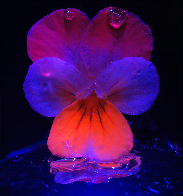
First impression: This is an "in your face" shot, both because of the vivid colours on black background, and because you pretty much filled the frame with the pansy. I think that a lot of viewers might have thought, "Weird!", when first being presented with this image.
It is a good match for the challenge.
Exposure looks to be right on.
Focus is quite good, except for a couple water drop (middle left side). IMO, if you're going to have stuff out of focus, it HAS to look like it is out of focus on purpose (especially for DPC voters), and even then most people will mind :)
Lighting is good, but it looks a bit stronger on the left, that is, the right side looks to be more in shadow. It is not slanted enough to create shadow textures, yet it is not right on either. I am not sure exactly what to think of it, but IMO, in this case, it would have aided the image to have even lighting.
Composition is good, I see nothing wrong with it. Centred does work some times. This image, even though it is centred, doesn't give the feeling of centred, I think mainly because of the horizontal colour striping (I like that). The pansy looks rather static (which I guess it is). The droplets look a bit like gel rather than water.
Artistic: This is a well done, solid image, but from an artistic point of view it seems to be lacking that little extra pizzaz that would make it a beautiful image for beauty's sake, or a message/story that would speak to the viewer (or maybe both).
Overall Right about 6.0 is a good score. As above, this is a well done solid entry. The colours in particular are lovely.
---------------
If you have any questions/comments/complaints, feel free to contact me. Take care,
~Ursula
|