| Author | Thread |
Comments Made During the Challenge  |
|
|
07/27/2002 03:14:00 PM |
Nice focus and clarity. Just not that appealing to me. 7
Ruthann |
|
|
|
07/27/2002 02:41:00 PM |
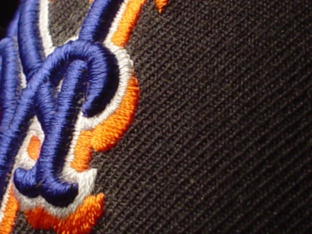
| very nice texture image... I would love to see a little more sharpness on the embroidery and less on the hat texture... = 7 - jmsetzler |
|
|
|
07/27/2002 05:18:00 AM |
| A little mor focus woud have pulled out the texture better"5" Dogman:-) |
|
|
|
07/26/2002 12:21:00 AM |
| This image improved greatly once I adjusted my monitor. Sorry about the low score all week, but I'm bumping you 1 point to a 5. I would have bumped you 2, but I hate the Mets :) Not fair? true... but neither is life :) |
|
|
|
07/25/2002 02:02:00 PM |
| You probably had a reason for cropping the way you did but I fail to see what that is. On the one hand you say the logo is important (since there's nothing else on the image) but on the other hand you say it is not worthy of showing it in its entirety. This doesn't do much for me. |
|
|
|
07/25/2002 01:32:00 PM |
| not focused as sharp as it could be, also i dont really like the fact that the black takes up 2/3 of the photo |
|
|
|
07/25/2002 01:18:00 PM |
| cool idea but a frontal shot tends to flatten the textures out a bit and loses the highs and lows...giving the material a more front to back shot with a background out of the focal range would add some contrast and interest to the texture....5...hokie |
|
|
|
07/25/2002 11:46:00 AM |
| definitely a texture. a bit fuzzy. right side a little dark. mnaybe move the camera to the left a little... |
|
|
|
07/24/2002 11:21:00 PM |
| Nice idea and composition, but it needs a little more depth of field to make it work. |
|
|
|
07/24/2002 03:48:00 PM |
| One of the finest photos of team wear I've seen. I'd look in the hat, see who the manufacturer is and sell this puppy to them for their annual report, next rade show display, press kit, etc. Formerly an editor at a national trade publication dealing with the sporting goods industry, I can say with some authority that this is a very marketable photo (IMHO). I've been in health care for several years now and can no longer give you a name of a decision maker. I'm sorry, because this is truly well-done. |
|
|
|
07/24/2002 02:42:00 PM |
Composition7
Originality9
Technical Aspects5
Meets Challenge6
Total Score7
For those that are just learning, like me.
Composition: Scoring in this area is based on basic composition of a picture and includes the rule of thirds, balance, cropping, and curved and diagonal lines. Subject matter that does not lend itself to the picture or otherwise unwanted is also considered here.
Originality: Scoring in this area is based on pictures or concepts that I have seen, as well as how much effort you have invested in the picture. Usually a little something that sets it aside from a snapshot. Does it make me want to come back for another look? You know things like that.
Technical Aspects: Focus, exposure, lighting, and other special effects (done by the camera), and post processing are all considered in this category.
Meets Challenge: This is based on my interpretation of if you, have/have not, met the challenge. This is fairly simple but quite important for this site.
There are many sites that can give you assistance in achieving better skills in photography, but I think the best way to learn is to take pictures and show them to other people. Believe me when it is a good one you will know it.
Good luck!
Autool
|
|
|
|
07/24/2002 01:15:00 PM |
| i can't recognize that symbol, but i'm pretty sure its some sports team =p |
|
|
|
07/23/2002 11:43:00 AM |
|
|
|
07/22/2002 07:04:00 PM |
| I might have focused on the left hand side rather than the centre |
|
|
|
07/22/2002 06:14:00 PM |
| I do like the texture of the hat, but I think that the DOF might be a bit soft. |
|
|
|
07/22/2002 04:10:00 PM |
| this shot could've benefited from sharpening, it would've brought out the texture much more. i do likethe colors and the texture in the shot, in fact, i think i would like to see more of the logo. also, was there a way of positioning this so that the TL corner would've been not just black background but more of the black fabric? -- gr8photos (3) |
|
|
|
07/22/2002 03:32:00 PM |
| this looked promising in thumbnail format, but full size I'd say there's a clear lack of focus, or an extremely shallow DOF? 4 beegee |
|
|
|
07/22/2002 10:36:00 AM |
| I think this could of been more crisp. Sitll I do like it, and the colors. Kee |
|
|
|
07/22/2002 10:20:00 AM |
| extra point because I'm a Mets fan! ha ha |
|
|
|
07/22/2002 06:43:00 AM |
|
Home -
Challenges -
Community -
League -
Photos -
Cameras -
Lenses -
Learn -
Help -
Terms of Use -
Privacy -
Top ^
DPChallenge, and website content and design, Copyright © 2001-2025 Challenging Technologies, LLC.
All digital photo copyrights belong to the photographers and may not be used without permission.
Current Server Time: 03/13/2025 03:44:54 PM EDT.