| Author | Thread |
|
|
08/08/2006 07:58:59 PM |
Greetings from the Critique Club
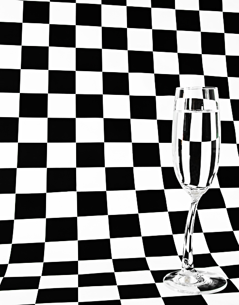
First, I really appreciate including the photographer's comments - I find it both educational and enjoyable to read about how people set up, execute, and process their shots. Second, I'm quite impressed with the effort you put into creating the paper!
This is a good variation on a repeated theme here at DPC. The fact you've curved the background and not lined it up completely square/straight seemed to bother some commenters. To me, though, it seems quite complementary to the curves of the glass and adds an element of interest that wouldn't be there with perfectly straight lines.
I'll agree with one commenter that it's nice not to have the glass centered, but will also agree that I find it a bit too close to the right side of the frame.
Lighting is good - even if it was something you corrected in post processing - the final product shows no colorcast, no obvious underlit or overlit areas.
There are some visible 'jaggies' but I've yet to find a way to recommend to you to avoid those with very distinct lines presented on a video screen. These are not overly distracting, though.
A good finish and a nice addition to your top row on your profile page. |
|
 Photographer found comment helpful. Photographer found comment helpful. |
Comments Made During the Challenge  |
|
|
08/01/2006 10:28:11 AM |
| The difference in the vertical lines and the border is somewhat distracting |
|
| Photographer found comment helpful. |
|
|
07/31/2006 06:22:36 PM |
|
| Photographer found comment helpful. |
|
|
07/31/2006 05:01:05 PM |
| Boy this has become cliche. Anyway, in this case your glass seems too far to the right and the line of your background are more distracting than anything because they aren't even close to straight. Sorry, just the way I see it. |
|
| Photographer found comment helpful. |
|
|
07/31/2006 09:43:21 AM |
| Nicely executed - even with the subject near the edge. |
|
| Photographer found comment helpful. |
|
|
07/31/2006 06:37:01 AM |
Okay, I'll be perfectly honest. In the thumbnail, it looked very "wow", but then on the large version, not so good. The lines weren't even trying to be straight, and I usually think on this type of photo, they need to be. I see how maybe (and this is just my guess), that you thought that the checkers should be askew because of the stem of the glass not being straight. I personally think one or the other is enough--you don't need both to be not straight on a type of photo like this.
I give this a 6. |
|
| Photographer found comment helpful. |
|
|
07/30/2006 03:29:34 PM |
| Clever photo and title...to bad it's the truth. Living in Las Vegas and working in Emergency Medicine...we get a lot of calls for people whom have had their drinks 'spiked' with other then alcohol. |
|
| Photographer found comment helpful. |
|
|
07/29/2006 10:51:26 PM |
| I like the contrast between the lopsided stem and the regular, square background. |
|
| Photographer found comment helpful. |
|
|
07/29/2006 09:10:32 PM |
| Another variation on the same concept as my entry. I like it! |
|
| Photographer found comment helpful. |
|
|
07/29/2006 01:50:36 PM |
|
| Photographer found comment helpful. |
|
|
07/29/2006 01:00:52 AM |
| i love the bend in the stem of the glass! it accentuates the effect the goblet gives |
|
| Photographer found comment helpful. |
|
|
07/27/2006 03:02:57 PM |
|
| Photographer found comment helpful. |
|
|
07/26/2006 05:50:40 PM |
|
|
|
07/26/2006 04:31:27 PM |
| Old idea, badly executed. |
|
|
|
07/26/2006 03:55:56 PM |
| I like that you did NOT place the glass in the center. Great photo. |
|
| Photographer found comment helpful. |
|
|
07/26/2006 12:41:39 AM |
| "WOW" factor here, and this is one of my favorites in this challenge..... |
|
| Photographer found comment helpful. |
Home -
Challenges -
Community -
League -
Photos -
Cameras -
Lenses -
Learn -
Help -
Terms of Use -
Privacy -
Top ^
DPChallenge, and website content and design, Copyright © 2001-2025 Challenging Technologies, LLC.
All digital photo copyrights belong to the photographers and may not be used without permission.
Current Server Time: 03/12/2025 07:51:58 PM EDT.