| Author | Thread |
Comments Made During the Challenge  |
|
|
08/04/2002 10:39:00 PM |
Composition - good
Technical Aspects - quite good.
Meets Challenge - yes
Visual Impact / Originality - high. Art is good!
|
|
|
|
08/04/2002 04:22:00 PM |
|
|
|
08/03/2002 03:29:00 PM |
|
|
|
08/03/2002 11:47:00 AM |
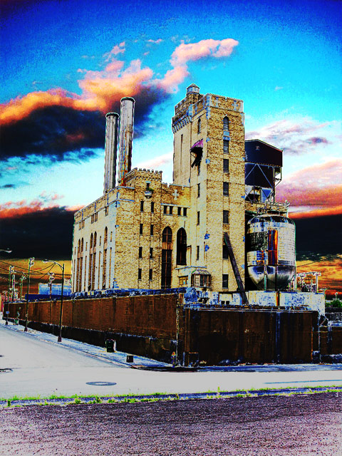
| the "grain", the stark colors, the tilt -- it all makes it seem surreal. i like it. karmat |
|
|
|
08/03/2002 02:31:00 AM |
spiffy image, very nice. a bit on the artsy side, but so what. ~mcmurma
Aesthetics...9
Meets Challenge...9
Overall...9 |
|
|
|
08/02/2002 12:05:00 PM |
| I love the cranking up of the different levels. -10 |
|
|
|
08/01/2002 11:07:00 PM |
| I love the post-processing on this! |
|
|
|
08/01/2002 10:46:00 PM |
| truly incredible effect. i guess this is a posterize of some kind. it looks like an incredible combination of a drawing and photo. like monty python or ralph bakshi, or Pink Floyd's the Wall. it 's a little tilted to the right... love it. 8. mag99. |
|
|
|
08/01/2002 01:09:00 AM |
| nice and artsy. reminds me of a grateful dead or pink floyd cover! nice use of overprocessing. 9--amitchell |
|
|
|
07/31/2002 07:55:00 PM |
| i really like the wacky colors and textures here...looks toxic! I even like the slight crookedness of the angle/leaning building. 8 LIsa |
|
|
|
07/31/2002 02:37:00 PM |
| Clever and interesting post processing |
|
|
|
07/31/2002 12:53:00 PM |
| I like the colour effects on this. Good image. |
|
|
|
07/31/2002 07:41:00 AM |
| Good use of a filter. It adds color and contrast to this photo. |
|
|
|
07/30/2002 07:00:00 PM |
| I kinda like. I don't like the posterize effect too much. I do like the heavy saturation though. |
|
|
|
07/30/2002 11:39:00 AM |
Very colorfull save for what I am guessing was a rather dull pictrure. Could you send me a 'how to', most of my pictures could benifit from this technique. :-)
I like it, one of my top picks. |
|
|
|
07/30/2002 10:41:00 AM |
| Very artistic and it fits the challenge� But there is something I can't quite put my finger on with this picture� Sorry, but I'm not sure what it is that I don't like about it. Perhaps it is the filter that detracts from the overall picture. Hopefully, the other voters will be a little more constructive� |
|
|
|
07/30/2002 07:22:00 AM |
| I like the colours in this picture. It could possibly be improved by sticking with the colour range in the bottom third, through desaturation or less contrast. Possibly a bit too much of a battle between orange/red and the blue at the top, making it imbalanced. |
|
|
|
07/30/2002 06:04:00 AM |
| is that from a digital camera? if yes, how to do that? |
|
|
|
07/30/2002 12:48:00 AM |
| Whoa! Too much manipulation. I think I would have really liked this photo in it's original form. |
|
|
|
07/29/2002 10:27:00 PM |
| Intresting use of solarize with this picture, I think it really works here. Looks like you have some vinetting on the top corners of your picture don't know if it was intentional but it is a little distracting. The way the colors are here really suggests the dullness of the corprate world when surrounded by the gradure of a sunset. Nice job one of my favorites. Score 8 ------- Corey |
|
|
|
07/29/2002 09:03:00 PM |
| I think you over did it a little.I would like to see this building as a straight print--its really interesting. |
|
|
|
07/29/2002 06:25:00 PM |
| It looks like you used a posterization/color-channel quantization effect. I personally feel this effect works best with more abstract subject matter or daring composition. It might have worked better for me if you got closer to the building, and used a more interesting camera angle. |
|
|
|
07/29/2002 04:26:00 PM |
| It does meet the challenge and I do like the title. Just find the manipulations overdone |
|
|
|
07/29/2002 02:36:00 PM |
| Very, very cool!! How did you do that?????????? I love it, and it's totally corporate to me. Great job! lhall |
|
|
|
07/29/2002 02:32:00 PM |
|
|
|
07/29/2002 01:59:00 PM |
| Great photo. I like what you did to the color. Focus is good, lighting is good. Subject matter is good. 8... |
|
|
|
07/29/2002 01:40:00 PM |
| I like the color treatment |
|
|
|
07/29/2002 01:22:00 PM |
| Nice Photoshopping. Nothing else to say. |
|
|
|
07/29/2002 12:12:00 PM |
|
|
|
07/29/2002 12:00:00 PM |
| very good use of color to set the mood |
|
|
|
07/29/2002 09:28:00 AM |
| I like the color effects and graniness. They work well with this picture. |
|
|
|
07/29/2002 08:19:00 AM |
| Doesnt this break the rules about filters? Other than that - good shot but it looks kinda like it's leaning to the right. |
|
|
|
07/29/2002 03:18:00 AM |
| nice use of inversion to create a surreal, pointillistic effect. |
|
|
|
07/29/2002 02:16:00 AM |
| outstanding colors...could not have done better... |
|
|
|
07/29/2002 01:21:00 AM |
| you have done too much editing with this. |
|
|
|
07/29/2002 01:06:00 AM |
| interesting photo, but the post processing isn't working for me... it is almost over the limit of still looking like a photograph... - jmsetzler |
|
Home -
Challenges -
Community -
League -
Photos -
Cameras -
Lenses -
Learn -
Help -
Terms of Use -
Privacy -
Top ^
DPChallenge, and website content and design, Copyright © 2001-2025 Challenging Technologies, LLC.
All digital photo copyrights belong to the photographers and may not be used without permission.
Current Server Time: 03/13/2025 03:45:03 PM EDT.