| Author | Thread |
Comments Made During the Challenge  |
|
|
08/04/2002 11:51:00 PM |
|
 Photographer found comment helpful. Photographer found comment helpful. |
|
|
08/02/2002 04:38:00 PM |
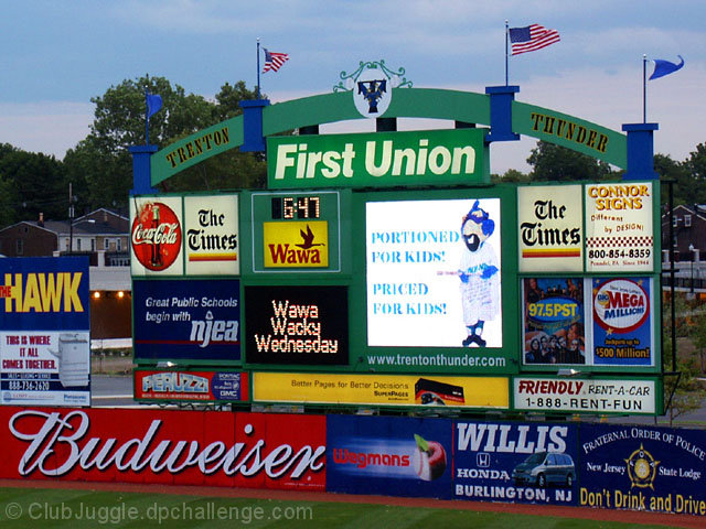
Nice idea, seems a bit dark, but maybe that's because the TV screen contrast. Not thrilled with the cropping, could you have brought it down to just the sign? Or maybe move even distances from the edge of the sign to the edge of the picture.
7 Swash |
|
| Photographer found comment helpful. |
|
|
08/02/2002 02:39:00 PM |
| good popping colors. somehow seems a little dark though. try raising the levels of just the midtones. that will brighten the overall pic without further blowing out the sign in the center. also the image seems slightly tilted left enough to be be distracting. lastly, i think you could give this pic a lot more energy by trying a more interesting 'angle of attack', not quite so straight up. . . mag99 |
|
| Photographer found comment helpful. |
|
|
07/31/2002 05:04:00 PM |
| There's some useful information in there somewhere - oh yes, there it is - the time. This is a great illustration of how over commercialised sport can be, I am sooooo glad the UK hasn't sunk this low yet. |
|
| Photographer found comment helpful. |
|
|
07/31/2002 01:21:00 PM |
| Don't you just love it? You can hardly find the baseball for all the SELL. |
|
| Photographer found comment helpful. |
|
|
07/31/2002 11:32:00 AM |
| Good idea for the theme, could've found a better example. |
|
| Photographer found comment helpful. |
|
|
07/31/2002 07:01:00 AM |
|
|
|
07/31/2002 02:18:00 AM |
|
| Photographer found comment helpful. |
|
|
07/30/2002 09:33:00 PM |
|
| Photographer found comment helpful. |
|
|
07/30/2002 09:35:00 AM |
|
|
|
07/30/2002 07:27:00 AM |
| A very good choice of subject but a little under exposed and a very conventional angle - perhaps could have been made more dramatic by getting closer and taking the photo from lower down. Or maybe from the side. |
|
| Photographer found comment helpful. |
|
|
07/29/2002 09:40:00 PM |
| I like it! Nice pic that expresses the challenge well! |
|
| Photographer found comment helpful. |
|
|
07/29/2002 08:53:00 PM |
| The contrast is a little muddy |
|
| Photographer found comment helpful. |
|
|
07/29/2002 01:52:00 PM |
The American pastime, sponsored by...
However, I think this would work better as a panoramic shot (640x427) to get at least the whole FoP billboard into the shot. |
|
| Photographer found comment helpful. |
|
|
07/29/2002 01:00:00 PM |
| nice and sharp; red on bottom left becomes focal point, needs some more balance on the right compositionally in color |
|
| Photographer found comment helpful. |
|
|
07/29/2002 10:04:00 AM |
| I personally love this picture. I think it really speaks to the age we live in... advertising is everything. Great detail and colors. |
|
| Photographer found comment helpful. |
|
|
07/29/2002 03:34:00 AM |
|
| Photographer found comment helpful. |
|
|
07/29/2002 02:57:00 AM |
| hehe, I love this one. The purpose (scoring board?) is drowned in propaganda, how typical! |
|
| Photographer found comment helpful. |
Home -
Challenges -
Community -
League -
Photos -
Cameras -
Lenses -
Learn -
Help -
Terms of Use -
Privacy -
Top ^
DPChallenge, and website content and design, Copyright © 2001-2025 Challenging Technologies, LLC.
All digital photo copyrights belong to the photographers and may not be used without permission.
Current Server Time: 04/27/2025 08:51:16 AM EDT.